Download
1 / 38
380 likes | 502 Views
Explore the fascinating history of pictograms and ideagrams as methods of communication, still used by some civilizations today. Understand the origins of the Latin alphabet, its transformation through the ages, and how Gutenberg revolutionized printing. Dive into various font classifications, including serif and sans-serif styles, along with an analysis of popular typefaces like Helvetica. This comprehensive overview highlights the significance of typography in written communication and its impact on modern design, showcasing how historical practices inform contemporary styles.

E N D
FONTS and TYPFACES
Pictorial Signs - (Pictograms) Pictograms are very simple drawings that represent things or ideas. This method of communication is still used today by certain civilisations including Chinese and Japanese and American Indians. Pictograms can also be found in ancient Egyptian hieroglyphics. In this series of Pictograms the message reads "I go with boat to that island. I sleep there, then go to another island. I sleep there twice. (Two nights.) I hunt and catch one sea lion."
Signs for Ideas - (Ideagrams) Ideagrams are often derived directly by simplifying pictograms. However, arbitrary shapes were used to represent ideas that are abstract and which cannot be conveyed in a picture. This means of communication is used mostly in Chinese and Japanese. In this visual Pictograms are on the left and Ideagrams on the right.
Latin Alphabet 1-400 AD Adapted from Greeks by Romans in 114 AD, on the Trajan Column in Rome. These Trajan capital letters have served, ever since, as a permanent criterion for modern lettering. They were first sketched on stone with a broad brush, then incised with a chisel & mallet. Spurs on the end were chisel marks, later to become serifs.
Second Century Roman Inscriptional Letterforms At this point in time there was no alternative to capital (majuscule) letters. However, it is clear that these beautiful forms did have an influence on the lowercase (minuscules) as they began to evolve during the following few centuries.
Gutenberg's Type, Circa 1440 The angular Gothic letter of Johann Gutenberg's type closely follows the style of handwriting practiced in Germany at the time. Gutenberg first invented the process of printing from moveable type in 1440… one of the most monumental achievements of our civilization. The visual is a page from his famous 42-line Bible which was printed in two volumes between 1452 and 1455.
The Development of the Alphabet From the time of the invention of printing in 1440 until 1500 printers from this period were mostly scholars who welcomed the means to produce books at what was then considered to be great speed. These printers were also the publishers and typefounders and it wasn't until many years later that the crafts, trades and businesses of typefounder, printer, publisher and bookseller became separate functions. Originally, books were meant ONLY for cultured men of certain social standing who became printers and who themselves undertook many of the operations within the printing process.
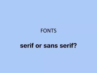
FONT CLASSICS - Serif Style These are known as “traditional” style fonts and are mostly used in books and magazines or if you are trying to achieve a more refined look.
FONT CLASSICS - Sans Serif Style These are known as “modern” style fonts and are used very often on billboards, signs, logos and on posters because of the fluid, easy to recognize and understand design and style. Futura Arial Eurostyle Verdana Verdana Verdana Verdana Franklin Gothic Demi Franklin Gothic Demi
Helvetica With the name Helvetica (Latin for Swiss), this font has the objective and functional style which was associated with Swiss typography in the 1950s and 1960s. It is perfect for international correspondence: no ornament, no emotion, just clear presentation of information. Helvetica is still one of the most well-know sans-serif fonts in use today.
Notice the minimal use of text. Because of this your eyes are drawn only to the information that’s most important to the artist or client.
Anatomy Of Letters 2. Booty 3. 1. 9. 4. 5. 8. 6. 7.
Text is measured in the following two ways. VERTICAL (up and down) is measured in POINTS 28 Point - Bryce Eats Paste 16 Point - Jesse also enjoys paste 50 Point - “Paste is delicious” - says Dalton
Which is correct? I go to the outhouse at least three times per day. I g o to the outhouse at least three times pe r day.
- measurements continued - N i c k l i k e s w h e n g u y s w h i s t l e a t h i m Jenna enjoys when guys whistle at her Terri enjoys when guys whistle at her • Dominic gets freaked outif girlswhistleathim
- KINDS OF TYPE - Headline Type sizes range from a minimum of 14 points onup.
- HEADLINE EXAMPLES - Why Does Adam Eat His Own Poop? IT’S OFFICIAL! SHEEHY & SAGAN TO WED!
- BODY TYPE EXAMPLE - Times New Roman Franklin Gothic Demi Garamond Arial
- BODY TYPE EXAMPLE - Which of these fonts are easiest for you to understand and read? ? Know why ? It’s what YOU are most accustomed to… thus these fonts get used most often.
Summary. Our current alphabet is made up of 26 distinct symbols that represent thousands of years of evolution in design. As a designer, you can modify, simplify or embellish these symbols and forms, but you cannot change the basic shapes without weakening communication.
Look through all the font links we have available online at www.juularts.com Also check out Fonts.com That is all for today spuds…
RECAP QUESTION TIME What is TYPOGRAPHY The Art Of Printing With or Design with Type Who was JOHAN GUTENBERG First invented the process of printing from movable type in 1440. What did GUTENBERG’S invention help create in the Western World? Books… Literacy… Schools… Critical Thinking… Individualism
RECAP continued This style of serif font is mostly used in books and magazines “Traditional” With guideline strokes is known as? SERIF Without guideline strokes is known as? SANS SERIF
RECAP continued Text is measured in the following two ways. POINTS which measures what? Height PICAS which measures what? Width KERNING - Adjusting the space between letters LINESPACING (LEADING) - Adjusting the space between lines of text WORDSPACING - Adjusting the space between words
RECAP continued HEADLINE TYPE is measured in 14 POINTS and up BODY TYPE is measured up to 12 points and down