Colors and the Web
320 likes | 425 Views
Learn about primary colors, color perception, color models, limitations, color harmony schemes, and tips for using color effectively in web design. Discover how to create visually appealing color combinations that enhance readability.

Colors and the Web
E N D
Presentation Transcript
Colors and the Web September 16 Unit 5
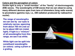
Primary Colors • In grade school taught that red, yellow and blue are primary • Works okay for mixing paint • Colors are dulled when mixed • Not so good for mixing light • Cones in the retina perceive color in three different wavelength ranges • Red, green, and blue are typically considered primary colors for dealing with light
Perceiving Color • Tristimulus theory attempts to explain how humans perceive color • A color is defined by three coefficients for red, green, and blue • Coefficients act as a percentage as the sum of the coefficients must equal 1 • Natural light is a mixture of all visible wavelengths • If all 3 types of cones sense equal amounts of light, we perceive white • Simulate white by having R,G,and B in equal amounts
Color Models • Humans can distinguish between 1 and 2 million colors • Impossible to describe them in words • Instead, color models are used • Common color models include: • RYB • RGB • CMYK • HSB
RGB Color Model • Additive color model • No colors = black • All colors = white • Used for systems which emit light • Monitors • Lights • TVs • Values for RGB often range from 0 – 255 • Can also be expressed in percentages • Secondary colors for RGB are CMY
CMYK • Subtractive color system • All colors = black • No colors = white • Describes systems which must reflect light for us to perceive • Used most often for printing • Secondary colors for CMY are RGB • The K is for black • Mixing CMY with inks doesn’t produce a good black • Usually black is a separate ink • On your computer, the RGB colors are converted by software to CMYK
HSB • Represented as a cone • Hue: color name • Often shown like a color wheel • Numeric value is the degree the color is at on the wheel • Saturation: how pure the color is • Expressed as a percentage • White, black, and gray all are 0% • Brightness: where the color falls between white and black • Expressed as a percentage • As brightness decreases, less of a range for saturation • We can’t perceive differences hue and saturation differences in dark colors
Limitations of Color Models • Not all color models are equal • RYB is good for picking colors • RGB is great for monitors and hardware • Difficult to figure what values for RGB and CMYK without a tool to help • Not all colors can be expressed in all models • CMYK has problems with colors with high saturation and brightness (think true red) • RYB and HSB use circular system for visualizing colors • Good for selecting colors to work well together
Color-Harmony Schemes • What we find attractive is not just based on theory, but can be personal and cultural • How to pick colors to appeal to a lot of people? • Can make use of color-harmony schemes • Monochromatic • Complementary • Analogous • Triadic • And more…
Monochromatic • Hue is constant (or very close) • Saturation and brightness can vary • Same color, different shades
Complementary • Pair of colors on opposites sides of the color wheel • The hues must be complementary, saturation and brightness can vary • Produce high-contrast colors
Analogous • Colors close to each other on the color wheel • Easy to get right! • Can often be more visually interesting if not all colors have same saturation or brightness
Triadic • 3 evenly spaced colors on a wheel • Hues form a triangle • Can be overpowering • Again, perhaps choose differing levels of brightness and saturation
Other Color Schemes • http://www.worqx.com/color/combinations.htm • Split-complementary • 1 color, plus two other colors equidistant from the complement of the first • Double-complementary • 2 pairs of complementary colors
How Many Colors? • One guideline is to use no more than 7 colors on a page (plus white and black) • This does not mean use 7 different hues • Between 2 and 4 hues is a good guide • Use different saturation and brightness to get other colors (if needed)
Background, Text and Legibility • Text must be legible • Best way to achieve this is through high contrast between text color and background color • Black text on a white background is best • Dark text on a light background works well in general • White text on black background has good contrast • Creates problems for some people
Can you read this? This isn’t any better Other Color Concerns • Don’t use a text and background color which only differ in the blue component in the RGB model • White and bright yellow • Human eye is less sensitive to blues • Don’t choose highly saturated colors • Text will “float” and sort of vibrate Yellow on white is bad!
How to Use Color • Useful for organizing a page • Navigation sections are a different color • Portions of the text with the same color are perceived as being related • Headings, links, etc. are easy to spot • If you want to use a dark background, perhaps use a white area surrounding the text with dark text to make it more readable • Use highly saturated colors sparingly • People’s attention goes to these bright colors • Use them to get attention, not as the main color
Background Images • May be tempting to use • But: • Static images can make the text look like its floating • Hard to get readable text on bright, patterned backgrounds • In general, it’s a bad idea
HORRID! • This is so annoying • Imagine a smaller font… • Or, even smaller, like on a webpage
This Is better • But still please don’t do it! • Backgrounds like this are made up of images • Many people don’t use image-enabled browsers • Or they turn off the pictures • Now they can’t read your site because it’s white text on a white background
Dying to Use the Background? • Why not use a white table cell for your text then? • You can see the pattern without preventing people from reading your page • Can still be irritating, like this background
Web-safe Colors • 216 web-safe colors • 6 values for red, green, blue • 0%, 20%, 40%,60%, 80%, 100% • Driven by monitors which could only display 256 colors (compared to the millions today) • HTML uses hexadecimal notation for colors • Have to convert 0-255 RGB to 00-FF Hex
Hexadecimal Numbers • We normally represent numbers in base 10 • 0-9 are the digits we use • Hexadecimal is base 16 • 0-9, A, B, C, D, E, F • A = 10 • B = 11 • C = 12… • F = 15
Converting to Different Bases • In class example
Hex example • In base 10 the number 123 = (3 x 1) + (2 * 10) + (1 * 100) Or (3 x 100) + (2 * 101) + (3 * 102) • In base 16 the number 123 = (3 * 1) +(2 * 16) + (3 * 256) Or (3 x 160) + (2 * 161) + (3 * 162) Which is the number: 803 in base 10
Hex and Colors • RGB is represented as a triplet of three numbers from 0 – 255 • e.g.(143, 0, 25) • Same values can be represented in Hex with 2 digits: • 00 – FF for each of the three parts of the color • So an arbitrary color can be 1A2F53 • Web-safe colors are have values of: • 00, 33, 66, 99, CC, FF for each of the RGB values
HTML and Colors • Some colors have pre-defined names • Red • Blue • Black • Colors are specified using #hexNumber • #FF0000 red • #00FF00 green • #0000FF blue • #000000 black
Using Web-safe Colors • Most people have monitors that can display more than 256 colors • You don’t have to use only web-safe colors • Remember that different monitors will display color differently
Colors and Usability • Take into account those with color-blindness • Most common is red-green • Good idea to use colors with different brightness • Printing a color image on a black and white printer
Colorblindness Websites • http://colorlab.wickline.org/colorblind/colorlab/ • Color lab • Can see a color palette in all the different forms of colorblindness • http://colorfilter.wickline.org/ • You can view any webpage (including yours) with different colorblindness filters • If your pages meets their criteria, you can put their logo on your site to show that its suitable for those with colorblindness
Questions? • Most of the content from this lecture is taken from : User-Centered Website Development A Human-Computer Interaction Approach Daniel McCracken, Rosalee Wolfe. Pictures are from www.wikipedia.com as well as some content