Download
1 / 18
180 likes | 303 Views
The CU Denver | Anschutz Medical Campus conducted a survey to assess the emotional and aesthetic response to the new website design. Results showed a favorable reception, particularly among prospective students, while highlighting navigation challenges for faculty and staff. Key findings included high scores in color and typography but lower in navigation and content. Proposed improvements include usability testing, content advisory teams, and a tailored intranet for staff. With a 95% confidence level from 672 responses, this initiative aims for continuous improvement.

E N D
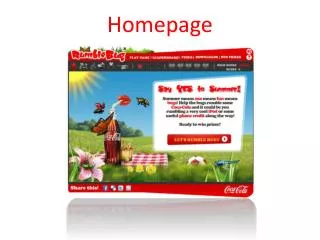
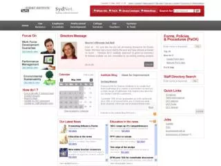
Homepage Design Audience Satisfaction Survey
Survey Goal: • The new website design should invoke an aesthetic emotional response with our audience. • The survey will measure what the audience thinks and feels when viewing the website designs for the first time and the degree to which the audience understands the website is for CU Denver | Anschutz Medical Campus rather than another university.
Key Findings: • The participants’perception of the new design was favorable and significantly higher than old design. • It scored highest with prospective students and lowest with faculty and staff but still higher than old site. • The design scored slightly higher with Denver Campus than Anschutz Medical Campus • The design successfully reflects university’s attributes with “Modern” scoring highest and “Traditional” scoring lowest. • Color, photography and typography scored high with all audiences. • Navigation, content and vertical scrolling scored lowest.
Proposed Solutions: • Conduct usability testing to improve navigation, content and user interaction (i.e. vertical scrolling). • Establish “Content Advisory Teams” for each panel to establish goals, review feedback and monitor changes. • Create and direct faculty and staff to new intranet homepage that will serve their needs better. This will simplify public homepage making it more usable for external audiences. • Better communicate website goals (i.e., reflect a consolidated university, brand university with colors and imagery, etc.)
Survey Responses • 672 Total Completed Surveys • 95% confidence level with less than 1% margin of error
I think the website design above represents the University of Colorado Denver | Anschutz Medical Campus
I think the website design above represents the University of Colorado Denver | Anschutz Medical Campus
I think the new website design represents the following qualities:
I think the new website design represents the following qualities:
Overall, how satisfied are you with the individual elements of the new website design:
Overall, how satisfied are you with the individual elements of the new website design:
Prospective Student Comments: Positive Negative “Finding course schedule is difficult. Search function not intuitive” “Schools should help keep the site appealing by updating the information on their own part of the UCD website.” “It's very clear, concise and straight forward. It's visually pleasing and easy to navigate” “I think it looks very professional and sophisticated. Great job!”
Current Student Comments: Positive Negative “The home page should contain current students first, then future students and/or faculty. I dont like having to scroll down half way down the home page just to access the current students.” “While the new website looks nice, it is difficult to navigate and find what I am looking for. “I don't like the way that the two campus websites are separated. Please put the blackboard/portal/e-college link back on the front page” “I feel that with the new design in the website and email for the UC Denver students creates a more professional look. I feel much prouder using the website and my email now that it looks more legit and looks much more like a highly revered college. I would tell any friend or family member to look up my school on Google just to see how amazing it looks all based off the new website” “As a current CU Denver student this new site design is miles ahead of the old one. It really makes you feel like you are attending a quality university which is not something I could have said about the old site”
Faculty and Staff Comments: Positive Negative “This may be fine for outside people who want to get the whole picture, but it is very hard to get to the standard links to get where one needs to go for the individual campuses. I have changed my homepage to the AMC page” “Important navigation items should be foremost on the site. For instance, portals that give access to several, often used tools should be easily found and identified (top of page). Pictures are nice and impressive, but it seems that the graphical content and size of the webpages is clogging the system.” “Overall I like it, It's just a matter of re-familarizing myself with it.” “The colors are awesome, and the CU logo is great. Also the navigation on the web page is well organized” “The more I use it I like it more. I liked having the quick links show up right away since I used that a lot” “I was very surprised to find the change. I really like the new design and layout. THANKS!!”
Next Steps: Continuous Improvement Websites are never complete Evolve not reinvent A/B test usability study outcomes Build intranet homepage focused on faculty and staff’s needs. Leadership decides the degree to which we create campus specific websites 1 in 4 students remove a school from their list if they can’t find what they need on their website