Download

1 / 13
130 likes | 289 Views
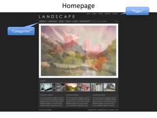
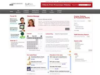
The homepage should be impressive but it also needs to make it easy for people to get to where they want to get and you don’t want to bombard people with too much unnecessary information. But few companies do this well – particularly in small business.

E N D
Call On: 1300 760 363 • The homepage should be impressive but it also needs to make it easy for people to get to where they want to get and you don’t want to bombard people with too much unnecessary information. • But few companies do this well – particularly in small business. • It seems a fairly typical small business homepage design is comprised of a menu, an image slider of some sort, maybe a news module, a welcome message, perhaps a few promos, maybe a contact us button or a phone number. • Have you ever stopped to wonder why small businesses seem intent on cramming so much into their homepages? So if your aim is to create a clutter free homepage how do we go about it? I have provided below a number of examples of how you can achieve it.
Use your homepage as a funnel not a brochure webcircle.com.au Call On: 1300 760 363
Call On: 1300 760 363 • You know the people are perhaps interested in your business or your area of expertise but you don’t know what they want. • Using your homepage as a funnel is one way to narrow down your visitors so you can build conversion pages tailored to groups of visitors • Once the visitor gets to those pages, we know quite a bit about them. • For businesses that offer a broad range of products / services (which is probably most businesses) it’s always going to be very difficult to get visitors to take the action you want them to take from the homepage directly • We have recently undertaken an experiment about funneling visitors where we tested how it impacted on a bunch of different website performance measures.
Create Exclusivity facebook.com Call On: 1300 760 363
Call On: 1300 760 363 • Have you ever gone to Facebook without being logged in? There is very little on the page other than a very brief statement about what Facebook is, a login form and a registration form – that’s pretty much it. It oozes confidence. • Facebook know they don’t need to sell you on the idea of joining up. They just need you to know that all of your friends are using it and you aren’t. • Facebook was conceived on the concept of exclusivity and it continues today with their clutter free homepage design. • If your site can utilise the idea of exclusivity then this could be a way to get people to take the next step. • We are releasing a site soon which employs elements of this principle so stay tuned for that.
Have a Clear PurposeGoogle.com Call On: 1300 760 363
Call On: 1300 760 363 • It is pretty clear what Google want you to do when you get to Google.com there isn’t a lot of room for error. • There is a logo, a search box and a button that says Google Search – not much more. • Google is the ultimate example of a clutter free homepage especially considering what their competitors (like Yahoo) were doing at the time Google came to prominence. • If your site has a clear goal (maybe to get people to sign up for something, or purchase something) you can have your homepage focus solely on this goal and provide a simple link to everything else.
Below The Foldhttp://37signals.com/ Call On: 1300 760 363
Call On: 1300 760 363 • Ok so you want to have stacks of information on the homepage but you still want a clutter free homepage – what do you do then? Put the content ‘below the fold’ so the immediate homepage is clutter free, clean and simple and people can scroll down for more. • If you are confident you know what the majority of your visitors want, make sure you include these things in your ‘above the fold’ area. • 37 Signals is a great example of this. Most people will get to their homepage and see a clear, clutter free presentation of their main products which is probably why they visited the site. But if they are just browsing, the heading text entices them to scroll down to the rest of the content.
Temporary fadehttp://www.apple.com/ Call On: 1300 760 363
Call On: 1300 760 363 • Apple are the masters of simplicity. • Their homepage is a great example of most of the points in this blog post but a technique I noticed recently is the fade in of the homepage after the visitor has had a chance to view their latest product. • When they have this fade-in active, you can go there and all you will see for the first few seconds is a giant ad for their latest product. • After a couple of seconds the rest of the site fades in. You want one don’t you? A MacBook Air? You know you want one.
Contact Us Website: http://awebsitedesigner.com.au/ Phone No.: 1300 760 363 Twitter: http://twitter.com/tanuj_rastogi Facebook http://www.facebook.com/pages/A-Website-Designer/675016145842611