Download
1 / 10
100 likes | 117 Views
u201c I am deeply passionate about helping women to feel beautiful with healthy glowing skin. This passion comes from my desire to educate my clients on how to achieve their skin health without the need to turn to anti-wrinkle injections, fillers, and plastic surgeryu201d

E N D
STYLE GUIDE PURPOSE & DEFINITIONS The purpose of a style guide is to make sure that multiple contributors create in a clear and cohesive way that reflects the corporate style and helps to ensure a continuous brand experience. It means that no matter how, when or where a customer experiences a brand, they are experiencing the same underlying traits. It's this consistency across every touch-point that helps build a brand and brand loyalty Brand language is the body of words, phrases, and terms that an organization uses to describe its purpose or in reference to its products Brand colours are a key component of a brand's visual identity. Typically there are 3-8 designated colours that create a colour palette complementary to the brand's personality and style. A moodboard is a succinct collection of visual assets that represents a brand's visual identity. It can contain a range of inspirational examples including photos, colours, type, patterns, shapes and more that make up a cohesive direction for a brand that can be displayed and understood on one page. Your typographic palette helps to tie all communications together, from the copy on your website, direct mail through to your logo; creating brand consistency and memorability.
BRAND LANGUAGE LUXURIOUS RELAXING PREMIUM REJUVENATING PASSIONATE PERSONALISED PROFESSIONAL INNOVATIVE EMPOWERED SPECIALISED AMBIENT
COLOUR PALETTE & USES #b2815d Brass/gold foil as a hierarchy point of difference #ffffff White for backgrounds #333333 Black for text #b69d97 Blush as a feature to bring warmth
TYPEFACES, PALETTE & HIERARCHY Raleway - Regular 22px Premium Heading & Quotes | THE VERVE LOUNGE TREATMENTS Raleway - light 18px Subheading | BODY SHAPING The Doctor Wrap Body Shaping is a safe and effective way to reshape and sculpt your body Body Copy | Cormorant- Garamond 16px Raleway - Regular 12px Call to Actions | IN-TEXT LINK
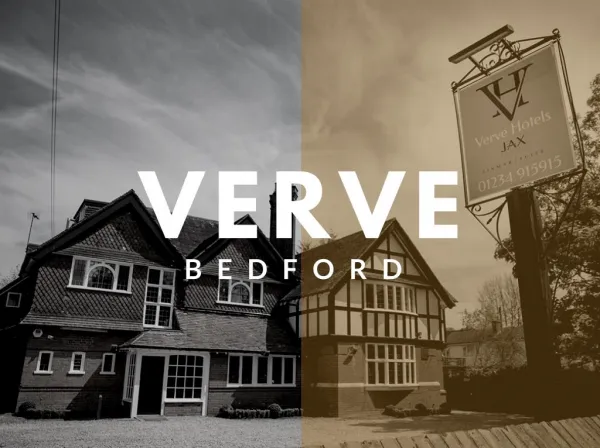
THE LOGO - The Logo is to be sized proportionately. Never to stretched or too small, must be able to read clearly in all forms - The logo should be black only or reverse in white on a black background. - Gold foil/Brass can be used as feature or for print.
BRAND & STOCK IMAGES - Use arch shapes to frame brand portraits as these highlight brand identity
BRAND & STOCK IMAGES - Use stock images with clean light or white backgrounds