Download
1 / 8
80 likes | 272 Views
Evaluation question 1 In what ways does your media product use, develop or challenge forms and conventions of real media products? . Film poster and magazine cover. Emily Moseley – A2 Evaluation. Film posters- what were their conventions? .

E N D
Evaluation question 1 In what ways does your media product use, develop or challenge forms and conventions of real media products? Film poster and magazine cover Emily Moseley – A2 Evaluation
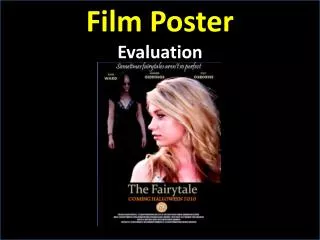
Film posters- what were their conventions? When designing my film poster and creating my film trailer, I looked to other social realism films and posters to try and pick out certain conventions of that genre that I could use in my own work. ‘Fish Tank’ was the film I took most inspiration from, and here is its film poster. So what were the conventions of a film poster? Logos of film festivals that have credited the film in the top right-hand corner • Very few fonts used (2 in this case) in complimentary colours • Minimal amount of different fonts used, keeps the poster looking tidy and professional • Quite an amount of empty space on the poster • The title is the largest part of the poster, helps attract an audience Main character at the edge of the poster, lit from the side Reviews from different companies/organisations with star ratings, and important, eye-catching words in larger font Tag line immediately underneath the title Large title in the middle of the page ‘Credits’, including producers, director’s and actor’s names
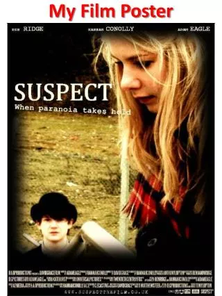
My film poster So, how far does my own film poster match the conventions discussed earlier in the ‘Fish Tank’ trailer Reviews from different companies/organisations with star ratings, and important, eye-catching words in larger font Logos of film festivals that have credited the film in the top right-hand corner Main character at the edge of the poster, lit from the side Title is largest text Tag line and ‘credits’ underneath the title As well as these points, I have stuck to using a very restricted colour scheme of blues and black, which compliment each other well I feel, and also a select few fonts. Both these ideas follow the conventions of the ‘Fish Tank’ trailer. There is also quite a bit of empty space on the poster. This was done to reflect the genre of the film, as social realism is known for being very empty and hollow.
What about different genres of film? Thriller War film Rom-com As well as social realism, I thought it would be a good idea to look at the wider picture concerning film posters, by looking at different genres of film.
From looking at these posters from 3 different genres of film, I can see there are considerable differences. Firstly, these poster are in portrait orientation, whereas mine is landscape. In that sense my poster challenges the conventions of a ‘traditional’ film poster. This may be due to that fact that the ‘Fish Tank’ poster was meant to be displayed in a different place to the other posters, for example, it may have been meant for a large billboard on the side of the street, which are usually landscape, rather than at a bus stop for example, in which the orientation would be landscape. Distribution companies aim to get their film recognised by as much of their target audience as possible, which involves creating supporting media products such as film posters available in a range of environments. Secondly, there is much more emphasis on the actual picture than much of the supporting text to try and attract an audience, contrasting to my film poster where the picture I feel isn’t as necessary in attracting an audience; that is left to the reviews at the top and bottom of the page. Again, that is another difference in conventions to the wider spectrum of film posters. There are some similarities however: both my poster and 2 of the 3 other posters have ‘credits’ underneath the heading, and use a minimal range of fonts and colours. The rom-com film poster uses stars and reviews to attract potential audience members, much the same as I have done in my own work. Altogether, my film poster does challenge most conventions of traditional film posters, but seems to fit quite well with my main inspirational text. If I knew what I know now, I would have probably orientated the poster to portrait, in order to match more conventions of traditional texts, but I feel my creation works quite effectively for the genre, as it implies the main figure is looking outwards an putting her past behind her, which is much a core theme in my film trailer. It also fits with a stereotype that society has of young people which is often portrayed through the social realism genre, the idea of ‘troubled and troublesome youth’.
Magazine covers – what were their conventions? When designing my magazine cover, I again needed some inspiration, so I turned to a popular film magazine to give me some ideas of what the conventions were. These were the 2 posters I analysed in the research and planning stage of the course, and here are the conventions I found. Title of magazine behind the character, also largest font on page Issue number and date of publication near title Single large image as the main focus of the page Supporting stories at sides of the cover, with larger title and smaller supporting text, in complimentary colours Barcodes at the bottom of the page Smaller images relating to other stories around the rest of the page Limited range of colours and fonts
My magazine cover So, how far does my own magazine cover match the conventions of traditional magazine covers? Title of magazine behind the character, also largest font on page Issue number and date of publication near title Single large image as the main focus of the page Supporting stories at sides of the cover, with larger title and smaller supporting text, in complimentary colours Limited range of colours and fonts Additional offers/ supporting material to encourage readers to buy the magazine Barcode at the bottom of the page
From comparing my magazine cover with that of published magazines, I have noticed that it fits in particularly well with the conventions discovered From analysing the conventions of traditional media, I feel that I can confidently say that my magazine cover fits in with these conventions quite comfortably. Technical conventions such as the placement of certain objects on the page has been met, for example the large title of the magazine behind the main character’s head, and the title of the film it is promoting in front of the character. I have also used a limited range of colours and fonts. I stuck with a pale, dark blue and white colour scheme, so that it was also correspond with my film poster, giving the two works continuity, and hopefully this comes across. The stories around the outside of the character are there to try and entice readers to buy the magazine, which is why I added the ‘free stickers’ section in the bottom corner. One convention I did miss out on however was the additional smaller photographs surrounding the main image in the centre of the page. If I was to go back, this is something I would’ve definitely added, to make my cover look more realistic.