Download
1 / 5
50 likes | 206 Views
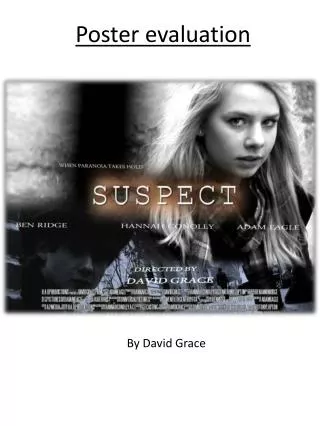
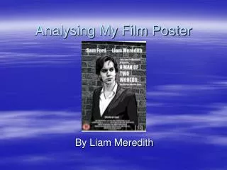
Film Poster Evaluation. Researching into other Film Posters:. Common interest in all three of these posters consists of the main two characters Layout of the pieces are similar; title at the bottom, block-print below title, date of the release of film below title but above the block-print.

E N D
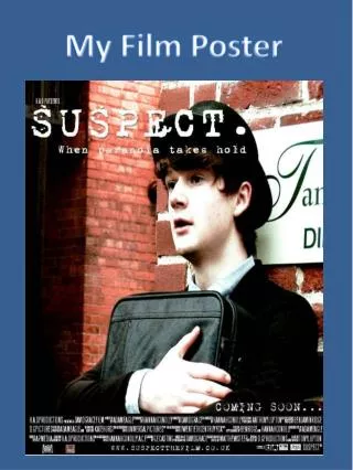
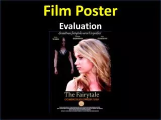
Film Poster Evaluation
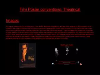
Researching into other Film Posters: Common interest in all three of these posters consists of the main two characters Layout of the pieces are similar; title at the bottom, block-print below title, date of the release of film below title but above the block-print. alongside main female in the forefront of composition is the other character. If it is a lover, it is right next to the female, however if it is an antagonist, he/she is kept a distance to the back. The background to these images is kept very simple and black. Not only is this to keep the poster looking neat, but it is also to not take away the audience’s attention to the main characters, which the audience are meant to engage with. The images take over the majority of the page also.
Photos I took to chose from With these photo’s I wanted to get an image that included both characters. I liked the effect of the second photo, however the image was too large and took up the majority of the page. I chose the last photo for what I would use as the picture for the poster, using picture editing software to adjust the image to what would be more engaging.
Being the first draft, there were many parts of the film poster I had to be sure to include; • The background image • Title • Age certificate • Release date • Block-print • When looking through my first draft of the poster, I still felt very unsatisfied. • The image seemed rather overwhelming and too congested, mainly from the woods in the background, it made it difficult in order for text to be clearly visible, so I had to put a transparent effect on a white box for the text to go over. First draft of Film Poster II was not overly pleased with the outcome of this poster, I found it came across to busy, with little expression to what the film is about. I wanted the background image to be much more simple, with the writing evenly spread across the page and giving more of a clear idea what the film is about.
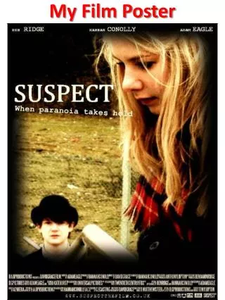
Final Film Poster Actors names at the top of the page, clearly placed for the public to see. I also put the first names in a smaller font than the surnames as this is what I saw in my poster research. Tagline of the film, put in small italics font at the top of the page. As it is just above the actors, the public can clearly see it as it is also in complete contrast with the black background. The title of the film but in large font to catch the public’s attention and so they don’t forget the title of the film as easily. It is also put in ‘gothic’ theme to create the idea of a castle, re-iterating the idea of a fairytale. Release date in a much brighter font to the rest of the text, as it is essential in order of getting a large audience to view the film in a cinema Block-print in very small, tightly closed font at the very bottom of the poster, as it is not as heavily essential in comparison to the other information on the screen.