Organizing and Presenting Data
Organizing and Presenting Data. GTECH 201 Session 11. Terminology. Classes Categories for grouping data Frequency Number of observations that fall in a class (frequency is a count) Frequency Distribution A listing of all classes along with their frequencies Relative Frequency

Organizing and Presenting Data
E N D
Presentation Transcript
Organizing and Presenting Data GTECH 201 Session 11
Terminology • Classes • Categories for grouping data • Frequency • Number of observations that fall in a class (frequency is a count) • Frequency Distribution • A listing of all classes along with their frequencies • Relative Frequency • The ratio of the frequency of a class to the total number of observations • Relative Frequency Distribution • A listing of all classes along with their relative frequencies • Width/Class Interval • The difference between the upper and lower cut points (breaks) of a class
Organizing Data • Classification Rules • Aim is to create categories or classes • First step is to compute range • Range = Largest Value – Smallest Value • Interval or Ratio Scale data only • Class Intervals • Width of Class Interval • Equal based on range • Unequal based on range • Quantile (Quartile or Quintile) • Natural
Classification Methods • Natural breaks • Quantile • Manual • Equal interval
How to Decide(on a classification scheme) • Rule of thumb: 3 - 7 classes • Classification histogram (see later today)
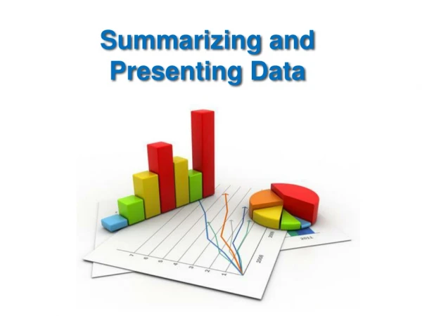
Graphs • Line graph • Bar graph • Scatterplots
Creating a Line Graph • The growth of the population of students at a Midwestern university is as follows
Bar Graphs • Here are data on the percent of females among people earning doctoral degrees in 1990, in several different fields of study
Scatter Plots • Graph bi-variate data when both variables are measured in an interval/ratio or ordinal scale • Units for one variable are marked on the horizontal axis • Independent variable should always go on the horizontal, x axis
Scatterplots • Survey of 3368 people asking them to estimate number of calories in common foods.
Example • A city planner collected data on the number of school age children in each of 30 families. • Construct a grouped data table using classes based on a single value
Computing Frequency • There are three ways you can create classes • a < but not equal to b b < but not equal to c • a – b, c – d, e - f • single value grouping
Distributions • Histograms • Difference between histograms and bar graphs • Bars in a histogram are always vertical • Base scale is marked off in equal units; there is no base scale in a bar graph • Width of bars in a histogram have meaning • Bars in a histogram touch each other
Constructing a Histogram • Histogram – height of bar equal to frequency of class represented • Bar extends from lowest value to highest value of the class
Frequency Polygons • Similar to a histogram • Midpoint of the class is indicated • Points connected by straight lines • Cumulative frequency polygon, ogive


