VISUAL RHETORIC
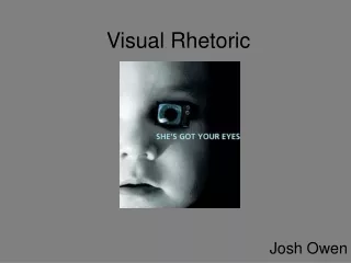
VISUAL RHETORIC. All the C.R.A.P. you need to know… The Purdue Writing Lab. When images are used to persuade audience, it’s called visual rhetoric.

VISUAL RHETORIC
E N D
Presentation Transcript
VISUAL RHETORIC All the C.R.A.P. you need to know… The Purdue Writing Lab
When images are used to persuade audience, it’s called visual rhetoric. • Producers of image-based texts utilize Contrast, Repetition, Alignment, and Proximity in order to control the way the reader understands the purpose of the text. VISUAL RHETORIC
What do we do when we read? • In general, we read words from top to bottom, left to right. The same is often true when we “read” visual texts. UNLESS, of course, the designer recreates the reading pattern using a visual hierarchy. • Visual hierarchy refers to the order in which viewers see various elements on the page. • Although visual designs are seen synchronously — we see the whole thing at once— designers can control the order in which a viewer’s eyes run over the page. VISUAL HIERARCHY
Group Analysis: What do YOU see first? W
Is the measurable amount of difference between all the elements in a design’s page, screen, frame, etc. • Contrast adds interest to the page and provides a means of emphasizing what is important or directing the reader's eye. On a page without contrast, the reader doesn't know where to look first or what is important. Contrast makes a page more interesting so the reader is more apt to pay attention to what is on the page. CONTRAST
Big and small elements of the same type, such as big and small images and big and small type are the most obvious uses of size to create contrast. Contrasting white space or the physical size of the piece with another element of the design is another method. CONTRAST WITH SIZE
The relative lightness or darkness of two elements to each other can create a contrast in value. Whether with shades of gray or tints and shades of a single color, the further apart the values the greater the contrast. CONTRAST WITH VALUE
Type contrast can utilize size, value, and color to create contrasting typographic treatments. Add bold or italics to create contrast. Mix large type with small type. Combine serif with sans serif type to create type contrast. Set portions of text in contrasting colors or varying values. CONTRAST WITH TYPE
Color theory is a body of practical guidance to color mixing and the visual impact of specific color combinations. • By using opposing colors on the color wheel, you can create a strong contrast and therefore attract the attention of the audience. • By using analogous colors, you can blend colors so as not draw attention away from contrasting elements. COLOR THEORY
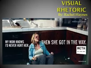
How about here?
Repetition, or consistency, means that you should repeat some aspect of the design throughout the entire document. • Repetition acts as a visual key that ties your piece together—in other words, it unifies it. Repetition controls the reader's eye and helps you keep his or her attention on the piece as long as possible. REPETITION
Graphic Style (Motifs) • Font Type and Size • Decorative Elements • Movement (in videos or movies) • Alignments • Shapes • Colors • Placement of Details (page numbers) • Navigational Tool Placement (on websites) • And potentially more! COMMONLY REPEATED ELEMENTS
Alignment is the placement of text and graphics so they line up on the page. Use alignment to: • create order • organize page elements • group items • create visual connections • Good alignment is invisible. Most readers won't consciously notice that everything is lined up neatly but they will feel it when things are out of alignment. ALIGNMENT
The left side lacks proper alignment: you can see how the boxes seem disordered. The right side is aligned—a straight line can be draw alongside the right margin, which means the layout has a right alignment. SIDE-BY-SIDECOMPARISON
PROXIMITY • The Principle of Proximity tells you to put related items close together physically. Things that aren't related should be farther apart. The amount of separation between items or groups tells your reader how the material is organized.
The last slide was bad (in case you missed it). The writing there was too far away from the heading of “proximity,” especially since they should be related. • Not only did the last slide violate proximity. It also had poor alignment because of this. PROXIMITY