Effective Mobile SEO: Implementing Best Practices
Master Mobile SEO Best Practices for higher search rankings! Learn essential techniques for optimizing your website's mobile performance. From responsive design to lightning-fast loading speeds, our expert tips ensure your site shines on mobile devices. Stay ahead in the mobile-first era with strategic content, streamlined navigation, and mobile-friendly formats. Elevate your SEO game and dominate the mobile search landscape! Dive into our comprehensive guide today.

Effective Mobile SEO: Implementing Best Practices
E N D
Presentation Transcript
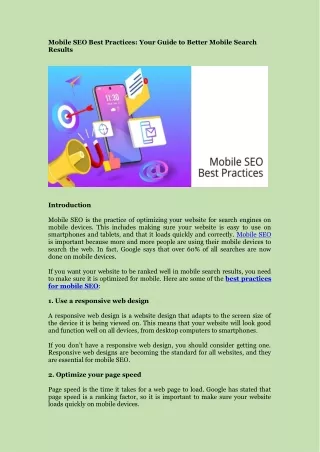
Mobile SEO Best Practices: Your Guide to Better Mobile Search Results Introduction Mobile SEO is the practice of optimizing your website for search engines on mobile devices. This includes making sure your website is easy to use on smartphones and tablets, and that it loads quickly and correctly. Mobile SEO is important because more and more people are using their mobile devices to search the web. In fact, Google says that over 60% of all searches are now done on mobile devices. If you want your website to be ranked well in mobile search results, you need to make sure it is optimized for mobile. Here are some of the best practices for mobile SEO: 1. Use a responsive web design A responsive web design is a website design that adapts to the screen size of the device it is being viewed on. This means that your website will look good and function well on all devices, from desktop computers to smartphones. If you don’t have a responsive web design, you should consider getting one. Responsive web designs are becoming the standard for all websites, and they are essential for mobile SEO. 2. Optimize your page speed Page speed is the time it takes for a web page to load. Google has stated that page speed is a ranking factor, so it is important to make sure your website loads quickly on mobile devices.
There are a number of things you can do to improve your page speed, such as optimizing your images, minifying your code, and using a content delivery network (CDN). 3. Use structured data Structured data is a way to provide additional information about your website to search engines. This information can be used to improve the way your website is displayed in search results. There are a number of different types of structured data, but some of the most common types for mobile SEO include: Local Business Schema: This schema provides information about your local business, such as your address, phone number, and hours of operation. Product Schema: This schema provides information about your products, such as their names, prices, and images. Review Schema: This schema provides information about reviews of your business or products. To use structured data on your website, you can use a markup language such as Microdata, RDFa, or JSON-LD. 4. Make sure your content is readable and easy to interact with When people are using their mobile devices to search the web, they are often on the go. This means that they are more likely to skim content and tap on links quickly. To make sure your content is readable and easy to interact with on mobile devices, you should: Use large fonts and plenty of white space. Break up your text into short paragraphs. Use bullet points and numbers to make your content easy to scan. Use clear and concise calls to action. Make sure your links are large enough to tap easily. 5. Optimize your images Images are a great way to make your website more visually appealing and engaging. However, they can also slow down your page speed if they are not optimized properly.
To optimize your images for mobile devices, you should: Resize your images to the appropriate dimensions. Compress your images without sacrificing quality. Use alt text for your images. 6. Use a mobile-friendly template If you are using a content management system (CMS) such as WordPress or Drupal, there are many mobile-friendly templates available. These templates are designed to make your website look good and function well on mobile devices. If you are not using a CMS, you can still create a mobile-friendly website by using responsive web design. 7. Test your website on mobile devices Once you have made your website mobile-friendly, it is important to test it on a variety of mobile devices to make sure it is working properly. You can use Google’s Mobile-Friendly Test tool to test your website on mobile devices. 8. Get backlinks from other mobile-friendly websites Backlinks are links from other websites to your website. Backlinks from high-quality websites can help to improve your website’s ranking in search results. When you are trying to build backlinks for your website, it is important to focus on getting backlinks from other mobile-friendly websites. This will help to improve your website’s mobile SEO. Conclusion By following these mobile SEO best practices, you can improve your website’s ranking in mobile search results and attract more visitors to your website.