Download
1 / 42
420 likes | 437 Views
This research article explores the key elements of good and bad website layout design and their impact on user experience. Learn how to attract and engage your website visitors effectively.

E N D
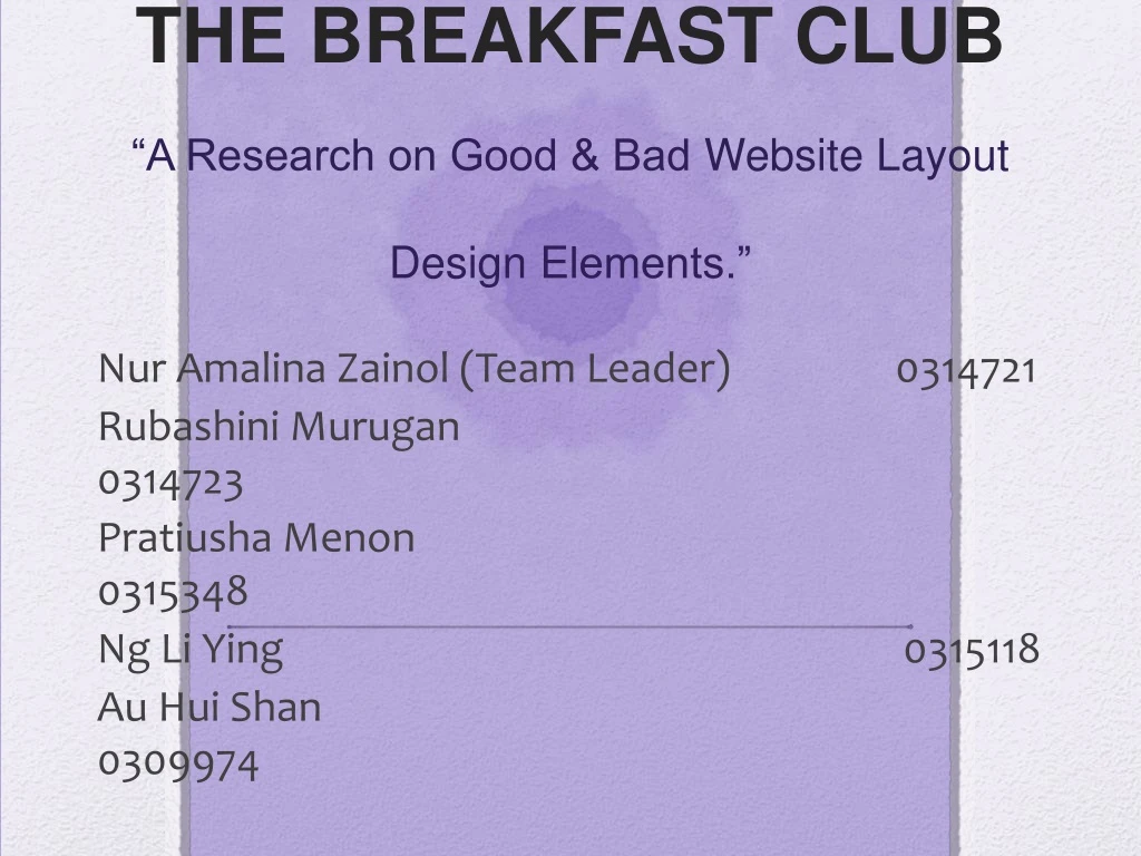
THE BREAKFAST CLUB“A Research on Good & Bad Website Layout Design Elements.” NurAmalinaZainol (Team Leader) 0314721 RubashiniMurugan 0314723 PratiushaMenon 0315348 Ng Li Ying 0315118 Au HuiShan 0309974
ABOUT US The Breakfast Club is consisted of 5 students from School of Communication in Taylor’s University. As a part of our assignment 2, we are required to conduct a research to study what are the element(s) of a website that makes them stand out (in either good or bad way). NurAmalinaZainol BMC in PR & Marketing RubashiniMurugan BMC in PR & Marketing PratiushaMenon BMC in PR & Marketing Ng Li Ying BMC in PR & Marketing Au HuiShan BMC in Broadcasting
Article 1: Don’t Bore Your Visitors Keep Them Thinking Essentially, a good website layout should be able to attract the attention of their viewers. The article also mentioned that a website should priorities its functionality – like how fast the media is being downloaded, or how the fonts can be read easily, or how accessible the navigation is. Designer has to treat the website’s design because first impression of a website is very important as it can actually reflect the identity of the organization (Texas A & M University, 2014). It is true that images and theme colour could attract the viewers but what about the content? A designer should know that viewers come to the website with one sole purpose- to seek information for their own needs. (Acorn Solutions, 2014)
However, the content of the website should be easily accessible especially when the viewers are not technological-savvy. When time poverty is common in these days so therefore the website should cater to the viewers as the viewers do not like to play the guessing game especially when they need the information as soon as possible.
(1.1) Picture reference: One Part Gypsy 2014, Homepage, viewed 8th October 2014, <http://www.onepartgypsy.com/
In these two (same) website screenshots, the viewers can easily access the pages as the designer has explicitly stated the navigation . At top section of the homepage (image 1.1), the website has added an image feature, big enough to attract the attention of viewer without sacrificing the website layout functionality.
(1.2) Picture reference: One Part Gypsy 2014, Homepage, viewed 8th October 2014, <http://www.onepartgypsy.com/
At the bottom of the very same webpage (image 1.2) the website offered their long list of information about their services incase the viewer is still lost. Furthermore, it has also a search button which enables viewer to search exactly what they’re looking for incase they are still confused.
As opposed to the two examples that were shown earlier, excessive pictures is a big no when it comes to website layout. It can be awfully tacky to some viewers and and distracting- thus making it difficult for the viewers to pin-point what are the information that they are looking for. Even though, images can be a good stimuli, a designer should aware that flashing images could actually bring more harm than good as it can trigger epilepsy seizure to some viewers.
(1.3) Picture reference: Lings Cars 2014, Homepage, viewed 8th October 2014, <http://www.lingscars.com/
In the image (1.3), on the middle right side you can see there is an image of a chicken blocking the Twitter feed and there is no way of removing the gif image. Not only the flashy images are redundant, some of the menu bar text have been blocked by unnecessary scribbles that does not give out any helpful information to viewers. The arrangements of submenu is scattered all over the place without any flow (For example, services at one section or social media buttons is not consistent and spread out to different section of the webpage.)
(1.4) Picture reference: Lings Cars 2014, Homepage, viewed 8th October 2014, <http://www.lingscars.com/ Picture above: A screenshot of a huge gif image blocking almost half of the webpage solely for aesthetic reason.
More example of badly navigated website. (1.5) Picture reference: Arngren 2014, Homepage, viewed 8th October 2014, <http://www.arngren.net/
Article 2: Don’t Make Them Wait One of the few things that need to be taken into consideration is that how strong the viewer’s internet connection as it will affect their surfing experience. Most of the time, users will just close the window if the page load way too slow for their liking. As the designer, we need to understand that size does matter. It is true, that the user’s computer performance does play a role when it comes to satisfying internet surfing experience (Starhub,2014) but one need to understand that it takes two to tango.
Image source: <http://gtmetrix.com/why-is-my-page-slow.html> If we look at the image above, the quality of the server side too are needed for a page to load efficiently (GTMetrix, 2014). So, as a designer there are a few things that need to consider in order to make a website runs smoothly without any disruption.
According to the article, the optimal size to be implement in the webpage would be around less than 30k. As a rule of thumb, any images that exceeded more than 50k should either be resize or replaced with something more smaller or has less image quality.
(2.1) Picture reference: Passion Bicycle 2014, Homepage, viewed 8th October 2014, <http://www.passionbicycle.com/
Inspect element page of “Passion Bicycle”. Before we begin, the website was tested and the page managed to load everything in merely 1 second. From image (2.1) the website showed a clean cut of only one feature image which could possibly be the reason why the page loaded pretty fast. When checking the inspect element page, we found out that the images that are imbedded in the website are all less than 30k and not more than 50k- which explains the amazing time taken for the page to load. We can conclude that based from the article 2 and the example above, the optimal size for images would be less than 30k.
And now we look at the end of the spectrum. Some designers believed that size are not important because they feel the need to showcase their images to attract the viewers attention. Not to mention, website also would show advertisement in hopes to gain revenue but unbeknownst to them, this will make the webpage more slower and heavy. For example, the readwrite website (refer image 2.2) has too many images in one page even though the website has already provided an accessible navigation bar for the viewers. Originally the website took too long to load and we have to refresh the page a couple more times because we thought it was momentarily stuck.
(2.2) Picture reference: Read Write Tech 2014, Homepage, viewed 8th October 2014, <http://www.readwrite.com/
Inspect element page of “Read Write Tech”. Based on the inspect element page, the average size image on that website is roughly 280k which explains why the page took too long to load despite strong internet connection (6mbps).
Article 3: Find Out What Colors Will Cause Your Visitors to Hate You One of the few things that designer always overlook is the colour scheme. Colours can make or break a website depending on how they use it. Generally, web browser is only capabe to detect 256 colours- and that is only an approximation due to different variation of browsers and gadgets. Therefore it is better to maintain within the 216 colours pallet. The wrong usage of colours will results in tiny dots in screen- which is called dithered colours. The article mentioned that the colour yellow and red should be use cautiously. However, rule of a thumb is that the designer should avoid other harsh colours entirely as it can strain the viewers’ eyes- thus making them spend lesser time on the website.
(3.1) Picture reference: Penny Juice 2014, Who is Penny Juice, viewed 8th October 2014, <http://www.pennyjuice.com/htmlversion/whoispj.htm From the image (3.1), the website uses different colours that has no consistency and glaringly bright. Dithered colour is detected on that image of baby on the left side of the screen.
(3.1) Picture reference: ClementineDaily 2014, Homepage, viewed 8th October 2014, <http://www.clementinedaily.com/
Contrasted with image (3.1), the Clementine Daily has a systematic colour pallet, by using white and grey as main theme while pink and black are used to accentuate the web page. The tones are subdued and not glaring, making the viewers’ eyes less strain and the chances of the viewers spending more time on the website is high. Even the images that were used are similar in tones- each images has that grey overtones, even the green grass image has different opacity of level of grey undertones. At the same time, there’s no dithered colours detected- as the website managed to maintain the colourpalete under 216.
Article 4: Navigation One question that every viewer will ask when they reach a certain website is “how and where can I go from here”. That is when the navigation come in handy. Navigation does not just refer to to the menu bar, but the company’s identity must also be kept in view all the time. Viewers usually opens more than one browser tab so they need to know which website are they in at that moment. Therefore the company’s logo or name should always be on top.
(4.1) Picture reference: Luxola 2014, Homepage, viewed 8th October 2014, <http://www.luxola.com/
From the website (refer image 4.1) the company has make it explicit that they are a beauty products company and currently the prices of the items will be charged in RM (top right side of the page) The menu bar has abundance of categories that viewers can choose from and on top of the menu bar, viewers has the choice to go to their account or continue shopping. There is also the company’s logo right in the middle top section of the website. The feature images can also be change with the navigator right left button so viewers does not have to wait for the image to change by itself.
(4.2) Picture reference: The Gourmet Australia 2014, Homepage, viewed 8th October 2014, <http://thegourmet.com.au/
On the contrary of website (4.1), this website from The Gourmet Australia is a bit complicated. Upon reaching to the home page, viewers does not even have the ability to close down the pop up windows that appear on top of the homepage. Plus, it only gives the viewer two option- to either sign in with facebook or paypal (which we believe can be quite risky to sign in using your banking account hence, it became a turn-off factor for some visitor) or viewer can provide an email in order to access the website. Even if the website’s main intention is to only let their members access the website- it can actually be quite confusing to first time visitor since there is a lack of information about the website and the only information available is quite vague and redundant.
Findings By conducting the research, we have narrowed down the vital factors that is important when it comes to what makes a good and interactive website. According to out findings, we concluded that the suitable factors are: • Content (Does it offer what the viewer wants?) • Appearance (Theme consistency) • Media content (Size of medias on the website) • Navigation (Company’s identity and website direction)
Content The main reason why viewers want to go to a website is to seek information. If the website does not provide ample information as the viewer need- the viewer will obviously spend less time on the webpage. Designer needs to explicitly lead the viewers to where does the information they need located.
(5.1) Picture reference: Lala Grace 2014, Homepage, viewed 8th October 2014, <http://www.lalagrace.com/ This website explicitly arranged their information in a very systematic manner, make it easier for users to access the content more fluidly. The menu bar is prominent, therefore users will not have a problem guessing which buttons will bring them to the page they wanted.
Appearance Website should also have consistent theme because it will positive vibes to the consumers because the themes of the website are so synchronize. Moreover, by using good color coordination theme will attract more consumers to the website.
(5.2) Picture reference: Air-Social 2014, Homepage, viewed 8th October 2014, <http://air-social.com/ The designer uses the colour blue as the website’s primary theme- the colour that is known to bring calmness and does not strain the viewer’s eyes after awhile. Instead of using harsh colours, the designer implemented the colours that quite close to the blue spectrum like green and just a smidge of yellow and green to accentuate the webpage.
Media Content It can be a challenge when it comes to media content. A designer wants to give as much information to the viewers yet at the same time it will slow down the page load which can drive the viewers away. When putting medias into the webpage, designer has to understand that not all viewers have strong internet connection.
(5.3) Picture reference: Oatmeal 2014, Homepage, viewed 8th October 2014, <http://www.oatmeal.com/ The oatmeal.com website uses images that are below 30k in order to avoid slow page load. It does not have any heavy media like audio or video that will load/play by itself hence it does not make the webpage heavy.
Navigation Website should have an easy navigation is because it will help the consumers to check the website easily where they can find whatever information that they are looking for quickly. Besides that, navigation buttons should always be on top of the left or right because most of the consumers are used to it. This will definitely be a user-friendly website.
(5.4) Picture reference: Hay Antwerpen2014, Webshop, viewed 8th October 2014, <http://www.hayantwerpen.be/nl/hay-nieuws/wedstrijd-win-1-van-de-4-hay-verjaardagspakketten/01-10-2014/12 Based on the earlier statement, the navigation button is on top of the webpage and it has clear and explicit information that explains where does the button will direct to the pages.
Reference • Acorn Solution. 2014. The Basics of Good Web Design. [ONLINE] Available at: http://acorn-solutions.com.au/index.php/expert_articles/web_design/good_design. [Accessed 08 October 14]. • Aptivate. 2014. Web Design Guidelinesfor Low Bandwidth. [ONLINE] Available at:http://www.aptivate.org/webguidelines/Introduction.html. [Accessed 08 October 14]. • Air Social. 2014. Offre Social Media Pour Les Start. [ONLINE] Available at: http://air-social.com/. [Accessed 08 October 14]. • Arngren. 2014. Arngren Technology and Gadgets. [ONLINE] Available at: http://www.arngren.net/. [Accessed 08 October 14]. • Clementine Daily . 2014. Today Multi-Faceted, Modern Woman. [ONLINE] Available at:http://www.clementinedaily.com/. [Accessed 08 October 14]. • GTMetrix. 2014. Why is my page slow?. [ONLINE] Available at: http://gtmetrix.com/why-is-my-page-slow.html. [Accessed 08 October 14].
Reference • Hay Antwerpen. 2014. Wedstrijd: Win 1 Van De 4 Hay Verjaardagspakketten. [ONLINE] Available at:http://www.hayantwerpen.be/nl/hay-nieuws/wedstrijd-win-1-van-de-4-hay-verjaardagspakketten/01-10-2014/12. [Accessed 08 October 14]. • LalaGrace. 2014. Earth Friendly Hand Illustrated Good Made in The USA. [ONLINE] Available at:http://www.lalagrace.com/. [Accessed 08 October 14]. • Ling's Cars. 2014. Car Leasing Business Deal. [ONLINE] Available at: http://www.lingscars.com/. [Accessed 08 October 14]. • Luxola. 2014. Makeup Malaysia. [ONLINE] Available at: http://www.luxola.com/. [Accessed 08 October 14]. • One Part Gypsy. 2014. One Part Gypsy Small Business Branding, Design and Consulting. [ONLINE] Available at: http://www.onepartgypsy.com/. [Accessed 08 October 14]. • Passion Bicycle. 2014. Passion Bicycle. [ONLINE] Available at: http://passionbicycle.com/. [Accessed 08 October 14].
Reference • Penny Juice. 2014. Who is Penny Juice. [ONLINE] Available at:http://www.pennyjuice.com/htmlversion/whoispj.htm. [Accessed 08 October 14]. • Read Write Tech. 2014. Web Apps, Web Technology Trends, Social Networking and Social Media. [ONLINE] Available at: http://readwrite.com/. [Accessed 08 October 14]. • Starhub. 2014. Factors affecting speed. [ONLINE] Available at:http://www.starhub.com/personal/support/broadband/home-broadband/broadband-101/factors-affecting-speed.html. [Accessed 08 October 14]. • Texas A&M University. 2014. Why Do Good Websites Matter?. [ONLINE] Available at:http://itss.tamu.edu/Web/Web_Design_and_Development/Why_Do_Good_Websites_Matter_.php. [Accessed 08 October 14]. • The Gourmet Australia. 2014. Sydney Meat, Wine and Gourmet Food Hampers. [ONLINE] Available at:http://thegourmet.com.au/. [Accessed 08 October 14]. • The Oatmeal. 2014. Comics, Quizzes, and Stories. [ONLINE] Available at: http://theoatmeal.com/. [Accessed 08 October 14].