Download
1 / 42
420 likes | 443 Views
In this presentation, I will show good and bad examples of data display and list rules for improvement. The goal is to promote evaluation of objectives/hypotheses and clearly depict relationships. Avoid unnecessary complexity, jargon, and abbreviations. Don't display raw data; instead, use figures or tables. Display error bars and be careful with line graphs. Always ensure enough clarity for easy interpretation.

E N D
Hints for better data display • Why data display? • Good ideas for future presentations • Data display is never perfect • Judges
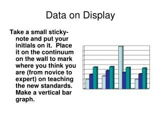
My approach today • I will show good and bad examples • As I proceed ask yourself how each figure could be improved. • I will also list some rules that you could use as guidelines.
Goal of display? • Strive to promote evaluation of objectives/hypotheses • Clearly depict relationships • Figures are usually preferable to tables • Use tables if the exact values are important • Very simple comparisons don’t require a figure or table
Rule 2: Avoid Jargon and be careful with abbreviations • You want your audience to have as little trouble following you as possible • By the way, what is wrong with this slide?
Loss of PIT tags by Desmognathus brimleyorum in SMZ’s that varied from 10 to 200 M in width Percent Loss Width of SMZ
Loss of tags by Ouachita dusky salamanders in relation to habitat width Percent loss Width of Streamside Management Zone
Rule 3: Don’t display raw data X Y 22 17 21 17 15 17 19 11 18 12 16 11 23 18 25 18 14 17 11 12 21 15 (r2=0.24 P=0.6)
Flight speed of quail encumbered and unencumbered by radio transmitters Without transmitter 22 MPH With transmitter 17 MPH Without transmitter 21 MPH With transmitter 17 MPH Without transmitter 17 MPH With transmitter 20 MPH Without transmitter 15 MPH With transmitter 17 MPH Without transmitter 19 MPH With transmitter 11 MPH Without transmitter 18 MPH With transmitter 12 MPH Without transmitter 16 MPH With transmitter 11 MPH Without transmitter 23 MPH With transmitter 18 MPH Without transmitter 25 MPH With transmitter 18 MPH Without transmitter 14 MPH With transmitter 17 MPH Without transmitter 11 MPH With transmitter 12 MPH Without transmitter 21 MPH With transmitter 15 MPH Unencumbered Flight speed Encumbered Flight speed
Table 1. What was wrong? 1. Conclusion difficult to see 2. Too messy 3. Units? 4. Font too small in some places
Flight speed of 11 quail encumbered and unencumbered by radio transmitters 22 17 21 17 15 17 19 11 18 12 16 11 23 18 25 18 14 17 11 12 21 15 Unencumbered Speed KPH Encumbered speedKPH
Same data in a figure and a table Mean Flight Speed of Quail With and Without Transmitters. W Trans W/O Trans Mean Flight Speed of Quail With and Without Transmitters With Transmitters Without Transmitters 15.4 KPH 18.5 KPH
Which was Better? • In this case I wouldn’t use a figure or a table. • Average flight speed of unencombered quail was 3.1 Km/hr faster than Quail encumbered by transmitters. • The difference is statistically significant (t=2.24, P=0.02 DF=10).
Same data; what is wrong with this? Axes not labeled Y-axis too messy Stats? F statistic; p-value and r2
More Complex Data Proportion of arthropods in the diets of male and female North American and EuropeanKestrels
Patterns are more easily interpreted when data are displayed in figures • But: • Make sure the figure is easy to interpret • The best figures are able to stand alone, i.e., they don’t need any help from the presenter • So, for every figure ask yourself: “Is there a better way to display the data”?
Kestrel data poorly displayed; interaction difficult to see Winter Spring % Insects in Diet
Winter Spring Stacked bars are almost never your best choice % Insects in Diet
The interaction shows up easily here, could it be better? Winter Spring % Insects in Diet
For bar graphs • Put bars together to illustrate the conclusions you are trying to display. • Make sure that your eye doesn’t have to travel back and forth across the figure in order to draw a conclusion
For example • Given 4 breast cancer cell lines and 4 chemotherapies • If you are interested in how the different cell lines respond to the treatments:
Group the data for each cell line together % Apoptosis
However, • If you are interested in the efficacy of the different treatments among cell lines:
Group the data for the different treatments % Apoptosis
What is missing? % Apoptosis
Rule 3: Display Error Bars • If you have replication of continuously distributed data you should display error bars. • Standard error, 95% confidence intervals and standard deviation are commonly used. • Don’t chose arbitrarily, know your error bars and what they mean
Rule 6: do not connect points in a scatter plot unless they are related Number of individuals
Make sure the dependent and independent variables are on the proper axisWhat else is wrong with this figure? Salinity Species richness
Too many lines: limit your line graphs to 3-4 lines; Other problems?
Summary of common mistakes in data display • Too many bars or lines are included • Lines connect independent data points • Raw data are displayed • Error bars are absent
More common mistakes in data display • Tables are used when a figure is more appropriate • Figures don’t illustrate anything • Figures are too complicated • The “wrong” figure type is used
Statistics and Study Design • Most of the time fairly simple statistical tests will suffice: • For categorical comparisons and proportions: Chi-squared • For two continuously distributed variables in a linear relationship: linear regression • For comparison of two means: t-test • For comparison of three means: ANOVA
Be careful • All of the above require independent and randomly drawn samples (one exception) • What if you take a before and after measurement on a set of subjects? • What if you take multiple measurements on each member of a sample population?


![Better Data, Better Science! [ Better Science through Better Data Management ]](https://cdn3.slideserve.com/6850091/better-data-better-science-better-science-through-better-data-management-dt.jpg)