Download
1 / 34
340 likes | 355 Views
Explore the concept of color perception, the properties of light waves, and the role of the human eye in creating and interpreting color.

E N D
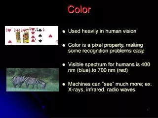
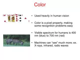
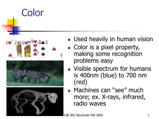
Color Perception created in the brain as a result of stimulation of the retina by light waves of a certain length The intrinsic physical properties of specific objects that allow those objects to reflect and absorb light waves of a certain length Color requires light…
Cosmic rays Gamma rays X-rays Ultraviolet Visible light Infrared Radar Television Commercial radio 1022 Hz 1021 Hz 1020 Hz 1019 Hz 1018 HZ 1017 Hz 1016 Hz 1015 Hz 1014 Hz 1013 Hz 1012 Hz 1011 Hz 1010 Hz 109 Hz 108 Hz 107 Hz 106 Hz 105 Hz Light portion of the spectrum of electromagnetic radiation that is visible to the human eye
Light - portion of the spectrum of electromagnetic radiation that is visible to the human eye Frequency range: approx. 750 nanometers to 400 nanometers (Nanometer = 1 billionth of a meter)
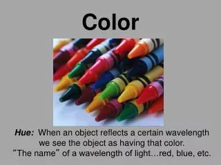
Hue: The quality that differentiates one color from another (the name of the color) hue Value: Relative lightness or darkness of a color tint shade Tint: A color with a high value – usually achieved by mixing white with a hue tone Shade: A color with a low value – usually achieved by mixing black with a hue black gray white Tone: Color of middle value – usually achieved by mixing black and white with a hue Color Terminology Saturation: (Chroma) The amount or % of a particular hue in a color mixture (Higher saturation = more hue)
How does the human eye see color? An electrochemical reaction interprets the simulation received when light is emitted by or reflected from an object. The light receptor nerves: Rods – Sensitive to faint light Cones – Sensitive to bright light (red, blue, green)
Sunlight contains all electromagnetic wavelengths of the visible spectrum Reflected blue and green light is received by the eye in the cones which then send signals to the brain to be interpreted as turquoise Light strikes a blue-green paint chip and the wavelengths that respond to that color are reflected – all other wavelengths are absorbed.
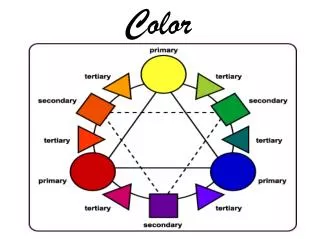
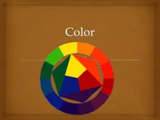
Color Mixing – Primary Colors Hues that cannot be derived or blended from any other hues. pigment light
Color Mixing – Secondary Colors pigment light Hues that result from mixing two primary colors.
Color Mixing – Complementary Colors pigment light Any two hues that, when combined yield white in light or black in pigment.
Color Mixing – Theory vs. Practice Theory… Complimentary hues = 1 primary hue + 1 secondary hue Secondary hue = 1 primary hue + 1 primary hue Complimentary = All 3 primary colors = Black (pigment) – Absence of light – not reflected color – Black – Practice… No pure pigments, so no pure black
Color and Light When white light passes through a filter, part of the spectrum is absorbed… Subtractive Color Mixing… Color filters allow only their own hue to pass through Saturation changes how much is absorbed/transmitted
Color and Light When white light passes through a filter, part of the spectrum is absorbed… Additive Color Mixing… Eye adds together several individual hues. Hue is NOT created!!! Cones in eye are stimulated and brain interprets the mix as a particular hue Tones, tints, and shades are determined by level of stimulation to the cones
Color and Paint Color mixing in paint = subtractive process Selective absorption characteristics of individual hues in a paint mix cause a reduction in saturation in the resultant hue… How ‘bright’ or ‘rich’ your orange is depends on the saturation of the red and yellow mixed to create it…
The Integrated Color Wheel Places light and pigment on the same wheel Renames the primary colors of light Reflects a more ‘true’ relationship between various hues in pigment and light = Light = Pigment
Hue relationship chart… Values of the colors on the outside columns correspond with the values of the adjacent gray blocks on the center gray-scale column
Complementary hue-tone relationships… The value of a specific hue changes as white or black is added. The values of the resultant tints and shades on the outside columns correspond with the values of the adjacent gray blocks of the central gray scale.
A word of warning… All discussion of color theory assumes that hues are 100% pure and saturate. In practice, they NEVER are… unless considerable expense and effort is expended End results often vary from theory – Practice is always dependent on other elements that theory cannot predict or assume
Color and Meaning: Common interpretations (not always ‘correct’) Yellow: stimulating, cheerful, exciting, joyful, serene, unpleasant, aggressive, hostile Orange: warm, happy, merry, exciting, stimulating, hot, disturbed, distressed, unpleasant Red: happy, affectionate, loving, exciting, striking, active, intense, defiant, powerful, masterful, strong, aggressive, hostile Green: youthful, fresh, leisurely, secure, calm, peaceful, emotionally controlled, ill Blue: pleasant, cool, secure, comfortable, tender, soothing, social, dignified, sad, strong, full, great Violet: dignified, stately, vigorous, disagreeable, sad, despondent, melancholy, unhappy, depressing Black: sad, melancholy, vague, unhappy, dignified, stately, strong, powerful, hostile, distressed, fearful, old White: pure, tender, soothing, solemn, empty Brown: secure, comfortable, full, sad, disagreeable
Practical Use - Pigment Hues of medium saturation and value: background rather than focus Proximity impacts spectators: strong contrast = greater tension Accent colors: small touches of contrasting color used by scenic and costume designers to enhance visual look Color selection impacts viewer by color meaning as well as visual translation!!!
Practical Use - Light Typically avoid heavy saturation: hard on skin and clothing! Seek to enhance rather than distract: brain stimulation with additive color Serve to enhance color palette of scenic and costume designers Sense of environment achieved by ‘mixed’ white light (can go slightly warm or slightly cool…) Focus and understanding of environment also draws on color meaning with light
Scenic Design Color Analysis of Terra Nova
Scenic Design Color Analysis of Terra Nova
Color Analysis of Terra Nova Costume Design
Color Analysis of Terra Nova Lighting Design Color Key for lighting design Arrows indicate direction from which the light is traveling toward the stage. The horizontal flags on the arrows at the upper part of the illustration indicated that those lights are coming from above, rather than behind, the actors
Lighting Design Color Analysis of Terra Nova Numbers indicate Roscolux gel colors – Notice a ‘cooler’ look in the image
Color Analysis of Terra Nova Lighting Design Numbers indicate Roscolux gel colors – Spotlight is also used in this image
Lighting Design Color Analysis of Terra Nova Numbers indicate Roscolux gel colors – England vs. Antarctica
Lighting Design Color Analysis of Terra Nova Numbers indicate Roscolux gel colors – ‘warmer’ look evident in this scene
Color Analysis of Cabaret Scenic Design
Color Analysis of Cabaret Scenic Design
Color Analysis of Cabaret Costume Design
Color Analysis of Cabaret Costume Design
Color Analysis of Cabaret Costume Design
Color Analysis of Cabaret Lighting Design • 3 Primary Considerations: • Full-spectrum of colors in costume design & set • Heavy, smoke-filled, sensuous atmosphere • Need for a ‘lighter’ more realistic atmosphere outside the cabaret