Download
1 / 3
0 likes | 4 Views
The colours we surround ourselves with have a quiet, persistent influence on how we feel and behave within a space. From the calming tones in a bedroom to the stimulating shades used in creative studios, colour psychology plays a central role in interior design.

E N D
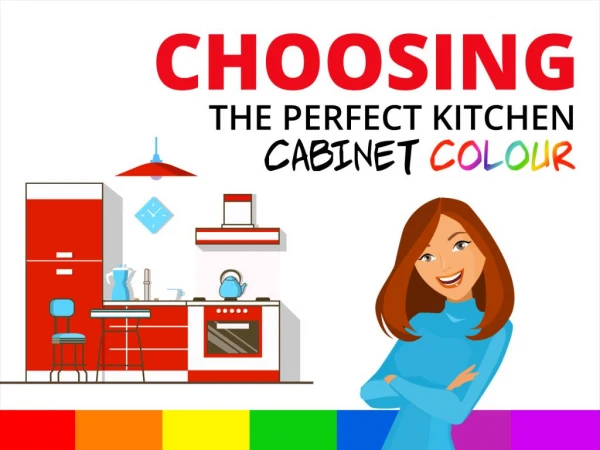
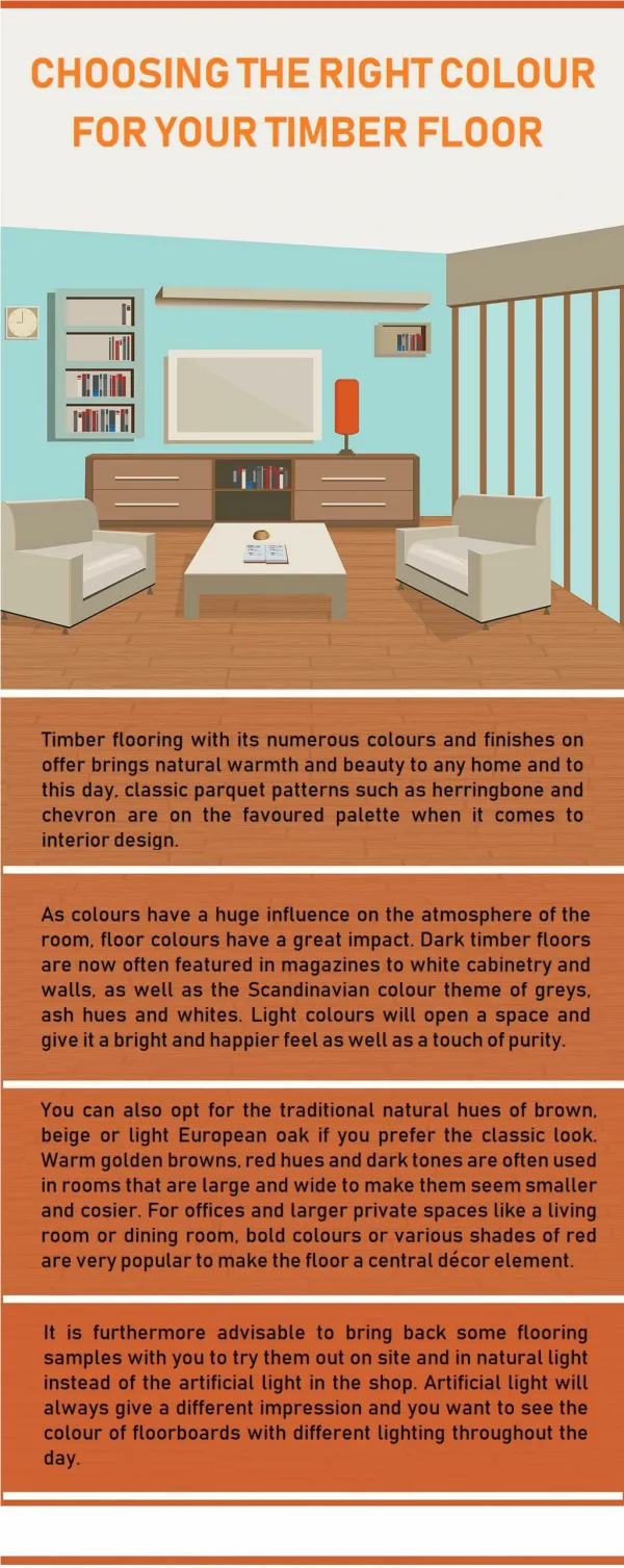
Colour Psychology in Interiors: Choosing the Right Palette The colours we surround ourselves with have a quiet, persistent influence on how we feel and behave within a space. From the calming tones in a bedroom to the stimulating shades used in creative studios, colour psychology plays a central role in interior design. When thoughtfully applied, the right palette not only enhances the visual appeal of a room but also supports its purpose — without needing drastic or expensive changes. With modern surface materials now available in a wide spectrum of hues and textures, it has become easier to implement these psychological cues practically, whether through wall finishes, furniture accents, or wardrobe panels. Materials featured in aveneer laminates catalogue or even in a contemporary mica catalogueare no longer restricted to neutral or wood tones. Today, they offer a palette that responds to emotional design just as much as aesthetic preferences. Understanding the Basics of Colour Psychology Each colour carries a certain emotional weight, often shaped by culture, environment, and even personal memory. Still, some associations remain relatively consistent: ● Blue is widely regarded as calming, making it a preferred choice for bedrooms, study corners, and places intended for quiet focus. ● Yellow introduces a feeling of warmth and positivity. In moderation, it works well in kitchens, breakfast nooks, or entryways. ● Green brings a sense of balance and renewal, ideal for living rooms or indoor spaces with a natural connection. ● Red, depending on how it is used, can energise a space but may overwhelm if applied too liberally. It works best in accents or in dining areas to spark conversation and appetite. ● Neutrals like beige, ivory, and grey create an understated foundation, allowing furniture, art, or texture to take the lead. The impact of these colours is not limited to paint. Laminated finishes, doors, and decorative panels can all be avenues for introducing the right tones into a room — subtly and effectively. Integrating Colour with Surface Materials Modern design materials allow colour to be introduced in ways that do not dominate a space but instead blend into the layout. Laminates, in particular, offer flexibility in both colour and
texture, giving interiors depth and character without relying solely on wall paints or soft furnishings. If you are browsing amica doors catalogue, for instance, you will find tones ranging from soft pastels to rich, darker shades — each of which can influence mood depending on where and how they are used. Using Texture and Finish to Reinforce Colour Effects Colour is rarely experienced in isolation. Its interaction with texture and finish plays a significant role in how it is perceived. Glossy laminates, for instance, tend to make colours appear brighter and more reflective, adding vibrancy to compact or low-light areas. On the other hand, matte or textured finishes soften the visual tone, creating a more subdued and grounded feel. For example, materials available in a heritage laminates catalogue pdf often feature time-tested textures and classic shades that work beautifully in traditional or transitional interiors. These can be paired with modern furniture or flooring for a balanced, layered look. Harmonising Colour Across Rooms Each room can have its own character, but it is important to maintain a sense of flow throughout the home. One way to do this is by choosing a base colour (such as soft grey or beige) and pairing it with accent colours that differ slightly from one room to the next. Laminated surfaces allow this kind of subtle shift in palette without requiring complete design overhauls. Making Practical Colour Choices While colour theory is a useful tool, practical aspects such as lighting, room size, and usage patterns should guide final decisions. Darker tones may lend a space depth but can make smaller rooms feel compact. Lighter shades tend to amplify space and brightness but may need regular cleaning in high-traffic zones. Here, thoughtful product choice becomes just as important as colour selection. Some laminate finishes are designed with scratch resistance, easy cleaning, and moisture tolerance — qualities that help maintain the look of a room long after installation. Merino’s product ranges, which cover a wide colour spectrum across multiple finishes, quietly support this kind of layered design. Their curated catalogues often make it easier to find
complementary shades across different surface applications, which helps in creating a unified interior experience without needing to compromise on material performance. Closing Notes Choosing a colour palette for your interiors is about more than matching shades to furniture. It is about aligning spaces with the emotions and experiences you want to create within them. A subtle shift in tone, a well-chosen texture, or a thoughtful finish can all transform how a space feels. And with a wide variety of laminate surfaces now offering both colour depth and material performance, it is easier than ever to turn psychological insight into practical design. Source Link : https://blogrism.com/colour-psychology-in-interiors-choosing-the-right-palette/