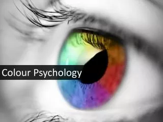
Colour Psychology
170 likes | 411 Views
Obvious to some.. unknown to others. Colour has dramatic effects on our psychology. It can also change your perception. In a room for example, a change in colour can make it feel cool, warm, energetic or even spacious. Choosing the right colour is important, as it can influence your mood and thoughts and general feeling of your home or office space.

Colour Psychology
E N D
Presentation Transcript
When Colour Is More Than Colour Obvious to some.. unknown to others. Colour has dramatic effects on our psychology. It can also change your perception. In a room for example, a change in colour can make it feel cool, warm, energetic or even spacious. Choosing the right colour is important, as it can influence your mood and thoughts and general feeling of your home or office space.
Warm Colours Warm colours on the right side of the colour wheel give a room a more vibrant appearance. Red: Red represents energy, power and advancement. Red colour makes a room inviting. It is predominantly used in dining rooms as it has been found to stimulate appetite. Red on the ceilings can make the room weighty and annoying.
Orange: Orange makes a room look warm and lively. It creates a sense of joy. Its hue close to Peach is used in bathrooms. Orange ceilings are energizing and advancing. Yellow: Yellow communicates happiness. It has high visibility qualities (it appears brighter than White) so often used in dim spaces. It is used for ceilings as its hue is light, luminous and reflective.
Cool Colours Cool colours can be seen on the left side of the colour wheel. They give a feeling of calmness and restfulness in a room. These colours make rooms appear larger and more airy. Green: It conveys a sense of growth and revival. It is excellent for indoors and blends easily with any room. Green colour on the walls conveys safety, reliability and calmness. It’s not a great option for ceilings as its reflection on the skin may not look attractive.
Blue: Blue colour represents peace. It (lighter colour) can make a room appear bright and refreshing. A dark shade creates a sense of dignity. Violet: This colour is often used in bedrooms as it conveys serenity. Soft violet colour on the walls complements the skin tone.
Neutrals Neutral colours such as White, Black and Brown reduce visual weight. Brown: The lighter shades of brown colour are often used in homes and offices as they bring neutral backdrop for furnishings. Dark hues evoke warmth and comfort. Dark brown is used for ceilings to hide ductwork and other repairs.
Grey: Grey inspires creativity. Grey colour on the walls makes the room look cool. White: White conveys sophistication and refinement. White colour reflects light and reduces shadows. Light coloured ceilings like those in White and Grey make a small room look larger.
Black: Black is often used as an accent colour in the indoors. Black coloured walls may look threatening and dramatic. By painting the ceiling with black colour, you can also lower the associated height of a ceiling.
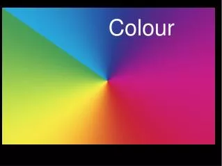
Colour Wheel A colour wheel can be a great tool for picking up the best paint colour for your home. Remember the primary colours learnt in school? Red, Yellow and Blue colours are on the colour wheel at 12, 4 and 8 respectively of a clock. Combining any of these colours will give you a secondary colour (Orange, Green, Purple, etc).
Colours opposite to each other on the wheel complement each other. For example, the combination of Red and green can look cleaner and brighter than if either was mixed with neutral colours such as grey or white. You can achieve a subtle and soothing look by using the colours of same shade (i.e., blues).
Colours near each other (for example Red and Orange) will make one colour stand out as they are similar. A colour wheel also illustrates the visual temperature of a colour. If you draw a line from red-violet to yellow-green mark on the colour wheel, you'll see that all the colours on the left side are cool and the colours on the right are warm.
Conclusion Hope this information helps you when selecting the right colours for your rooms.
Joshua Hockley is an expert commercial and house painting consultant. He is in the field of painting for over a decade. He loves writing about interior decoration, painting and home improvement. Most of his write-ups are intended to educate his clients and others about colors, paints and interior decoration. Joshua Hockley works for Triple Coat, a team of professional Gold Coast painters. Triple Coat is a good option for people looking for painters Gold Coast. You can know more about Triple Coat here (www.triplecoat. com.au).