Download

1 / 3
40 likes | 564 Views
Visit https://casamiauae.com/ for Building Material Suppliers, Top Building Material Supplier, Building Materials Store Near Me, Building Supplies Near Me, Home Building Materials, Building Material Supply, Tiles Floor Tiles, Tiles in Dubai, Tiles Design, Italian Kitchens Dubai, Ernestomeda Kitchens, Designer Wallpaper Dubai, Profile Suppliers Dubai, Decorative Profiles.

E N D
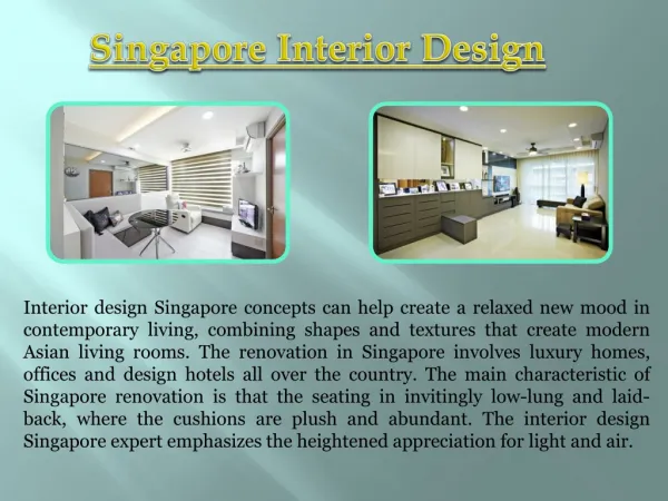
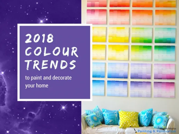
COLOUR PSYCHOLOGY IN INTERIOR DESIGN Colour psychology is an extremely powerful tool when it comes to interior design. It has a huge impact on how we feel and act, and this phenomenon is quite helpful when it comes to decorating and renovating your own home. Although many of us don’t consider the true impact of interior design colours, they can alter our mood - evoke happiness, sadness, anger and more which is why it’s crucial to take into consideration colours that reflect who you are and what you want to feel. For example, having a living room full of nothing but dark colours is often seen as negative, whereas rooms filled with light and bright colours make us feel more energized and happy. It’s your job to create the intended atmosphere in each room and to connect colours to your emotions. The majority of colours can be divided into 2 categories – warm colours and cool colours. Warm Colours– These are used to describe colours that are vivid or bold in nature. These include red, yellow and orange. They can evoke feelings of passion, anger, and other things that make you feel a touch of warmth. Warm colours have the ability to make large rooms look and feel cozier and more intimate. Cool Colours – These are used to describe colours that bring about a calm or soothing nature. These include light purple, blue and green. While warm colours often make you think of sunshine, heat and light, cool colours remind you of the water and the sky. Cool colours have the power to make small rooms appear larger and more spacious. THE INTERIOR DESIGN COLOUR WHEEL The interior design colour wheel is another helpful tool that helps determine what kind of colours you want to go for. Below is a list of colours and their types. Complimentary Colours– Complimentary colours refer to colours that are directly opposite to each other on the colour wheel, take blue and orange as an example. Triad Colours –Triad colours essentially form a triangle on the colour wheel. They’re most often used as accent colours, but you must be careful as it can be difficult to balance them out. Monochromatic Colours– Monochromatic colours is the use of one colour but in different shades. Analogous Colours– Colours that side beside each other on the colour wheel. Non Colours–These are colours that aren’t found on the colour wheel. They are greys, browns, whites, black, beiges. THE MEANING OF COLOURS Choosing a colour for each room in your home can be difficult when you have a floating colour wheel circling around and you simply don’t know which colour to pick! So, in order to make it easier we’ve
made a list of colours and their psychological meaning to further enhance your knowledge and hopefully help your end decision. Red The warmest of colours. Red generally emotes feelings of strength, energy, desire, love, and passion. There are various shades of red, but all of which represent the feeling of warmth and joy. This colour, however, can increase irritability and anger. Red is not often used in bedrooms or bathrooms but is most commonly found in the kitchen or dining area. This is because it could potentially increase and promote hunger. If you do want to use red in any room throughout your home, be careful to use it moderately and don’t allow it to be too overpowering. Yellow Bright yellows are an inspiring colour that promotes optimism, joy and an upbeat attitude. However, this is a colour that should be used moderately, the same as red. It’s an ideal choice for kitchen and dining rooms, and bathrooms. Yellow makes people feel welcome, increases their energy levels and is sunshine in colour form! Orange Similar to yellow, orange is associated with sunshine, joy, happiness, creativity, success, and enthusiasm. Orange can be like Marmite, you either love it or you hate it, but in the right doses it can really brighten a room and make it distinct and unique. In ancient colours, the colour orange was believed to increase energy levels and heal. Pink If we were going to name a colour that is underestimated in the world of design, it would be pink. It’s often associated with girl’s bedrooms, because it’s a delicate and ‘feminine’ colour. Pink shades and tones, however, provide a comforting look and feel for bedrooms, and living rooms. Purple Purple is a colour that emotes richness and sophistication. It’s mostly associated with creativity and luxury, with a lighter purple finding its way into many bedrooms. If you’re looking to create a bold statement, purple acts a great statement colour. Green The colour associated with nature and calmness. Green symbolizes freshness, growth, and harmony which uplifts moods and makes people feel safe, emotionally. The colour is versatile and can work in any room throughout the home, but we recommend using different shades to add contrast and depth. Blue
The colour that reminds people of the sky, the sea and nature in general. There are many different shades of blue, all of which work extremely well in any room. Blue symbolizes trust, security, wisdom, confidence, and safety. It has the ability to slow down the metabolism and therefore create a calming and soothing effect, which is very effective and beneficial to the mind and body. Light blue colours create tranquility and a sense of luxury, especially in rooms that are relatively small. Ideally, blue can be used for any room, but we recommend playing around with tones and shades for the kitchen, bathroom, and the bedroom. Black Black is the most popular and go to colour for many of us. It’s a very neutral colour which is why it’s so easy to choose from. It constantly promises quality, style, sophistication and luxury. Black symbolizes mystery, drama and power. It’s used effectively as an accent colour, but in order to make rooms feel and appear larger, we strongly recommend matching black with uplifting, light and neutral colours, like its all-time favorite partner – white. TIPS FOR CHOOSING A COLOUR FOR YOUR ROOM Consider how long you are going to be spending in the room What will the room are used for? What mood and atmosphere are you looking to create? How big is the room? Is it spacious? Small? Deciding on what colour scheme to go with can be a tricky task, but knowing what atmosphere you want to create is a great start to upgrading your home with new colours. Be sure to take into consideration your furniture and other items in the home that contribute to the overall design and style. This can be from furniture sets to internal doors, rugs, accessories and more. Visit https://casamiauae.com/ for Building Material Suppliers, Top Building Material Supplier, Building Materials Store Near Me, Building Supplies Near Me, Home Building Materials, Building Material Supply, Tiles Floor Tiles, Tiles in Dubai, Tiles Design, Italian Kitchens Dubai, Ernestomeda Kitchens, Designer Wallpaper Dubai, Profile Suppliers Dubai, Decorative Profiles.