Download
1 / 28
290 likes | 402 Views
This exploration highlights the power of data visualization as a library service, showcasing historical examples like William Playfair's impactful charts. It reflects on how these visual tools aid in analyzing and illustrating publishing patterns through the Chalmers Publication Library. Key topics include network analysis, co-authorship networks, geospatial visualizations, and the geography of collaboration. The discussion also emphasizes modern techniques like using Gephi and Raw for creating interactive visual data representations, enhancing our understanding of academic contributions and relationships.

E N D
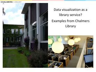
Datavisualization as a library service? • Examples from Chalmers Library
Hi(story) • William Playfair • 1759 – 1823
‘[the king] at once understood the charts and was highly pleased. He said they spoke all languages and were clear and easily understood.’
Examples: Analyzing & illustrating publishing patterns • Our repository: Chalmers Publication Library (CPL) • Network analysis - and visualisation • Authors (co-authorshipnetworks, citations networks) • Keywords (co-wordanalysis) • Organisations/departments (co-authorshipnetworks) • Geospatial visualisations • Co-authorship
Author Co-citation Analysis • Road acoustics • Top citedauthors • Links • Size • Centrality
2011-2012 ≥ 5citations 1352 journals 6clusters • “The journal cloud”
Visualizing research collaboration Publications 2012 (Chalmers/Onsala) Adress strings Data cleaning Frequency distribution ≥ 2 co-authored publications (393 organisations) Geocoding Google Maps/Google Earth W,47.506225,19.06482,"Budapest UnivTechnol & Econ, H-1111 Budapest, Hungary",,6,,
country level maps Department of Energy and Environment 2008-2013
“Gephi is an open-source software for visualizing and analyzing large networks graphs.”
“Raw is an open web app to create custom vector-based visualizations on top of the amazing D3.js library through a simple interface.”