How to Create Graphs Using the TI-83+ Calculator
This guide provides step-by-step instructions for creating various graphs using the TI-83+ calculator. Learn how to prepare your calculator for graphing, including entering data into lists and setting up your viewing window. Follow simple steps to create scatter plots, histograms, modified box plots, and standard box plots, ensuring you select the appropriate data lists and frequency settings. Enhance your data visualization skills with these essential graphing techniques for effective analysis.

How to Create Graphs Using the TI-83+ Calculator
E N D
Presentation Transcript
Using the TI-83+ Creating Graphs with Data
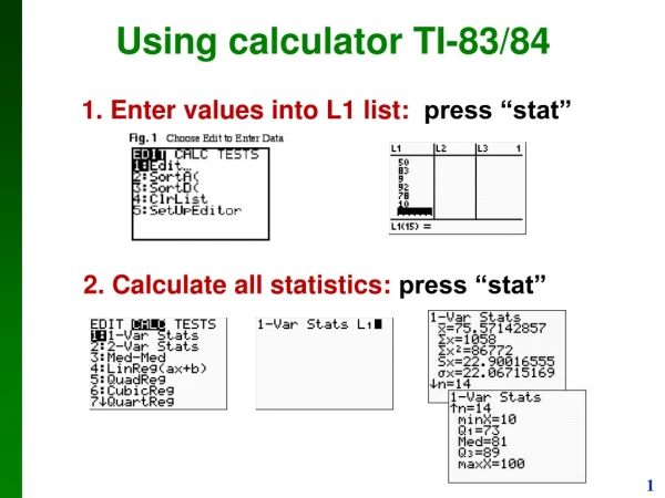
Preparing to Graph • Once the calculator is on and you have entered data into your lists, press the “Y=“ button on the very top row of the calculator. • If there are any equations in Y1 through Y0 (press the down arrow to find Y8, Y9, and Y0) press the CLEAR button to erase them. • Look at the top of the screen where it says Plot1, Plot2, Plot3. If any of them are shaded, move the cursor over them and press ENTER.
Setting up a Graph • Press the “2nd” key and then the “Y=“ key right above it. Press ENTER to set up Plot1. • Press ENTER on the word “ON” to turn on Plot1. • Press the down arrow one time. Press the right arrow until the cursor is over the type of graph you need. The next four slides will show you about the four most common of these six graphs.
Creating a Scatter Plot • The first graph next to the word “Type” is a scatter plot. Press ENTER if it is not already shaded. • Press the down arrow one time. Tell the calculator which list you want to be the x-variables by pressing “2nd” and the number of the list. • Press the down arrow one time and repeat the previous instructions for the y-variables. • Press the down arrow one time and the right or left arrows to select the type of mark to graph points on the scatter plot (the first two are the best options). • Press the ZOOM button on the top row of the calculator and select option #9 to set the graphing window appropriate for your data.
Creating a Histogram • In the “Type” menu, press the right arrow key twice and press ENTER to select a histogram. • Press the down arrow one time. As with the scatter plot, choose the list that has the data you want to display by pressing “2nd” and the list number. • Make sure the number next to “Freq” is a 1. If not, press the down arrow one time and change the number to a 1. • Press the ZOOM button on the top row of the calculator and select option #9 to set the graphing window appropriate for your data.
Creating a Modified Box Plot • In the “Type” menu, press the right arrow key three times and press ENTER to select a modified box plot. • Press the down arrow one time. As with the scatter plot, choose the list that has the data you want to display by pressing “2nd” and the list number. • Make sure the number next to “Freq” is a 1. If not, press the down arrow one time and change the number to a 1. • Press the down arrow one time and the right or left arrows to select the type of mark to graph points on the box plot (the first two are the best options). • Press the ZOOM button on the top row of the calculator and select option #9 to set the graphing window appropriate for your data.
Creating a Box Plot • In the “Type” menu, press the right arrow key four times and press ENTER to select a box plot. • Press the down arrow one time. As with the scatter plot, choose the list that has the data you want to display by pressing “2nd” and the list number. • Make sure the number next to “Freq” is a 1. If not, press the down arrow one time and change the number to a 1. • Press the ZOOM button on the top row of the calculator and select option #9 to set the graphing window appropriate for your data.