Download
1 / 9
90 likes | 265 Views
Examples of good design. Graphics = Good!. ~ 8 words (55 characters) per line of text. Create hierarchy Larger text for big ideas Smaller text for supporting details. Simple color palette with only 2-3 colors Good contrast between text and background Only 2-3 fonts.

E N D
Graphics = Good! ~ 8 words (55 characters) per line of text
Create hierarchy Larger text for big ideas Smaller text for supporting details • Simple color palette with only 2-3 colors • Good contrast between text and background • Only 2-3 fonts
Very professionally presented poster, but simply looking good does not substitute • for content, accuracy and using proper scientific referencing • Present material in a short bullet format – it is much easier to read • (adapted text and image from http://writing.colostate.edu/guides/speaking/poster/mb300/example5.htm)
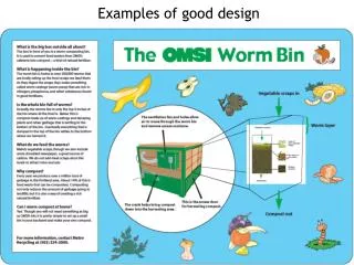
This poster is very creative, makes people want to read it • Posters should be informative, accurate and adequately referenced • Models and photos are well labeled • (adapted text and image from http://writing.colostate.edu/guides/speaking/poster/mb300/example4.htm)
HOW TO MAKE A REALLY BAD POSTER, OR, HOW TO MAKE PEOPLE WANT TO RUN AWAY SCREAMING The number one mistake is to make your poster too long. Densely packed, high word-count posters are basically manuscripts pasted onto a wall, and attract only those viewers who are for some reason excited by manuscripts pasted onto walls. Posters with 800 words or less are ideal. For those who feel that their experiment somehow warrants an exception to this brevity advice (i.e., "everyone"), find a friend to help you edit, asking them, "What text, figure, or table could I possibly delete or modify?" To view your word count in Powerpoint, go to the File menu and select Properties. If your poster is really bad, you might consider attaching a bag of candy or chips to the easel to lure visitors. If you situate yourself a few posters away, you can then pounce on people as they help themselves. If they have taken your food offering, they will feel obliged to stay and talk to you.
Absolutely horrible color combination! • Title is way too long • Too many fonts • Text in blue is too wide (should only have ~55 characters per line) • Avoid centered text; left-justified with a ragged right margin is better • What does this graph mean? There’s no key. • Example of “window lines”, i.e. leaving one word at the end of the paragraph. • Don’t do this. Plagiarism alert! Don’t forget to cite your sources. Both text selections are quoted from http://www.swarthmore.edu/NatSci/cpurrin1/posteradvice.htm
How to make a great presentation Questions to ask yourself • What is my “hook?” • What is my “Big Idea?” • How can I present the big idea in 3 different ways? • How does my topic relate to real life? • What jargon will I have to define? • What 3 questions can I ask the visitor?