Download
1 / 33
330 likes | 478 Views
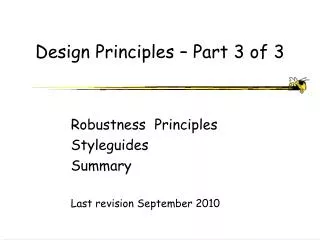
Design Principles – Part 3 of 3. Robustness Principles Styleguides Summary Last revision September 2010. 3. Robustness Principles. Supporting user in determining successful achievement and assessment of goals Observability Recoverability Responsiveness Task Conformance.

E N D
Design Principles – Part 3 of 3 Robustness Principles Styleguides Summary Last revision September 2010
3. Robustness Principles • Supporting user in determining successful achievement and assessment of goals • Observability • Recoverability • Responsiveness • Task Conformance UI Design - Georgia Tech
Robustness: Observability • Can user determine internal state of system from information provided? • Browsability • Explore current state (without changing it) • Reduces memory load • But don’t overwhelm user with information either • Reachability • Navigate through observable states • Persistence • How long does observable state persist? • Observability also aids learnability UI Design - Georgia Tech
Observability - Role of Feedback • Feedback helps create observability • Feedback taxonomy (generally don’t need all of these) • “I understand what you have asked me to do” • “I am doing what you have asked me to do” • “And it will take me this much longer” • Song and dance routine to distract user (busy interval as opposed to idle interval) • “And here are some intermediate results to keep you happy until I am done • “All done, what’s next?” UI Design - Georgia Tech
Observability - Forest + Trees Represents overall drawing Work area, showing part of a larger drawing Represents portion of drawing seen in work area Menus, feedback, etc. Overall display area UI Design - Georgia Tech
Observability - How Did I Get Here? • Tree showing history of queries Presidents elected before age 50 & Democratic & & & from East of graduate from farm Mississippi degree family & served two terms in office UI Design - Georgia Tech
Observability - How did I Get Here? • List of pages visited • Graphicalhistories UI Design - Georgia Tech
Observability – Where am I, How did I Get Here? Bread crumbs on web site UI Design - Georgia Tech
Observability - Where Did I Come From, Where can I go? UI Design - Georgia Tech
Observability – Acrobat Reader Acrobat Reader with ToC to give context Forest is the bookmarks, tree is the single page UI Design - Georgia Tech
Observability - Scroll Bar • Scroll bar size indicates % in view - but does not indicate absolute sizes. • Can add other info, such as • Page 5 of 12 UI Design - Georgia Tech
Observability - feedback placement • Where the eyes are • Cursor shape • In Newshole • Thumbs down – problem • Buddha – to encourage patience • Use of sounds can supplement or sometimes replace use of cursor UI Design - Georgia Tech
Observability - Forest + Trees Work Area List 2 Item 1 Item 2 Item 3 UI Design - Georgia Tech
Observability - Memory Load • Use as a tool to decrease user memory load • Also to avoid mis-steps • Gray-out disabled menu items • Indicate type of input (alpha, numbers) expected UI Design - Georgia Tech
Do Not Set the User Up • Make it hard for the user to make errors • Instead of allowing them to make error and then saying “tsk, tsk” • Gray out disabled menu items • Ask for confirmation of major actions UI Design - Georgia Tech
Do Not Set the User Up • Don’t let the user do something that will lead to an error message UI Design - Georgia Tech
Robustness: Recoverability • Ability to take corrective action upon recognizing error • Forward recovery • Ability to fix when we can’t undo • Backward recovery • Undo previous error(s) • Abort operation underway • Only makes sense if is a slow operation UI Design - Georgia Tech
Why is recoverability such an important feature????? • Encourages experimentation (hence learnability) by reducing cost of making mistakes • Allows us to work faster • We know we can easily recover UI Design - Georgia Tech
Robustness: Responsiveness • Response to motor actions • Keyboarding, mouse movement - less than 100 msec. • Rich Human Factors literature on this • Consistency is important - experimental result • Users preferred longer but more consistent response time • Times that differed 10% to 20% were seen as same (JND) UI Design - Georgia Tech
Robustness: Responiveness • Sometimes is argued that “too fast” is not good because: • Makes user feel like they need to do something quickly to keep up with computer? • Other reasons?? • ?? • Do you agree/disagree? UI Design - Georgia Tech
Robustness: Task Conformance • Does system support all tasks user wishes to perform in expected ways? • Task completeness • Can system do all tasks of interest? • Task adequacy • Can user understand how to do tasks? • Does it allow user to define new tasks? • Extensibility UI Design - Georgia Tech
Task Conformance - Extensibility What are mechanisms for providing extensibility? What are their pros and cons? UI Design - Georgia Tech
Using the Principles • In doing design and implementation of your project, revisit this list • Assess your design against these usability principles UI Design - Georgia Tech
Styleguides • Codify many of these principles for a particular look and feel • Mac OS, Windows, Motif, Palm, Blackberry • Developed in concert with toolkit, but go beyond toolkit UI Design - Georgia Tech
Styleguides “How to” for a specific UI UI Design - Georgia Tech
Introduction to the Apple Human Interface Guidelines What Are the Mac OS X Human Interface Guidelines? Who Should Read This Document? Organization of This Document Conventions Used in This Document See Also Part I: Fundamentals Human Interface Design Human Interface Design Principles Keep Your Users in Mind The Development Process Design Decisions Managing Complexity Extending the Interface Involving Users in the Design Process Part II: The Macintosh Experience First Impressions Packaging Installation General Installer Guidelines Setup Assistants Mac OS X Environment The Finder The Dock The File System Multiple Users Remote Log In Assistive Technologies Networking Application Services Displays The Always-On Environment Using Existing Technologies Providing User Assistance Internationalizing Your Application Storing Passwords Printing Choosing Colors Setting Fonts and Typography Characteristics Selecting Attributes Associated With People Speech Technologies Part III: The Aqua Interface User Input The Mouse and Other Pointing Devices The Keyboard Selecting Editing Text Drag and Drop Drag and Drop Overview Drag and Drop Semantics Selection Feedback Drag Feedback Destination Feedback Drop Feedback Clippings Text Fonts Style Icons Icon Genres and Families Icon Perspectives and Materials Conveying an Emotional Quality in Icons Suggested Process for Creating Aqua Icons Tips for Designing Aqua Icons Cursors Standard Cursors Designing Your Own Cursors Typical TOC - MAC OS X UI Design - Georgia Tech
Menus Menu Behavior Designing the Elements of Menus The Menu Bar and Its Menus Contextual Menus Dock Menus Windows Types of Windows Window Appearance Window Behavior Utility Windows The About Window Preferences Windows Inspectors and Info Windows Find Window Fonts Window and Colors Window Dialogs Types of Dialogs and When to Use Them Dialog Behavior The Open Dialog Dialogs for Saving, Closing, and Quitting The Choose Dialog The Printing Dialogs Controls Buttons Selection Controls Adjustment Controls Indicators Text Controls View Controls Grouping Controls Layout Examples Positioning Controls Sample Layouts Grouping Controls Using Small and Mini Versions of Controls Keyboard Shortcuts Quick Reference Tab View Differences Between Mac OS X Versions Document Revision History More TOC UI Design - Georgia Tech
Excerpt from OS X Styleguide Drag and Drop Overview Ideally, users should be able to drag any content from any window to any other window that accepts the content’s type. If the source and destination are not visible at the same time, the user can create a clipping by dragging data to a Finder window; the clipping can then be dragged into another application window at another time. Drag and drop should be considered an ease-of-use technique. Except in cases where drag and drop is so intrinsic to an application that no suitable alternative methods exist—dragging icons in the Finder, for example—there should always be another method for accomplishing a drag-and-drop task. The basic steps of the drag-and-drop interaction model parallel a copy-and-paste sequence in which you select an item, choose Copy from the Edit menu, specify a destination, and then choose Paste. However, drag and drop is a distinct technique in itself and does not use the Clipboard. Users can take advantage of both the Clipboard and drag and drop without side effects from each other. A drag-and-drop operation should provide immediate feedback at the significant points: when the data is selected, during the drag, when an appropriate destination is reached, and when the data is dropped. The data that is pasted should be target-specific. For example, if a user drags an Address Book entry to the “To” text field in Mail, only the email address is pasted, not all of the person’s address information. You should implement Undo for any drag-and-drop operation you enable in your application. If you implement a drag-and-drop operation that is not undoable, display a confirmation dialog before implementing the drop. A confirmation dialog appears, for example, when the user attempts to drop an icon into a write-only drop box on a shared volume, because the user does not have privileges to open the drop box and undo the action. (Color added for emphasis.) UI Design - Georgia Tech
Styleguides • General User Interface Design Style Guides • Apple Human Interface Guidelines (Mac OS X) Design Guidelines • Microsoft User Interface Guidelines (Click in the left tree on User Interface Design...) • Windows XP Guidelines • Yale Web Style Guide (2nd Edition) • Java Look and Feel Guidelines (version 1) • Java Look and Feel Guidelines version 2 • Java Look and Feel Guidelines: Advanced Topics • IBM 3D design Guidelines • Silicon Graphics Indigo Magic User Interface Guidelines • Open Source Usability Guidelines • Motif Style Guide • KDE User Interface Guidelines • Gnome Human Interface Guidelines 1.0 • Corporate User Interface Standards and Guidelines (samples) • Telstra Online Standards • Taligent Human Interface Guidelines • Ameritech Graphical User Interface Standards and Design Guidelines • http://www.experiencedynamics.com/science_of_usability/ui_style_guides/ UI Design - Georgia Tech
And More Styleguides …. • Government funded Usability Guidelines • MITRE Guidelines for Designing User Interface Software (US Airforce) • Research based Web Design and Usability Guidelines (Dept. of Health and Human Services) • Cancer Institute Usability Guidelines • NASA User Interface Guidelines • Canadian Command Decision Aiding Technology (COMDAT) Operator-Machine Interface (OMI) Style Guide: Version 1.0 • Gaming Devices (J2ME games) • Games Usability Guidelines (from Nokia) • Wireless and Mobile Usability Guidelines • Palm OS Design Guidelines • Openwave GSM Guidelines • Openwave Top 10 Usability Guidelines for WAP Applications • Blackberry and RIM wireless handheld UI Developers Guide (PDF) • Sprint Usability Requirements for XHTML (Application Developers Program) • NTT DoCoMo imode service guideline (user interfaces) • Accessibility Guidelines • Techniques for Web content Accessibility Guidelines 1.0 UI Design - Georgia Tech
Design Patterns • UI design elements that have been found useful in practice • Typically follow / instantiate design guidelines • Typically more macroscopic than low-level interaction techniques such as menu selection, dialogue boxes, icon drag, slider dial • Provide a design vocabulary – a palette • Example at http://www.welie.com/patterns/ • Includes code to implement • Are many other web sites UI Design - Georgia Tech
Design Pattern Books (are more) Web-centric UI Design - Georgia Tech
End Part 3 of 3 UI Design - Georgia Tech