Download
1 / 11
110 likes | 193 Views
Explore a collection of ATEC courses by Aaron Nelson showcasing consistent design for easy navigation across courses. Learn more about the visual cues and structured layout that enhances learning experience.

E N D
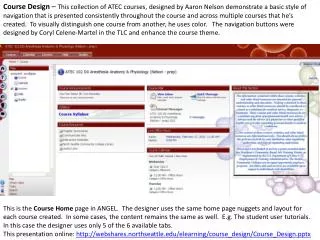
Course Design – This collection of ATEC courses, designed by Aaron Nelson demonstrate a basic style of navigation that is presented consistently throughout the course and across multiple courses that he’s created. To visually distinguish one course from another, he uses color. The navigation buttons were designed by Coryl Celene-Martel in the TLC and enhance the course theme. This is the Course Home page in ANGEL. The designer uses the same home page nuggets and layout for each course created. In some cases, the content remains the same as well. E.g. The student user tutorials. In this case the designer uses only 5 of the 6 available tabs. This presentation online: http://webshares.northseattle.edu/elearning/course_design/Course_Design.pptx
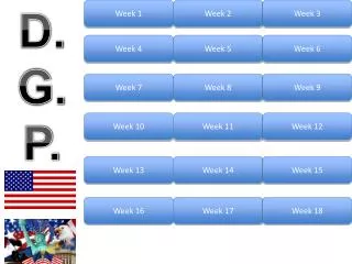
The Lessons tab shows 11 weeks with buttons as ‘symbols’ for visual recognition. Note the Course Guide on the the Left side is open to the Lessons page. It too presents a simple and consistent grouping of links. Symbols are not present on the guide and may be a preferred view for those who aren’t attracted to the colors and pictures. This same grouping and page layout is consistent across all this designer’s courses. What changes from course to course is the theme/color and specific content.
Here we see the content of each week. 4 steps each week: • Reading Assignments • Online Activities • Discussion • Quiz • Note the Course Guide navigation remains clear and understandable. The individual week requirements remain consistent throughout this course and across all courses created.
The contents of Step 1 presented with minimal words and limited scrolling – to avoid reader confusion.
Minimal text, no scrolling required, links to course content activities. A button is provided that connects students directly to their next step. Clear, understandable Course Guide navigation.
In this course, multiple means of discussion are incorporated including ANGEL discussion tool and an offsite wiki that is open to industry members internationally. The Instructor is careful to include their instructions for completing Step 3.
Here the change in color helps to cue the student that this is a different course entirely. However, note that the nuggets found on this Course Home page are the same and in the same arrangement as can be seen in all the courses.
Though this may be a new course, we continue with the same basic design and therefore have a foundation of experience and knowledge from which to proceed with this new course.
This presentation is online: http://webshares.northseattle.edu/elearning/course_design/Course_Design.pptx