Color
210 likes | 230 Views
Dive into the fascinating world of colors with this comprehensive guide on color theory. Learn about primary, secondary, and tertiary colors, as well as complementary, analogous, warm, cool, and neutral colors. Understand color value, brightness, saturation, and the difference between high saturation RGB colors and CMYK colors. Explore how to set your camera for optimal color reproduction.

Color
E N D
Presentation Transcript
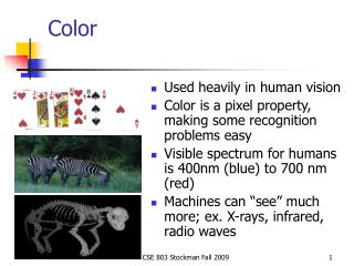
Color Understanding Color Theory
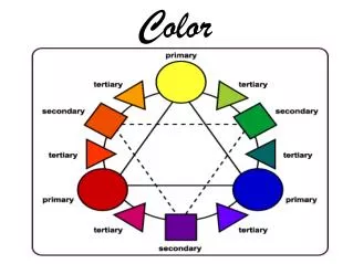
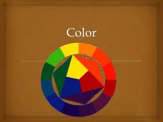
Visualizing Colors You have 6 basic colors: • red, orange, yellow, green, blue, and purple. • Then you have extra, "in-between" colors that are mixes of the basic colors.
Primary Colors • Red, Yellow, Blue. • These 3 colors are the base colors for every other color on the color wheel. This is why they're called "primary." When you mix two primaries together, you get a secondary color.
More on Primary Colors • Primary colors are useful for designs or art that need to have a sense of urgency. • Primary colors are the most vivid colors when placed next to each other, which is why you'll notice that most fast food eateries use pairs of primary colors in their logos, as it evokes a sense of speed.
Secondary Colors • Orange, Green, Purple. • These 3 colors are what you get when you mix pairs of primary colors.
Tertiary Colors • These are those colors like Yellow-Green and Red-Violet. They're made by mixing one primary color and one secondary color together. There are many combinations of tertiary colors, depending on how they're mixed.
Complementary Colors • Red and Green, Blue and Orange, Purple and Yellow. These are the colors directly across from each other on the color wheel. Don't let the name fool you, they rarely look good when used together. • They're called "complementary" because, when used together, they become extremely vibrant and have heavy contrast.
Analogous Colors • Red and Orange, Blue and Green, etc. • These are colors that lie next to each other on the color wheel. They're good for evoking serene-feeling designs and artwork in which you want viewers to feel comfort.
Warm Colors • Colors such as red, yellow, and orange. These colors evoke warmth because they remind us of things like the sun or fire.
Cool Colors • Cool Colors: Colors like blue, green, and purple (violet). • These colors evoke a cool feeling because they remind us of things like water or grass.
Neutral Colors • Gray, Brown. • These aren't on most color wheels, but they're considered neutral because they don't contrast with much of anything. They're dull and uneventful.
Color Value • Usually refers to the amount of black in a color. The more black a color has, the darker its value (and the lower the number attributing its value).
Brightness • Refers to the amount of white in a color. The more white a color has, the brighter it is and the higher the number attributing its value.
Saturation • Refers to the amount of a color used. When a color is at full saturation, it is extremely vibrant. • When a color is "desaturated," a large amount of color has been removed. Desaturated colors tend to be close to being neutral because there is so much gray in them.
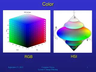
RGB Color • This is color based upon light. Your computer monitor and television use RGB. The name "RGB" stands for Red, Green, Blue, which are the 3 primaries (with green replacing yellow). • By combining these 3 colors, any other color can be produced. Remember, this color method is only used with light sources; it does not apply to printing.
CMYK Color • This is the color method based upon pigments. "CMYK" stands for Cyan, Magenta, Yellow, and Black (black is what the K stands for). Using these 4 colors, most other colors can be made and is usually best for printing. • Unfortunately, CMYK cannot reproduce the same amount of colors as RGB can, which is why yellow-greens sometimes look a bit muddy when printed.
Setting Your Camera • sRGB: If you have no access to Photoshop or other Adobe software, use this. • Adobe RGB: More colors than sRGB and easier to edit than RAW • RAW: Massive files and great flexibility but requires more editing/processing time.