Download
1 / 5
50 likes | 137 Views
This membership card features space for personal info and an expiry date. The color and font scheme reflect the company's branding. Feedback suggests incorporating blue and original images for a unique touch. Contact information and renewal date space are included, but there's room for improvement in making the card more distinctive.

E N D
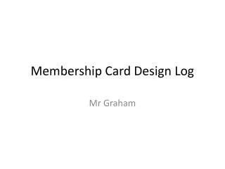
Membership Card Robin Marsh
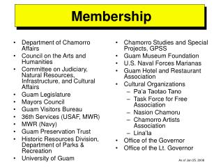
Research This membership card has space for personal information and an expiry date. It also uses a colour and font scheme which reflects the purpose of the membership card. There is no contact information provided, however this could be displayed on the back of the card. This card provides space for personal information as well as an issue and expiry date. The company is clearly portrayed through the images on the card ‘easy lawn care’ and a short description in the top right describes what the membership card entitles. However there is no contact information provided for the company which would be useful for the member. The font is consistent and the bold heading is effective This card has space for a signature which makes the card suitable for only the individual who signed it. It provides contact information and uses a consistent colour scheme on the front and back of the card. However there is nowhere to write any personal information or an renewal date.
Draft 1 • Feedback: • The card could be creative and use some blue as shown in the reports • The contact information could be the same font as the headings and have a description of what it is • The use of a green background suggests a wildlife theme • You have included space for personal information and a renewal date • The font is consistent from the reports • To improve: • I will apply some blue into the membership card and create an original image in the design
Draft 2 • Feedback: • The card include an original image or border to make it individual from others • The contact information could have a small sentence explaining why it is provided • The use of a green background suggests a wildlife theme • You have included space for personal information and a renewal date • The font is consistent from the reports • The blue heading background is consistent on the back and front • To improve: • I will create an original image in the design and make sure that 8 cards can fit on a page