Association
Association. Reference Brown’s Lecture Note 1 Grading on Curve. Topics. Method for studying relationships among several variables Scatter plot Correlation coefficient Association and causation. Regression Examine the distribution of a single variable. QQplot. Regression.

Association
E N D
Presentation Transcript
Association Reference Brown’s Lecture Note 1 Grading on Curve
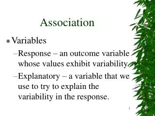
Topics • Method for studying relationships among several variables • Scatter plot • Correlation coefficient • Association and causation. • Regression • Examine the distribution of a single variable. • QQplot
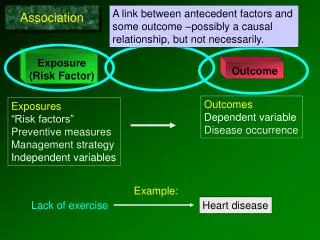
Regression • Sir Francis Galton in his 1885 Presidential address before the anthropology section of the British Association for the Advancement of Science described a study he had made of • How tall children are compared to their parents? • He thought he had made a discovery when he found that child’s heights tend to be more moderate than that of their parents. • For example, if the parents were very tall their children tended to be tall, but shorter than the parents. • This discovery he called a regression to the mean. • The term regression has come to be applied to the least squares technique that we now use to produce results of the type he found (but which he did not use to produce his results). • Association between variables • Two variables measured on the same individuals are associated if some values of one variable tend to occur more often with some values of the second variable than with other values of that variable.
Study relationships among several variables • Associations are possible between … • Two quantitative variables. • A quantitative and a categorical variable. • Two categorical variables. • Quantitative and categorical variables • Regression • Response variable and explanatory variable • A response variable measures an outcome of a study. • An explanatory variable explains or causes changes in the response variables. • If one sets values of one variable, what effect does it have on the other variable? • Other names: • Response variable = dependent variable. • Explanatory variable = independent variable
Principles for studying association • Start with graphical display: scatterplots • Display the relationship between two quantitative variables. • The values of one variable appear on the horizontal axis (the x axis) and the values of the other variable on the vertical axis (the y axis). • Each individual is the point in the plot fixed by the values of both variables for that individual. • In regression, usually call the explanatory variable x and the response variable y. • Look for overall patterns and for striking deviations from the pattern : interpreting scatterplots • Overall pattern: the relationship has ... • form (linear relationships, curved relationships, clusters) • direction (positive/negative association) • strength (how close the points follow a clear form?) • Outliers • For a categorical x and quantitative y, show the distributions of y for each category of x. • When the overall pattern is quite regular, use a compact mathematical model to describe it.
Positive/negative association • Two variables are positively associated when above-average values of one tend to accompany above-average values of the other and below-average values also tend to occur together. • Two variables are negatively associated when above-average values of one accompany below-average values of the other; and vice versa.
Add numerical summaries” - the correlation Straight-line (linear) relations are particularly interesting. (correlation) Our eyes are not a good judges of how strong a relationship is - affected by the plotting scales and the amount of white space around the cloud of points.
Correlation • The correlation r measures the direction and strength of the linear relationship between two quantitative variables. • For the data for n individuals on variables x and y, • Calculation: • Begins by standardizing the observations. • Standardized values have no units. • r is an average of the products of the standardized x and y values for the n individuals.
Properties of r • Makes no use of distinction between explanatory and response variables. • Requires both variables be quantitative. • Does not change when the units of measurements are changed. • r>0 for a positive association and r<0 for negative. • -1 r 1. • Near-zero r indicate a weak linear relationship; the strength of the relationship increases as r moves away from 0 toward either -1 or 1. • The extreme values r=-1 or 1 occur only when the points lie exactly along a straight line. • It measures the strength of only the linear relationship. • Scatterplots and correlations • It is not so easy to guess the value of r from a scatterplot.
Cautions about correlation • Correlation is not a complete description of two-variable data. • A high correlation means bigger linear relationship but not ‘similarity’. • Summary: If a scatterplot shows a linear relationship, we’d like to summarize the overall pattern by drawing a line on the scatterplot. • Use a compact mathematical model to describe it - least squares regression. • A regression line: • It summarizes the relationship between two variables, one explanatory and another response. • It is a straight line that describes how a response variable y changes as an explanatory variable x changes. • Often used to ‘predict’ the value of y for a given value of x.
Mean height of children against age • Strong, positive, linear relationship. (r=0.994)
‘Fitting a line to data’ • It means to draw a line that comes as close as possible to the points. • The equation of the line gives a “compact description” of the dependence of the response variable y on the explanatory variable x. • A mathematical model for the straight-line relationship. • A straight line relating y to x has an equation of the form
Height = 64.93 + (0.635×Age) • Predict the mean height of the children 32, 0 and 240 months of age. • Can we do extrapolation?
Prediction • The accuracy of predictions from a regression line depend on how much scatter the data shows around the line. • Extrapolation is the use of regression line for prediction far outside the range of values of the explanatory variable x that you used to obtain the line. • Such predictions are often not accurate.
Least-squares regression • We need a way to draw a regression line that does not depend on our eyeball guess. • We want a regression line that makes the ‘prediction errors’ ‘as small as possible’. • The ‘least-squares’ idea. • The least-squares regression line of y on x is the line that makes the sum of the squares of the vertical distances of the data points from the line as small as possible. • Find a and b such that is the smallest. (y-hat is predicted response for the given x)
Equation of the LS regression line • The equation of the least-squares regression line of y on x • Interpreting the regression line and its properties: • A change of one standard deviation in x corresponds to a change of r standard deviation in y. • It always passes through the point (x-bar, y-bar).
Correlation and regression • In regression, x and y play different roles. • In correlation, they don’t. • Comparing the regression of y on x and x on y. • The slope of the LS regression involves r. • r2 is the fraction of the variance of y that is explained by the LS regression of y on x. • If r=0.7 or -0.7, r2=0.49 and about half the variation is accounted for by the linear relationship. • Quantify the success of regression in explaining y. [Two sources of variation in y, one systematic another random.]
r2=0.989 • r2=0.849
Scatterplot smoothers • Systematic methods of extracting the overall pattern. • Help us see overall patterns. • Reveal relationships that are not obvious from a scatterplot alone.
Categorical explanatory variable • Make a side-by-side comparison of the distributions of the response for each category. • back-to-back stemplots, side-by-side boxplots. • If the categorical variable is not ‘ordinal,’ i.e. has no natural order, it’s hard to speak the ‘direction’ of the association.
Regression • Francis Galton (1822 – 1911) measured the heights of about 1,000 fathers and sons. • The following plot summarizes the data on sons’ heights. • The curve on the histogram is a N(68.2, 2.62) density curve.
Data is often normally distributed: The following table summarizes some aspects of the data: Quantiles 100.0% maximum 74.69 90.0% 71.74 75.0% quartile 69.92 50.0% median 68.24 25.0% quartile 66.42 10.0% 64.56 0.0% minimum 61.20 Moments Mean 68.20 Std Dev 2.60 N 952
Normal Quantile Plot • A “normal quantile plot” provides a better way of determining whether data is well fitted by a normal distribution. • How these plots are formed and interpreted? The plot for the Galton data on sons’ heights:
Normal Quantile Plot • The data points very nearly follow a straight line on this plot. • This verifies that the data is approximately normally distributed. • This is data from the population of all adult, English, male heights. • The fact that the sample is approximately normal is a reflection of the fact that this population of heights is normally distributed – or at least approximately so. • IF the POPULATION is really normal how close to normal should the SAMPLE histogram be – and how straight should the normal probability plot be? • Empirical Cumulative Distribution Function • Suppose that x1,x2….,xnis a batch of numbers (the word sample is often used in the case that the xiare independently and identically distributed with some distribution function; the word batch will imply no such commitment to a stochastic model). • The empirical cumulative distribution function (ecdf) is defined as (with this definition, Fnis right-continuous).
Empirical Cumulative Distribution Function • The random variables I(Xi≦x) are independent Bernoulli random variables. • nFn(x) is a binomial random variable (n trials, probability F(x) of success) and so EFn(x) = F(x), VarFn(x) = n-1F(x)1- F(x). • Fn(x) is an unbiased estimate of F(x) and has a maximum variance at that value of x such that F(x) = 0.5, that is, at the median. • As x becomes very large or very small, the variance tends to zero. • The Survival Function: • It is equivalent to a distribution function and is defined as S(t) = P(Tt) = 1- F(t) • Here T is a random variable with cdf F. • In applications where the data consist of times until failure or death and are thus nonnegative, it is often customary to work with the survival function rather than the cumulative distribution function, although the two give equivalent information. • Data of this type occur in medical and reliability studies. In these cases, S(t) is simply the probability that the lifetime will be longer than t. we will be concerned with the sample analogue of S, Sn(t) = 1- Fn(t).
Quantile-Quantile Plots • Q-Q Plots are useful for comparing distribution functions. • If X is a continuous random variable with a strictly increasing distribution function, F, the pth quantile of F was defined to be that value of x such that F(x) = p or Xp = F-1(p). • In a Q-Q plot, the quantiles of one distribution are plotted against those of another. • A Q-Q plot is simply constructed by plotting the points (X(i),Y(i)). • If the batches are of unequal size, an interpolation process can be used. • Suppose that one cdf (F) is a model for observations (x) of a control group and another cdf (G) is a model for observations (y) of a group that has received some treatment. • The simplest effect that the treatment could be to increase the expected response of every member of the treatment group by the same amount, say h units. • Both the weakest and the strongest individuals would have their responses changed by h. Then yp = xp + h, and the Q-Q plot would be a straight line with slope 1 and intercept h.
Quantile-Quantile Plots • The cdf’s are related as G(y) = F(y– h). • Another possible effect of a treatment would be multiplicative: The response (such as lifetime or strength) is multiplied by a constant, c. • The quantiles would then be related as yp = cxp, and the Q-Q plot would be a straight line with slope c and intercept 0. The cdf’s would be related as G(y) = F(y/c).
Simulation • Here is a histogram and probability plot for a sample of size 1000 from a perfectly normal population with mean = 68 and SD = 2.6. Moments Mean 67.92 Std Dev 2.60 N 1000
Another Data Set • R. A. Fisher (1890 – 1962) (who many claim was the greatest statistician ever) analyzed a series of measurements of Iris flowers in some of his important developmental papers. Histogram of the sepal lengths of 50 iris setosa flowers This data has mean 5.0 and S.D. 3.5. The curve is the density of a N(5, 3.52) distribution.
Normal Quantile Plot: Sepal length • Why are the dots on this plot arranged in neat little rows? • Apart from this, the data nicely follows a straight line pattern on the plot. N(5.006,0.35249)
Fisher's Iris Data • Array giving 4 measurements on 50 flowers from each of 3 species of iris. • Sepal length and width, and petal length and width are measured in centimeters. • Species are Setosa, Versicolor, and Virginica. • SOURCE • R. A. Fisher, "The Use of Multiple Measurements in Taxonomic Problems", Annals of Eugenics, 7, Part II, 1936, pp. 179-188. Republished by permission of Cambridge University Press. • The data were collected by Edgar Anderson, "The irises of the Gaspe Peninsula", Bulletin of the American Iris Society, 59, 1935, pp. 2-5.
Not all real data is approximately normal: • Histogram and normal probability plot for the salaries (in $1,000) of all major league baseball players in 1987. • Only position players – not pitchers – who were on a major league roster for the entire season are included. Moments Mean 529.7 S.D. 441.6 N 260
Normal Quantile Plot • This distribution is “skewed to the right”. • How this skewness is reflected in the normal quantile plot? • Both the largest salaries and the smallest salaries are much too large to match an ideal normal pattern. (They can be called “outliers”.) • This histogram seems something like an exponential density. Further investigation confirms a reasonable agreement with an exponential density truncated below at 67.5.
Judging whether a distribution is approximately normal or not • Personal incomes, survival times, etc are usually skewed and not normal. • Risky to assume that a distribution is normal without actually inspecting the data. • Stemplots and histograms are useful. • Still more useful tool is the normal quantile plot.
Normal quantile plots • Arrange the data in increasing order. Record percentiles of each data value. • Do normal distribution calculations to find the z-scores at these same percentiles. • Plot each data point x against the corresponding z. • If the data distribution is standard normal, the points will lie close to the 45-degree line x=z. • If it is close to any normal distribution, the points will lie close to some straight line.
qqline (R-function) • Plots a line through the first and third quartile of the data, and the corresponding quantiles of the standard normal distribution. • Provide a good ‘straight line’ that helps us see whether the points lie close to a straight line.