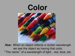

COLOR
E N D
Presentation Transcript
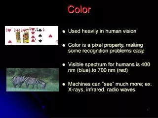
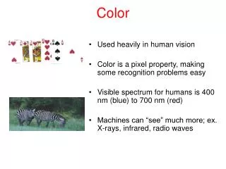
COLOR FOR THE WEB
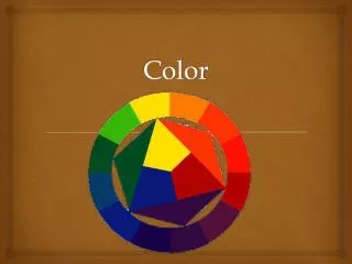
Colors are also divided into WARM and COOL categories. The WARM colors are red, orange and yellow. COOL colors are green, blue and violet.
A TINT of a color is made by adding white. A SHADE is made by adding black.
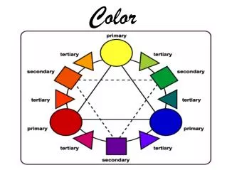
Contrasting Schemes: If 2 hues are opposite each other on the color wheel they are considered to be COMPLEMENTARY COLORS. When used together in a design they make each other seem brighter and more intense. (example: red & green)
Contrasting Schemes: Split Complementary color schemes use 3 colors: any hue and the 2 adjacent to its complement. (example: red, yellow-green, & blue-green)
Contrasting Schemes: A Triadic color scheme also uses 3 colors: these are colors that are evenly spaced from each other along the color wheel. (example: red, yellow, & blue)
Discordant Schemes: A Double Compliment color scheme uses 2 pairs of complements. (example: yellow & violet, blue & orange)
Discordant Schemes: An Alternate complement color scheme uses 4 colors: a triad and a complement to one of the hues. (example: red, yellow, blue & violet)
DiscordantSchemes: A Tetrad color scheme uses 4 colors evenly spaced on the color wheel: a Primary, Secondary and 2 Tertiary colors. (example: red, green, yellow-orange, & blue-violet)
Neutral colors are shades of white, gray or beige. Most neutrals are tinted slightly with a WARM or COOL color. Neutral-colored backgrounds provide a backdrop that does not compete with colors used in the foreground.
How color behaves in relation to other colors and shapes is a complex area of color theory. Compare the contrast effects of different color backgrounds for the same red square. Red appears more brilliant against a black background and somewhat duller against the white background. In contrast with orange, the red appears lifeless; in contrast with blue-green, it exhibits brilliance. Notice that the red square appears larger on black than on other background colors.
Different Readings of the Same Color The small purple rectangle on the left appears to have a red-purple tinge when compared to the small purple rectangle on the right.
However they are both the same color as you can see in the illustration below. This demonstrates how 3 colors can be perceived as 4 colors. Observing the effects colors have on each other is the starting point for understanding the relativity of color. The relationship of values, saturations and the warmth or coolness of respective hues can cause noticeable differences in our perception of color.
ANALOGOUS COLORS are any 3 colors which are side by side on a 12 part color wheel, such as yellow-green, yellow, and yellow-orange. Usually one of the three colors predominates.
Complementary colors are any 2 colors which are directly opposite each other, such as red & green or red-purple & yellow-green. In the following illustration, there are several variations of yellow-green in the leaves and several variations of red-purple in the orchid. These opposing colors create maximum contrast and maximum stability.
Nature provides a perfect departure point for color harmony. In the illustration below, red, yellow, & green create a harmonious design, regardless of whether this combination fits into a technical formula for color harmony. Local colors are realistic colors, as they appear in nature such as green grass, blue sky, brown earth, etc. Earth colors are not seen on most color wheels. Black, grays, whites, browns, beiges and tans are Earth colors and can be made by mixing all three primaries together with some black or white.