Download
1 / 12
120 likes | 132 Views
Explore the world of print media and editorial design. Discover the impact of print communication and learn the key design principles for effective print materials.

E N D
what is print media? • Communications delivered via paper or canvas. Print media is a process for reproducing text and images, typically with ink on paper using a printing press. Magazines, newspapers, newsletters, books and flyers are examples of material that classify as print media.
the power of print! • Across the world, over 45 trillion pages (2005 figure) are printed annually • In 2006 there were approximately 30,700 printing companies in the United States, accounting for $112 billion of printing revenue (Barnes Reports) • Print jobs that move through the Internet made up 12.5% of the total U.S. Printing market last year (InfoTrend/CAP Ventures)
the power of print! • SEE ARTICLES
what is editorial design? • Editorial design can be divided into the following print media categories: • magazines • newspapers • business reports • newsletters
print design goals • You must reflect your works through a variety of creative mediums. • Be creative not only through you projects you choose but be creative through the process and reflecting that process. • Project images to get the audience into the mind of the artist (you), or the artist you are trying to be through your work.
white space • Use white space wisely: Just because the space is there doesn't mean you have to fill it! Good designs contain well-planned white space. ("White space" is simply the areas in a layout that are left bare - without text or graphics.) It gives the eye a break and helps to highlight the important points. Make sure to have enough space around the edges and in-between columns and articles. And remember that there is a fine line between not enough and too much white space. Consult well-designed magazines and ads or computer templates for layout inspiration and ideas.
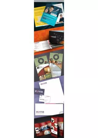
find effective graphics • Find effective graphics, supporting elements and photos: It's always better to use too few than too many graphics. One great graphic is so much better than four weak ones. Sometimes they are not even necessary. When you do use graphics and photos, make sure they help illustrate your point, rather than just inserting them to take up space. Likewise, be sure their sizes are appropriate to the space. Stick with high-quality graphics. Make sure the graphic element illustrates your main point - it's the first thing the reader sees, so it's important it portrays your message accurately. Lastly, don't mix differently styles of illustration or photography - keep a consistent look to create harmony.
typography • Select appropriate font treatment: More is NOT better when it comes to fonts. Pick no more than two typefaces per document - one for headlines and one for body copy. Stick to a simple, clean font for easy body copy readability. Headline fonts can be a little more creative. For emphasis on certain words or phrases, use italics, boldface, or underlining sparingly. Also try to make the typeface match the personality of the service or product you're representing.
length of copy • Keep copy short and neat: Readers are more likely to read short sentences, paragraphs, and articles written as if you're having a friendly conversation. Break up large blocks of text with bullet points and subheads. Instead of using fancy multi-syllable complex vocabulary, use everyday words that your audience will understand. Finally, always have someone else proofread your work. It's impossible to catch all your own typos.
visual pathways • Watch the flow: People generally read a page from top to bottom and from left to right. Draw people into the top left corner of your ad or newsletter with a headline or strong graphic. Then, pull their eyes down and through the text in the mid-section of the page, and finish up in the lower right corner. Picture a "Z" shape. Finally, be sure to include a "call to action" at the bottom to get the results you desire.
where to look • art magazines, art websites, art annuals, design books