Download
1 / 20
200 likes | 329 Views
Learn how to optimize fonts, colors, and graphics for impactful PowerPoint presentations. Follow key points and layout continuity while ensuring readability and visual appeal. Avoid overwhelming slides and use appropriate background colors. Utilize graphs and charts effectively without overcrowding information. Keep bullet points concise and limit text for better audience engagement. Stay consistent with animation styles and avoid text-heavy slides for a successful presentation.

E N D
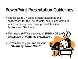
PowerPoint Presentation Guidelines • The following slides present guidelines and suggestions for the use of fonts, colors, and graphics when preparing the PowerPoint presentation of your work. • Remember we just need 10-15 slides!!
PowerPoint Slide • Highlight key points that the facilitator is saying • Slide should be short and to the point and include only key words and phrases for visual reinforcement • In order for your presentation to fit on most screens, text and images should be placed within 95% of the PowerPoint slide. • This “action safe” area is seen in the next slide.
PowerPoint Layout • Layout continuity from frame to frame makes a sense of completeness • Headings, subheadings and logos should show up in the same spot on each frame • Margins, fonts, font size, and colors should be consistent with graphics located in the same general position on each frame • Lines, boxes, borders, and open space also should be consistent throughout
Fonts Do !! • Font Style Should be readable • Recommended fonts: Arial, Tahoma, Verdana • Standardize the Font Throughout • This presentation is in Tahoma
Font Size • The larger, the better. Remember, your slides must be readable, even at the back of the room. • This is a good title size Verdana 40 point • A good subtitle or bullet point size Verdana 32 point • Content text should be no smaller thanVerdana 24 point • This font size is not recommended for content. Verdana 12 point.
Caps and Italics • DO NOT USE ALL CAPITAL LETTERS • Makes text hard to read • Conceals acronyms • Denies their use for EMPHASIS • Italics • Used for “quotes” • Used to highlight thoughts or ideas • Used for book, journal, or magazine titles
Don’t! Don’t use multiple backgrounds in your presentation Changing the style is distracting
BackgroundColors Remember: Readability! Readability! Readability! This is a good mix of colors. Readable! This is a good mix of colors. Readable! This is a bad mix of colors. Avoid bright colors on white. Unreadable! Don’t! Do !!
Graphs and Charts Make sure the audience can read them!
Electricity Generation and Peak Demand Time Evolution (1985-2010) Electricity Generation (GWhx10^-1) 1000 18 Peak Load Demand (MW) El. Generation Increase 900 16 Peak Demand Increase 800 14 700 12 600 10 Increase Rate (%) Peak Demand Electricity Generation & 500 8 400 6 300 4 200 2 100 0 0 -2 1988 1991 1993 1995 1997 1998 1999 2000 2002 2004 2005 2008 2009 1985 1986 1987 1989 1990 1992 1994 1996 2001 2003 2006 2007 2010 Year Graphics and Charts Avoid using graphics that are difficult to read… i.e. graphs with too much of information and small fonts. It would be very difficult to see, especially in the back of a room. Don’t! 8
Good Graph These are examples of good graphs, with nice line widths and good colors. Do !!
Charts and Graphs – no 3D! Don’t!
Limit Each Slide to One Idea Use Bullet Points to Cover Components of Each Idea Do !!
Keep each bullet to 1 line, 2 at the most • Limit the number of bullets in a screen to 6, 4 if there is a large title, logo, picture, etc. • This is known as “cueing” • You want to “cue” the audience on what you’re going to say • Cues are a brief “preview” • Gives the audience a “framework” to build upon Bullets Do !!
Don’t! Bullets (con.) • If you crowd too much text, the audience won’t read it • Too much text looks busy and is hard to read • Why read it, when you’re going to tell them what it says? • Our reading speed does not match our listening speed; hence, they confuse instead of reinforce
Points to Remember • Limit each slide to 1 idea • Limit each bullet point to only a few words to avoid long sentences that go on and on! • Limit animation – Too much animation can be distracting. Be consistent with animation and have all text and photos appear on the screen the same way each time. There are many animation modes to choose from, but it is best to use just one throughout.
Another thing to avoid is the use of a large block paragraph to introduce your information. Attendees do not like to have what is on the screen, read to them verbatim. So, use short, bulleted statements and avoid typing out your whole presentation on to the slides. Also, it is difficult for some to listen and read a large amount of text at the same time. Don’t! Avoid the “All Word” Slide
Limit Animation ! Don’t! Do !! • Use the same animation throughout the entire presentation • Using more than one can be very distracting • The audience will only see the animation and not the message you’re trying to get across