1 / 7
70 likes | 82 Views
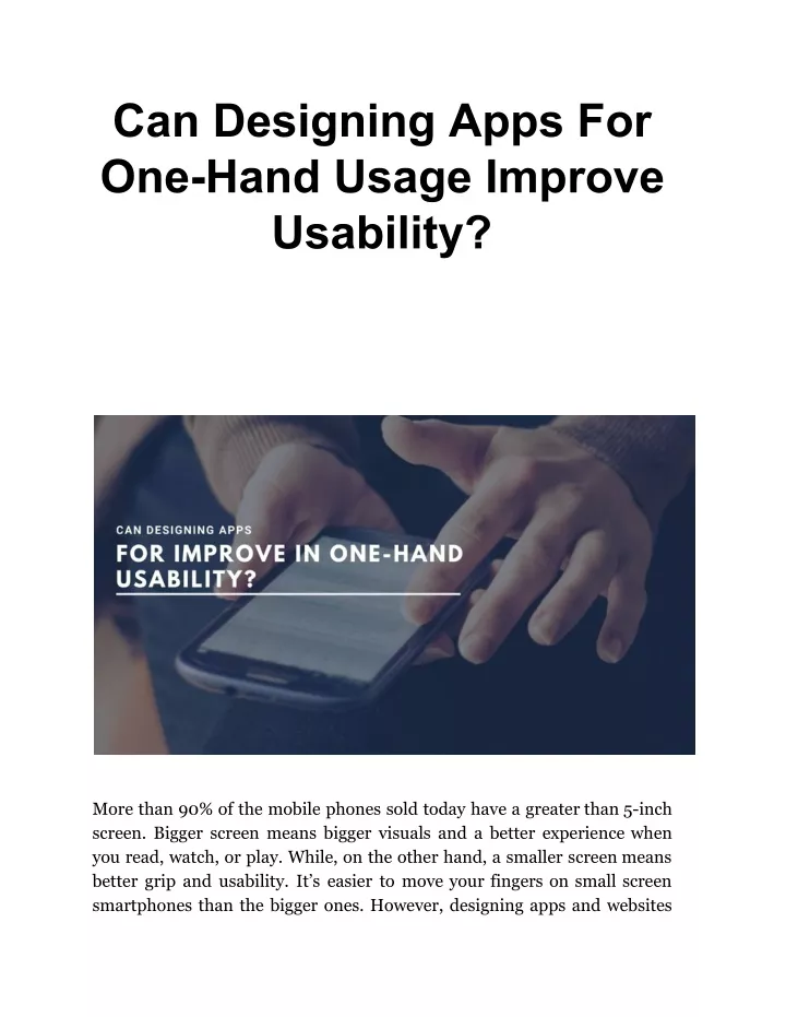
More than 90% of the mobile phones sold today have a greater than 5-inch screen. Bigger screen means bigger visuals and a better experience when you read, watch, or play. While, on the other hand, a smaller screen means better grip and usability. Itu2019s easier to move your fingers on small screen smartphones than the bigger ones. However, designing apps and websites for bigger screens are newer challenges for designers. Read more on https://bit.ly/3aqG4iE

E N D
Can Designing Apps For One-Hand Usage Improve Usability? More than 90% of the mobile phones sold today have a greater than 5-inch screen. Bigger screen means bigger visuals and a better experience when you read, watch, or play. While, on the other hand, a smaller screen means better grip and usability. It’s easier to move your fingers on small screen smartphones than the bigger ones. However, designing apps and websites
for bigger screens are newer challenges for designers and developers that they need to solve very soon. In this blog, we will see how designing apps for one-hand usage can improve usability and enhance the users’ experience. But before grasping important information about the one-hand usage of mobile devices, I must tell you something about SFWP Experts. It is the top web design Los Angeles company that has seasoned designers, developers, copywriters, and SEO analysts who work on projects passionately and make it highly successful. You can trust us for getting a wide variety of services starting from professional web design and development and going up to online marketing and search engine optimization. How Mobile Phones Came Into Existence? Back in January 2007, the world shrank into our palms when three revolutionary products - a phone, iPod, and internet - were merged into one. The product developed after unification was not something to introduce you with, it was a smartphone we know and love today. iPhone was built to be comfortably used by people single-handedly, allowing smoother movement of thumb across the whole screen. One of the great designers at that time once said that the 3.5-inch screen is the perfect size for users to operate a mobile phone and anything larger than that is foolishness. Well, the statement he has given was quite practical and it definitely relates to our mobile-usage experience. For example, if you use some app on your phone that has a 6-inch screen and some of its buttons are located at the top left corner, you will find it difficult to tap on those buttons. But the case is completely different in the mobile phones having less than 3.5 inch screen. You can touch or tap on any of the links or buttons that are positioned at different places on the screen.
Now you know why mobile devices with small-sized screens have better usability? If you want to design your app for one-hand usage on mobile phones, be informed that our Los Angeles web design company can help you achieve your goals. The result-oriented services that we offer at fair prices include business website design and development, website support and maintenance, web hosting and domain registration, SEO, PPC, and many more. Why Bigger Screens Have Low Usability? While bigger screens are great for showing more content, it has also larger out-of-reach areas for thumbs. On the flip side, smaller screens may not please you when it comes to the great visual experience, but it is easier for thumbs to move across the screen. The #1 design consideration of making mobile phones with the 3.5-inch screen wasn’t the result of overnight thinking. To figure out the ideal size of displays for one-handed usage, an American designer had to do deep research. In his 2-month long research, he spent time at airports, streets, cafes, and on buses and trains just to find out how people hold their phones. He found most of the people holding their phone in three ways that you can see in the picture above. Also, users were frequently changing their grip based on their comfort level and situation. What was most important to take into consideration is that 49% of users hold their phones with one-hand, especially when they were on the go. It was the point when he realized that designing mobile devices for one-hand usage will deliver customers a great experience. Since then apps were designed for one-hand usage. If you also wish to design your mobile application for one-hand usage, you must lead with an
approach to place your links or buttons within the reach of the thumb. Alternatively, you can also assign your project to our Los Angeles web design company and then we will develop your mobile app to be operated by one hand. We are not only into customized web design and development, but you can also hire our company for social media marketing, online advertising and promotion, and conversion rate optimization services. Why Designing Apps For One-Hand Usage Should Be The Top Priority For Developers? We use our mobile phones a great deal when we are in a hurry or looking for something very important. It greatly impacts the way we hold our phones and operate the apps. That hurried usage of mobile apps translates into a lot more of one-handed usage. As you remember well, 49% of users hold their phone in one hand when they have to perform a certain task, apps are the greater part of their usage. According to some research, the average user checks their phones 58 times a day, in which 70% of mobile interactions last within 2 minutes. Often we use our phones in distracted short-burst usage and continue if there is something we can’t afford to miss. Here short-burst usage means “one thumb, one eyeball” mobile user experience. This type of mobile use shows how a distracting environment compels users to engage with mobile phones single-handedly, having a short span of partial attention. What’s more, the best type of smartphone usage with a single hand is one where quick interaction happens due to smooth functionality. Some of the examples for short-burst usage of mobile phones are: While opening doors Walking down the street
Carrying a baby (clutched in one hand) Calling a cab driver Standing in the buses or trains Shopping household items Surfing social media sites These are the scenarios when we use our mobile phones for a short span of time. In case you want to know more reasons for designing apps for one-hand usage you can make a call to our Los Angeles web design company. Our experienced designers will get in touch with you and explain the advantages of having such apps. Mostly, we practice our skills in two main areas i.e., web design and development, and internet marketing (including SEO, PPC, copywriting, and content marketing). How To Design Your Apps Considering this One-Handed Short-Burst Smartphones? The answer to this question is quite simple as you are just required to do continuous usability testing and study different ways for how users hold their phones in different situations. If your users usually use your app in the distracting scenarios, then you should focus on your design approach that targets reachability and one-handed use. Spotify placed the Hamburger menu at the top-left corner of the screen that resisted users to use those features. On top of that, when bigger screens came into picture another design challenge was added to the previous list - reachability. This picture shows the level of difficulty and discomfort that users experience when they use the app. Usage Of
Considering the seriousness of the situation, Spotify’s team pulled down the Hamburger Menu in 2016 and shifted its core features - Home, Browse, Search, Radio, and Library - at the bottom. As a result of this action, an increase in the percentage of their clicks was observed - 9% on general options and 30% on menu items. Wrapping up You have seen how designing apps for one-hand usage is the deal of profit for your company. There is no denying the fact that the improved reachability of users will translate into increased engagement and higher conversions. Therefore, it is important for every app maker to test the newly developed apps for usability while considering the different ways in which users hold their phones. Keep collecting the data and making changes to your app design, and then you will be able to figure out differences between the before and after results. For technical help and guidance, you can also contact our Los Angeles web design company where we listen to you, analyze your app or website, and then make the most appropriate changes to increase your users’ engagement. Over a decade, we have been offering quality services to businesses around the world, some of which are eCommerce web design and development, mobile app development, software development, and a full range of online marketing services. So, if you are in the market, looking for the most trusted Wordpress website design company for your next project, you want to work with SFWP Experts. Contact Details: 213-277-9177
la@sfwpexperts.com Visit Reference Profile Websites: https://bit.ly/2xb1a6c http://bit.ly/36QoXog http://bit.ly/2V3vVDL https://repl.it/@sfwpexpert http://bit.ly/3b2uoUa http://bit.ly/3al4Cdi http://bit.ly/3c337Bz http://bit.ly/2U7hJcF http://bit.ly/399jLxw http://bit.ly/2v4XUYJ http://bit.ly/2SQo9MD http://bit.ly/2EyIzRQ Wordpress Developer