Download
1 / 65
650 likes | 835 Views
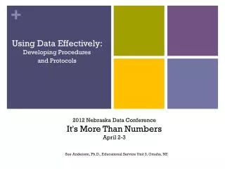
Communicating EMSC Data Information Effectively: It’s More Than About Numbers . Cindy Wilmshurst, MA, MPH Lisa Hyde, MPA National EMSC Data Analysis Resource Center. The need to communicate EMSC information, specifically informational data, is significant for EMSC decision makers

E N D
Communicating EMSC Data Information Effectively: It’s More Than About Numbers Cindy Wilmshurst, MA, MPH Lisa Hyde, MPA National EMSC Data Analysis Resource Center
The need to communicate EMSC information, specifically informational data, is significant for EMSC decision makers EMS providers Legislators Local, state & national agencies Media Program justification Public Research and evaluation Importance of Communicating EMSC Data Information
Potential Problems with Reporting • Some EMSC announcements, reports, and studies generate substantial attention; yet, others receive little notice and even less response. WHY? • Information is not shown to be important or newsworthy • General message is ambiguous • Methodology is confusing • Data are too complex or look unreliable
Effective EMSCCommunication Requires: Step 1: Identifying your Audience Step 2: Ensuring Readability Step 3: Explaining your Methods and Results Step 4: Accurate Statistical Analysis Step 5: Intuitive Charts, Graphs, Tables, etc. Step 6: Concluding Effectively
Communication Objectives are Applicable to EMSC: • Reports • Presentations • Web pages • Fact sheets • Published research
“So I just dumb it down, Right?” • Not an easy task • Takes work to convey information succinctly and effectively • Understanding how to communicate your data information effectively will make a difference!
Communicating Effectively Step 1: Identifying your Audience Step 2: Ensuring Readability Step 3: Explaining your Methods and Results Step 4: Accurate Statistical Analysis Step 5: Intuitive Charts, Graphs, Tables, etc. Step 6: Concluding Effectively
Identify Your Audience • Administrators (EMS, hospital, public health) • Agencies (funding, local non-profit, state, national) • Educators • EMSC Personnel (MDs, RNs, EMTs)
Identify Your Audience • Law enforcement • Legislators • Media • Peer-reviewed journals • Public • Researchers
Scientific Audience Follows standard format Focuses on methods and data analysis Emphasizes specific outcomes Addresses limitations and uncertainties Non-Scientific Audience Focuses on message rather than on format Simplifies methods, results, and data analysis Summarizes by advising a course of action De-emphasizes limitations and uncertainties Scientific versusNon-Scientific Audiences
When Communicating to Non-Scientific Audiences: • Remember first impressions--ensure the document looks and is readable • Facilitate comprehension of methods and results • Perform accurate statistical analysis and communicate in basic language
When Communicating to Non-Scientific Audiences: • Create intuitive charts, graphs and tables • Reemphasize what the data mean when summarizing and making recommendations
Communicating Effectively Step 1: Identifying your Audience Step 2: Ensuring Readability Step 3: Explaining your Methods and Results Step 4: Accurate Statistical Analysis Step 5: Intuitive Charts, Graphs, Tables, etc. Step 6: Concluding Effectively
What Readers Look for First: • Is the title interesting? • Who is the author(s)? • Does it have a summary or abstract? • Is it professional looking and readable?
Is the Title Interesting? • Always give your document a clear, descriptive title that can be referred to by others • Preferably, a catchy, memorable name combined with a descriptive subtitle • Should capture the primary take-home message you want people to associate with your data • Good: “Wisconsin Driver Fatality Report” • Better: “Fatal Distraction? A Comparison of the Cell Phone Driver and the Drunk Driver”
Who is the InformationComing From? • Readers want to know if they can trust the institution • Be sure to include your organization name, logos, and contact info • List the author(s) names, positions, degree(s)
Is There a Summary or Abstract? • Include a “data highlights,” executive summary or abstract at the beginning • Most end-users of your data will never read the entire report
Lots of text on each page? Complex data tables? BAD Lots of white space, contrast, color, pictures, and charts? GOOD Does it Look Readable?
Readability • Keep sentences and paragraphs as short as possible for non-scientific audiences • Sentences to fewer than 20 words • Paragraphs to no more than 4 short sentences • Don’t make people read all the way across the page • 3-4 inches is ideal
Undifferentiated Text is Daunting • Use different-sizedfonts, bold, and italics to emphasize sections • Use pull quotes, headlines, subheads, and sidebars for variety • Helps break up the text and magnify the key points you want readers to remember • Most important; be consistent
Color and Shading • Color and shading can be used to provide professional-looking contrast • Use carefully: Too much color looks juvenile and unprofessional • If materials are likely to be photocopied, use gradations of black and white
Other Readability Tips • Don’t overestimate your audience’s knowledge • Avoid technical jargon and overly technical language • Use consistent key words throughout the document • Example: “vehicle” vs “car” • Example: “fever” vs “febrile”
Communicating Effectively Step 1: Identifying your Audience Step 2: Ensuring Readability Step 3: Explaining your Methods and Results Step 4: Accurate Statistical Analysis Step 5: Intuitive Charts, Graphs, Tables, etc. Step 6: Concluding Effectively
Describing Methodology • Explain it very simply and briefly • Non-scientific audiences don’t want to know that much about study methodology • They will respect your position of authority and assume the information is credible • Complex methodology may be confusing • Use appendices for more details • Use footnotes for explanations
Planning your Results Section • Data communicators believe: • that their audience shares a sincere interest in the data information AND OFTEN THINK • that more data will help justify the approach, results, or conclusions HOWEVER . . .
Data Caveat #1 Mistake of communicating data information is: DATA OVERLOAD
You Need to Provide Data and Information That: • Shows the magnitude of the problem • Provides context • Provides meaning • Is interesting or noteworthy • Suggests an action
Shows Magnitude of the Problem • How big of a problem is this? • “More than 10,000 children die each year because of . . . ” • How does the problem compare with other problems? • “More children die of injuries than all the diseases combined.”
Provides Context for the Problem • How do the data compare with data elsewhere? • How do they compare with other groups of people (age, sex, race/ethnicity)? • Is the problem getting better, worse, or staying the same over time – is there a trend?
Provides Meaning to the Problem • Why should we care? • Children are suffering needlessly • $$$ spent, wasted, or could be saved • Impact on quality of care, time, or efficiency • Is the problem preventable? • Is the audience accountable for addressing the problem? • Is the audience, their friends or family at risk?
Is Interesting or Noteworthy • Hot, controversial issues • Surprising, counter-intuitive or against expectation • Significant rises or falls from the previous year • Unusual trends in your region compared to other regions
Suggests an Action • As a result of these findings, what needs to be done? • Who needs to carry out the action? • When should the action be done?
Lastly, Remember . . . Less is More • Avoid data overload • Most people can comprehend only a few key pieces of information • Only provide what is absolutely necessary • People generally want less than you think
Communicating Effectively Step 1: Identifying your Audience Step 2: Ensuring Readability Step 3: Explaining your Methods and Results Step 4: Accurate Statistical Analysis Step 5: Intuitive Charts, Graphs, Tables, etc. Step 6: Concluding Effectively
Why did the statistician become a statistician? . . . . He found accounting too exciting.
Statistics Whether you have done the statistics yourself, used a statistician or compiled them from different sources . . . it is “how” you present your statistics that will make the difference!
Statistics • Statistical terminology should be avoided when there are simpler ways to explain results • Most people have low math literacy, even highly educated persons
Terms to Avoid • The phrase “statistically significant” is rarely meaningful to non-scientists • Consider saying “more or less likely” • If possible, avoid using the terms: • p-value • 95% confidence limits • correlation coefficient • regression analysis • chi square
Keep your statistics basic and easy to understand. Use . . . Numbers/counts Rankings Percents Averages Odds ratios Rates Simple relationships Statistics that are Effective
Instead of presenting a relative risk as 2.0 Say, “Smoking cigarettes doubles the risk of dying from a heart attack.” Instead of saying, “25% of children do not wear seatbelts.” Say, “One out of every four children does not wear a seatbelt.” Turn Numbers into Words
Ethics • You are perceived as an expert on your data by non-scientific audiences • Important to be ethical, which is to be careful, honest, and accurate • Always have others examine your statistics! • Never skew data to make it look better • Resist the temptation to over-interpret or over-generalize findings • Remain unbiased in your language
Communicating Effectively Step 1: Identifying your Audience Step 2: Ensuring Readability Step 3: Explaining your Methods and Results Step 4: Accurate Statistical Analysis Step 5: Intuitive Charts, Graphs, Tables, etc. Step 6: Concluding Effectively
Pie charts Bar charts Line graphs Tables Pictures Maps Useful Graphics for Non-Scientific Audiences
Charts • Wonderful for illustrating data clearly • Good for highlighting the data you want to emphasize • Useful with break-up of text
Pie Charts • Good for highlighting either the largest or the smallest piece • No more than six slices • Largest piece starting at 12:00 • Slices should be displayed clockwise in descending order Major Causes of Death 6% Poisoning 12% Falls 22% Drowning 60% Car crash
Bar Charts • Most versatile means for displaying data • Often used to visually show magnitude of numbers and compare groups • Most effective if they contain only a few bars • Avoid stacked bar charts Major Causes of Death
Line Graphs Number of Crashes and Drownings by Year • Effective for sequential time, age groups, etc. • Time is generally shown on the x-axis, and numbers are on y-axis, with plotted points connected • Avoid the clutter of too many data lines (<4) or poor labeling