Download
1 / 21
210 likes | 227 Views
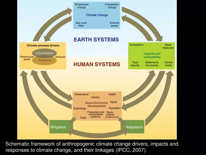
Schematic framework of anthropogenic climate change drivers, impacts and responses to climate change, and their linkages (IPCC, 2007).

E N D
Schematic framework of anthropogenic climate change drivers, impacts and responses to climate change, and their linkages (IPCC, 2007).
Warming of the climate system is unequivocal, as is evident from observations of increases in global average air and ocean temperatures, widespread melting of snow and ice and rising global average sea level (IPCC, 2007).
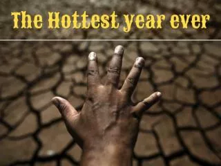
1934 the hottest year on record in U.S. (U.S. only comprise 2% of globe)! NASA scientists say 2012 and 2013 were the 9th and 4th warmest years on Earth since 1880, continuing a long-term trend of rising global temperatures. With the exception of 1998, the nine warmest years in the 132-year record all have occurred since 2000, with 2016 and 2007 ranking as the hottest years on record.
Of the 29,000 observational data series from 75 studies, that show significant change in many physical and biological systems, more than 89% are consistent with the direction of change expected as a response to warming (IPCC, 2007). Changes in physical and biological systems and surface temperature 1970-2004 (IPCC, 2007).
Global carbon dioxide production by country. Note that China surpassed the U.S. production in 2007 and India and Brazil are rapidly deeloping!
Relative importance of atmospheric gases and particulate matter on global warming versus cooling. Note that methane gas has a greater greenhouse effect than CO2 gas, but its anthropogenic productioin and overall atmospheric level is lower.
(a) Global annual emissions of anthropogenic GHGs (greenhouse gases) from 1970 to 2004. (b) Share of different anthropogenic GHGs in total emissions in 2004 in terms of CO2-eq. (c) Share of different sectors in total anthropogenic GHG emissions in 2004 in terms of CO2-eq. (forestry includes deforestation) (IPCC, 2007).
Anthropogenic concentrations of CO2, CH4 and N2O) over the last 10,000 years (large panels) and since 1750 (inset panels). Measurements are shown from ice cores (symbols with different colors for different studies) and atmospheric samples (red lines). The corresponding radiative forcings relative to 1750 are shown on the right hand axes of the large panel (IPCC, 2007). The atmospheric concentrations of CO2 and CH4 in 2005 exceed by far the natural range over the past 650,000 years.
How is the rate of atmospheric CO2 concentration changing over time? What accounts for the annual variation in the Mauna Loa record?
Dissolved CO2 content of the world’s oceans follows the trend of the rise in atmospheric CO2 content. As dissolved CO2 content increases in the world’s oceans, pH decreases (acidity increases).
Comparison of observed continental- and global-scale changes in surface temperature with results simulated by climate models using either natural or both natural and anthropogenic forcings.
Relative changes in precipitation (in percent) for the period 2090-2099, relative to 1980-1999. Values are multi-model averages based on the SRES A1B scenario for December to February (left) and June to August (right). White areas are where less than 66% of the models agree in the sign of the change and stippled areas are where more than 90% of the models agree in the sign of the change (IPCC, 2007).
Scenarios for GHG emissions from 2000 to 2100 in absence of additional climate policies (IPCC, 07 & 2014). SRES – (Fuss et al., 2014).
CO2 emissions and equilibrium temperature increases (above pre-industrial for a range of stabilization levels). Note the large discrepancy in outcomes. How do you account for this large discrepancy?
Atmosphere-Ocean General Circulation Model projections of surface warming (2020-2029 and 2090-2099). IPCC, 2007.
The 5th IPCC Assessment Report (AR5) was completed in 2014. You can access the report and data on line: http://www.ipcc.ch/