Download
1 / 16
160 likes | 267 Views
Learn to interpret scatterplots, calculate Pearson's correlation coefficient, and perform linear regression analysis. Discover the key factors to consider in data analysis, Excel usage, and interpreting regression output.

E N D
Administrative Tasks • Turn in your HW • Sample Research Paper • Buckle your seatbelts we have a lot to cover
Scatterplots • Y is the vertical axis • X is the horizontal axis • Dots are observations • The intersection of the IV & DV for each unit of analysis • What can you infer from about the IV/DV relationship from the scatterplot on the left? • Presentation can be deceiving
Three factors to consider when analyzing scatterplots • Directionality • Do the dots appear to flow in a particular direction? • Or, does the scatterplot look more like white noise (like a TV when it doesn’t have a signal)? • The more it looks like white noise the less the two variables are related • Clustering • Are the majority of the dots in a small area of the graph? • How would this impact our confidence in predictions outside of this area? • Outliers • Are there cases that differ markedly from the overall pattern of the dots? i.e. not near the cluster or contrary to the directionality • Which observations are these? How influential are these cases?
Pearsons’s correlation coefficient: quantifying scatter • To estimate the strength of the relationship between two interval level variables we can calculate Pearson’s correlation coefficient (r) • Values range from -1 to +1 • -1 = perfectly negative association • +1 = perfectly positive association • 0 = no association • The perks of Pearson: • Direction • Magnitude (of predictive power) • Impervious to the units in which the variables are measured
Calculating r • “That’s scarier than anything I saw on Halloween!” • 1. Subtract each observations x value from x’s mean and multiply it by the difference between its y value and the mean of y • 2. Do that for each observation and sum them all together • 3. Divide that sum by n-1 times the s.d. of x & the s.d. of y
The real good news? You don’t have to actually do that • Excel is your best buddy & will do all the hard work for you • Not only that, but Excel will also allow you to create a scatterplot and show you a line depicting this relationship • Let’s check it out:
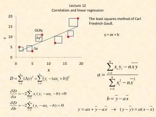
“Tell me more about this line!” • Slope: • Change in Y divided by change in X • Intercept • Value of Y when X = O • Error • Distance between the line’s Y value and a data point’s Y value • The line minimizes the sum of all the squared errors • “I love line!”
Recipe for creating the line • The line rarely, if ever, passes through every point • There is an error component • Thus, the actual values of Y can be explained by the formula: • Y=α+βX+ε • α - Alpha – an intercept component to the model that represents the models value for Y when X=0 • β - Beta – a coefficient that loosely denotes the nature of the relationship between Y and X and more specifically denotes the slope of the linear equation that specifies the model • ε - Epsilon – a term that represents the errors associated with the model
This is ordinary least squares (OLS) or linear regression • The Goal: • Minimize the sum of the squared errors • Consider the impact of outliers • How many ways can a line be created?
“Not gonna do it. Wouldn’t be prudent.” • You know the trick: • It’s not as hard as it looks • You are really comparing Y’s deviations from it’s mean alongside X’s deviation from it’s mean • See the formula at the bottom of pg. 331 • Ideally the Xi’s move in sync with the Yi’s divergence from the mean • This is covariation
The Really Good News? Excel does it all for you! • Enter the data into Excel • Click the “Data” tab at the top • In the Data tab look all the way to the right and click on “Data Analysis” • In the Analysis Tools menu click on Regression and hit Ok • Highlight the appropriate columns in the “Input Y Range” & Input X Range” fields • Check the labels option & hit Ok • Instant regression results!
What to look for when examining regression output • Beta coefficient: • Directionality • Size of the coefficient • Standard Error • Statistical Significance • Constant • Far less important than Beta • When X = O what would we expect Y to be? • Is X ever O? • Goodness of fit • How much of the variation in Y is actually explained by X? • How “good” does your model “fit” the actual values of Y? • R-squared (the coefficient of determination) provides an estimate
r Strikes Back! • Recall that r, Pearson’s correlation coefficient, measures the degree to which two variables co-vary • With OLS the: • Constant tells us where the line starts • Beta tells us how the line slopes • R-squared tells us the % of the variation in Y our model predicts • Range 0-1 • O = Predicts none of the variation • 1 = Predicts all of the variation