Download

1 / 13
130 likes | 219 Views
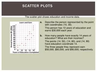
Scatter Charts. The Relationship between Earnings and Education. Data for 1000 people Education level and earnings per year The data are in pairs Both education and earnings can vary from one person to the next. Problems.

E N D
The Relationship between Earnings and Education • Data for 1000 people • Education level and earnings per year • The data are in pairs • Both education and earnings can vary from one person to the next Prof. Leighton
Problems • One person with a college degree may earn 40,000/year and another person may earn 50,000/year • A particular value on the X axis (education) could have two or more values on the Y axis • No persons with 13 or 9 years of education in the data set • Data may be in uneven intervals on the x-axis • Scientific and business data often are of this nature Prof. Leighton
AFDC Data • Data set contains information on the number of AFDC recipients in 10 large metropolitan areas and the unemployment rate in those areas • Model: the number of AFDC recipients in an area is directly related to the unemployment rate in the area Prof. Leighton
Data Prof. Leighton
Model • AFDC =f(U rate) • AFDC will be placed on the y-axis • Represents the dependent variable • U rate will be placed on the x-axis • Represents the explanatory variable Prof. Leighton
Fitting a Trend Line • The relationship looks approximately linear • Fit a trend line (simple regression) through the data • Use trend line to predict AFDC for given values of the unemployment rate • Equation for a line is Y=bX + a • where a is the Y intercept (AFDC level) when X (U) =0 • b is the slope of the line, Y/X = AFDC/ U Prof. Leighton
Descriptive Statistic – Goodness of Fit • The R-squared value • Proportion of the variation in Y that is explained by variation in X • The closer the R-squared value is to 1, the better the data fit the trend line Prof. Leighton
The Trend Line • y = 9.5289x - 26.238 • Intercept is - 26.238 • Slope is 9.5289 • For every one percentage point increase in the unemployment rate, AFDC persons increase by 9.5289/1000 • Use the trend line to predict. Suppose unemployment rates soared to 20.0% • Y=9.5289*20 - 26.238 = 164.34/1000 Prof. Leighton
Forecast and Tend Functions • =FORECAST(x,known_y’s,known_x’s) • Where the value for which you want to forecast is x • =FORECAST(20,C4:C13,B4:B13) • =TREND(known_y’s,known_x’s,new_x’s • This is an array function • Can return a vector of new X’s • =TREND(C4:C13,B4:B13,20) Prof. Leighton
Goodness of Fit • R-squared = .80 • Tells us that 80 percent of the variation in AFDC recipients across metropolitan regions is explained by variation in unemployment rates Prof. Leighton