Download
1 / 21
210 likes | 301 Views
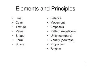
Elements and. Principles. of Design. The Basic Elements of Design are:. Color. Lines. Shapes. Mass. Texture.

E N D
Elements and Principles of Design
The Basic Elements of Design are: Color Lines Shapes Mass Texture
Lines can take many forms. They can be loose and free or they can be straight and sharp. Lines can create patterns which adds emotional impact to the visual image. Lines can also be used as forms of universal language in communication. Lines
The three basic shapes are square, circle, and triangle. Each of these shapes have a psychological meaning associated with it. The triangle has the attitude of conflict or action. The circle gives the feeling of protection or infinity. Honesty or equality is associated with the square. Shapes
Mass refers to the size or amount of space taken up by an element. The mass or solid, plus the shape, tend to give relationship with other elements. The various weights of different shapes can be used to emphasize type styles. Mass
Texture Texture is a part of every printed image. The first reaction is to touch the surface. Texture can be produced by lines that form images. However, this element is usually visual and no reaction would be received through the sense of touch. Actual texture can be produce by embossing.
Color When color is used on a layout, it causes that part of the layout to attract attention. Color can have a strong emotional and psychological impact on the reader. It can be used to add interest and to reduce boredom. Yellow, orange, and red are considered warm colors and often denotes aggression, excitement, and danger. Blue, green, and violet are considered to be cool colors and are associated with nature and passiveness.
The basic Principles of Design include: Unity Balance Rhythm Contrast Proportion
Balance Balance refers to equalizing the weight of elements in a design. Formal balance is achieved when all of the elements on the page are of equal weight and are placed symmetrically on the page. If a line were drawn through the exact center, it would divide the design elements in half. Informal balance may be achieved when the value, size, and location of unequal elements on a page are changed.
Contrast Contrast or emphasis adds variety to a design. It is the variations of elements in the printed product. Some elements of a layout stand out because of contrast. This is achieved by a difference in size, color or appearance. A few contrasts are: round and straight, ornate and plain, broad and narrow. Contrast can be used to keep the attention of the reader and to keep the reader's interest moving from one element to another.
Unity Unity or harmony gives elements the appearance of belonging together. It is the proper balance of all elements so that a pleasing whole results. The image is viewed as one piece, as a whole, and not as separate elements. Using too many shapes or typefaces may cause a design to be unfocused. An organized design can be achieved by using a basic shape which is then repeated.
Rhythm is used to create eye movement and direction. It occurs when a design element is repeated. Rhythm acts as guide so the eye reads important parts of a message. Numbers can then be used to direct the reader from one element to another. Rhythm
Proportion is the relationship between size and shape. It helps to achieve balance and unity in a layout. To obtain good proportion the sizes of the elements must be regulated. To avoid the design from being dull and static, proportion must be balanced by the use of contrast or unity. Proportion is a means of developing an aesthetically pleasing relationship between each of the elements used in the layout. Proportion
Questions on Quiz 1. The following is NOT an element of design: a. Shape. b. Texture. c. Mass. d. Beauty. 2. The attitude of conflict or action is associated with the __________. 3. The feeling of protection or infinity is given by the __________. 4. Honesty or equality is associated with the __________. 5. The design element that can be produced by lines that form images or can be created by embossing is __________.
Questions on Quiz 6. Color can be used to add interest and to reduce boredom. True or False? 7. Warm colors are yellow, orange and red. True or False 8. Cool colors are blue, green, and violet. True or False 9. The following is NOT a design principle: a. Balance. b. Unity. c. Equality. d. Contrast.
Questions on Quiz 10. There are two kinds of balance, informal and __________. 11. Variety is added to a design by the use of _________. 12. Elements appear to belong together by the use of unity. True or False? 13. Eye movement is created by the design principle __________. 14. An aesthetically pleasing relationship between elements is achieved with __________.