Download
1 / 60
600 likes | 619 Views
Learn about the basics of information visualization, common mistakes to avoid, and how to create engaging visualizations. Explore encoding techniques, human attention processes, and success stories like solving the London cholera epidemic. Dive into tasks like information foraging and interactive data analysis for effective communication.

E N D
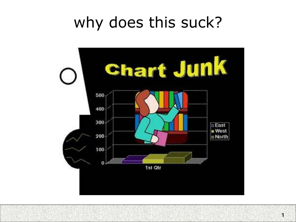
some of the reasons it sucks • y-axis unlabeled • y-axis at poor scale • needless use of 3D bar chart • color used instead of x-axis labels • x-axis label should be the title, and be more informative • for example, what metric? what year? • giant face on left side • distracting by engaging human face perception • distracting by creating figure/ground separation illusion • chart junk • useless image of librarian, tacky word art • missing context • nothing to compare to! are these numbers good or bad? how do they compare to previous quarters/years or to the competition?
Information VisualizationRyan Aipperspach (slides from Jeffrey Heer) April 19, 2006
overview • why infovis? • review some basics • examples deconstructed • modeling visualizations
overview • why infovis? • review some basics • examples deconstructed • modeling visualizations
basic problem We live in a new ecology. (slide “borrowed” from PARC User Interface Research Group)
web ecologies 1 new server every 2 seconds7.5 new pages per second (slide “borrowed” from PARC User Interface Research Group)
scientific journals Journals/person increases 10X every 50 years 1000000 100000 Journals 10000 1000 Journals/People x106 100 10 1 0.1 Darwin V. Bush You 0.01 1750 1800 1850 1900 1950 2000 Year (slide “borrowed” from PARC User Interface Research Group)
innate human capacity 1000000 100000 10000 1000 100 10 1 0.1 Darwin V. Bush You 0.01 1750 1800 1850 1900 1950 2000 (slide “borrowed” from PARC User Interface Research Group)
attentional processes “What information consumes is rather obvious: it consumes the attention of its recipients. Hence a wealth of information creates a poverty of attention, and a need to allocate that attention efficiently among the overabundance of information sources that might consume it.” ~Herb Simon as quoted by Hal Varian Scientific American September 1995 (slide “borrowed” from PARC User Interface Research Group)
human-information interaction • The real design problem is not increased access to information, but greater efficiency in finding useful information. • Increasing the rate at which people can find and use relevant information improves human intelligence. (slide “borrowed” from PARC User Interface Research Group)
information visualization • Leverage highly-developed human visual system to achieve rapid uptake of abstract information. 1.2 b/s (Reading) 2.3 b/s (Pictures) (slide “borrowed” from PARC User Interface Research Group)
augmented cognition • Using external artifacts to amplify human mental abilities. • Classic examples: pen and paper, slide rules • A primary goal of Information visualization • In the case of InfoVis, how? • Increased resources • Reduced search • Enhanced pattern recognition • Perceptual inference • Perceptual monitoring • Manipulable medium
Visualization Success Story Mystery: what is causing a cholera epidemic in London in 1854?
Visualization Success Story Illustration of John Snow’s deduction that a cholera epidemic was caused by a bad water pump, circa 1854. Horizontal lines indicate location of deaths. From Visual Explanations by Edward Tufte, Graphics Press, 1997
Visualization Success Story Illustration of John Snow’s deduction that a cholera epidemic was caused by a bad water pump, circa 1854. Horizontal lines indicate location of deaths. From Visual Explanations by Edward Tufte, Graphics Press, 1997
overview • why infovis? • review some basics • examples deconstructed • modeling visualizations
basic types of data elements • Nominal • (no inherent order) • city names, categories, ... • Ordinal • (ordered, but not at measurable intervals) • first, second, third, … • cold, warm, hot • Mon, Tue, Wed, Thu … • Quantitative • (ordered, with measurable distances) • real numbers • Relations • (relations between elements) • Networks • Hierarchical relationships (parent/child)
basic types of visual encodings • “Retinal” properties • spatial position (e.g., x-y axes) • size • shape • color • orientation • texture • “Gestalt” properties • connectivity • grouping (e.g., enclosure) • Animation • view transitions • animated elements
sensemaking tasks [Card et al] • Information foraging • Collect information of interest • Search for schema • Identify relevant dimensions of data • Instantiate schema (with data!) • Schema == knowledge representation • Organize / codify information • Analysis (problem solving) • Analyze and filter data, answer questions • Refine schema as needed • Record / communicate • Make a decision, take action, or communicate results
interactive tasks [Shneiderman] • Overview • Get an overview of the collection • Zoom • Zoom in on items of interest • Filter • Remove uninteresting items • Details on demand • Select items and get details • Relate • View relationships between items • History • Keep a history of actions for undo, replay, refinement • Extract • Make subcollections
overview • why infovis? • review some basics • examples deconstructed • modeling visualizations
characterizing the visualization • x-axis: year (quantitative) • y-axis: currency (quantitative) • color: imports/exports (nominal) • color: positive/negative (nominal/ordinal)
characterizing the visualization • x-axis: year of release (quantitative) • y-axis: popularity (quantitative) • color: genre (nominal) • dynamic query filters • title (nominal) • actor (nominal) • actress (nominal) • director (nominal) • length (quantitative) • rating (ordinal)
principle: interactivity • turn visual analysis into a real-time iterative process • explore various hypotheses or interests • filter to hone in on data of interest • get details on demand
issue: multi-dimensional data • FilmFinder visualizes 3 dimensions at a time, using 2 spatial dimensions and color • can we effectively see more dimensions simultaneously?
perspective wall • Video online at: http://www.sims.berkeley.edu/courses/is247/f05/movies/PerspectiveWall.mov
characterizing the visualization • x-axis: time of file access (quantitative) • y-axis: file type (nominal) • use of 3D perspective to • fit more data in the display • de-emphasize peripheral data
principle: focus+context • Keep all the data in view • Show data of interest in high detail • Show peripheral data in lower detail • Often achieved through perspective or visual distortion
Reingold-Tilford Layout Top-down layout Uses separate dimensions for breadth and depth tidier drawing of trees - reingold, tilford
TreeMaps Space-filling technique that divides space recursively Segments space according to ‘size’ of children nodes map of the market – smartmoney.com
cone trees • Video online at: http://www.sims.berkeley.edu/courses/is247/f05/movies/ConeTree.mov
characterizing the visualization • x-axis: tree depth (hierarchical) • y-axis / z-axis: arrangement of sibling / cousin nodes (hierarchical) • connectivity: parent-child relationships (hierarchical) • animation: perform view transition • lighting: shadow provides flattened 2D view of structure
principle: animation • depicts change over time • invaluable for view transitions • can communicate change, even on periphery of vision (eyes are very sensitive to motion) • existing debate about the efficacy of animation (depends on usage)
principle: 3D • 2D or not 2D? Actually quite controversial! • Though “cool”, 3D can present problems with occlusion and navigation (and even sex/gender issues arise) • Most visualizations stay in the 2D or 2.5D • Perspective Wall: 3D perspective, 2D interaction
characterizing the visualization • similar to cone-tree, but flattened • color: selection/focus status of nodes (nominal) • increased information density [Tufte] • curved edges create funnel effect • allows greater y-separation of parents and children • more focus+context • only show selected, expanded subtrees • collapsed subtrees replaced with a graphic, roughly indicating subtree size • if too many siblings, aggregate to keep legible
network visualization Skitter, www.caida.org
characterizing the visualization • angle: longitude (quantitative) • radius: number of connections (quantitative) • color: number of connections (quantitative) • color spectrum moving from cool to hot colors • color: continents (nominal/ordinal) • category colors along periphery
principles • redundant coding • in this case radius and color • reinforce data of interest • design decision can obscure data • network sparsity in Africa is masked by European networks
more video examples • Video online at: http://www.sims.berkeley.edu/courses/is247/f05/movies/prefuse.avi • Shows selected applications built using the prefuse visualization toolkit for writing 2D visualizations in Java. • http://prefuse.sourceforge.net
overview • why infovis? • review some basics • examples deconstructed • modeling visualizations
Data Visual Form Task Raw Data Data Tables Visual Structures Views Data Transformations Visual Mappings View Transformations infovis reference model • Data Transformations • Mapping raw data into an organization fit for visualization • Visual Mappings • Encoding abstract data into a visual representation • View Transformations • Changing the view or perspective onto the visual representation • User interaction can feed back into any level
reference model examples • Visual mappings • Layout (assigning x,y position) • Size, Shape, Color, Font, etc… • View Transformations • Navigation: Panning and Zooming • Animation • Visual Distortion (e.g., fisheye lens)
apply the model: cone trees • Raw Data: File system directories • Data Transformations: Traverse file system subtree • Data Tables: Parsed/extracted directory tree • Visual Mappings: Assign 3D coordinates to tree elements (layout), assign colors, fonts. Set lighting. • Visual Structures: 3D model of tree • View Transformations: Camera placement; animation between tree configurations • View: Rendered, interactive visualization • Interaction: Selection of new focus node