Download
1 / 7
70 likes | 130 Views
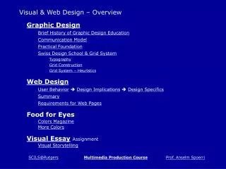
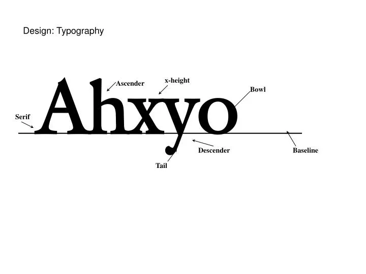
Design: Typography. Ahxyo. x-height. Ascender. Bowl. Serif. Descender. Baseline. Tail. Ahxy Avant Garde Ahxy Galliard Ahxy Brittanic. Letter breaks and spacing Dangerous Child Molester Caught Dangerous Child Molester Caught V A it m VA itm

E N D
Design: Typography Ahxyo x-height Ascender Bowl Serif Descender Baseline Tail
Ahxy Avant Garde Ahxy Galliard Ahxy Brittanic
Letter breaks and spacing Dangerous ChildMolester Caught DangerousChild Molester Caught VA itm VA itm General rule: 40 to 70 characters per line, 9-10 words.
Use of Capital Letters RINGAROUNDTHEROSY RingAroundTheRosy Whose Tools, Which Era? Whose tools, which era?
Interline Spacing (Leading) Space between the baseline of one line to the baseline of the next. General rule: font size is 80%, or 4/5, of interline spacing If one line of text is spaced reasonably far apart from the next, you have room to read and make the jump to the next line withno trouble. TNR, normal ratio If one line of text is very close to the next line, you can’t read iteasily, and you experience claustrophobia! TNR, ratio too close A lot of leading can lead to a slow-paced, sereneeffect, but too much can leave you feelingdownright lost. TNR, ratio too large.
If one line of text is spaced reasonably far apart from the next, you have room to read and make the jump to the next line withno trouble. AG, normal ratio If one line of text is very close to the next line, you can’t read iteasily, and you experience claustrophobia! AG, ratio too close A lot of leading can lead to a slow-paced, sereneeffect, but too much can leave you feelingdownright lost. AG, ratio too large.
Alignment Type that is set in flush left, ragged right, often has more even spacing throughout. Readers can easily locate the next line because the space relationships between one line and the next provide “landmarks.” flush left or left-justified Type that is justified doesn’t give those “landmark” clues. It also might cause a “river of white space” running through the paragraph. This can be disruptive to comfortable reading, but it is difficult to avoid when the column width is narrow. justified or full justification