Visual Design Basics
Visual Design Basics. Creating Effective Handouts, Flyers and Brochures. Your task (If you choose to accept it!). Design a handout for today’s presentation. Whoaaa !. Freedom to use desktop publishing software can sometimes lead to “unusual” results. Scary!!!. The Goal.

Visual Design Basics
E N D
Presentation Transcript
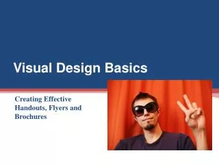
Visual Design Basics Creating Effective Handouts, Flyers and Brochures
Your task(If you choose to accept it!) Design a handout for today’s presentation
Whoaaa! • Freedom to use desktop publishing software can sometimes lead to “unusual” results... Scary!!!
The Goal • A handout that is easy to read, understand and use • An enhanced learning experience
Readability and Legibility Readability and legibility are both particularly important considerations when creating print materials for individuals with vision problems, limited literacy or cognitive disabilities.
Legibility • Serif – e.g. Times New Roman • sans serif – e.g. Ariel and Tahoma • Decorative – e.g.Curlz MT and Edwardian Script
Don’t be tempted... • Less is more
To keep things as legible as possible, always follow the classic rule of KISS (Keep It Simple, Silly). When in doubt, go with the simplest possible typeface choices, and avoid the beginner’s mistake of creating a one-page handout using every single typeface available on your computer!
The General Rule of Thumb • Use a common, easily recognised, serif typeface for the body of the work • Break up the body text with headings and captions in sans serif typeface • Use decorative typefaces sparingly. Only use decorative typefaces for a short title or sub-heading.
Readability C • The ease at which something can be understood. • Where to place your text and graphics on the page. R A P
Proximity and Spacing = Relationships Less Explanation Required
Tips • Don’t be timid about unused space • Make use of faces • Use bulleted lists (like this one!) to separate discrete bits of information while simultaneously grouping them together
Testing for Legibility and Readability • What is the most important thing on the page? • Do the squint test • Give it to someone who has not been involved in the publication • Peer • Similar person to the intended audience
An Example Squint Test Contrast Repetition Alignment Proximity
Final Thoughts • Look at what other designers have done – supermarkets, magazines • Make use of Williams’ principles of contrast, repetition, alignment and proximity
References • Williams, R. (1994). The Non-Designer’s Design Book: Design and Typographic Principles for the Visual Novice. Berkeley, CA: Peachpit Press • Brown, A. (2005). Visual Design Basics: Creating Effective Handouts, Flyers and Brochures. Fullerton, CA: California State University • Kuhlmann, T. (2008) 3 Graphic Design Principles for Instructional Design Success. The Rapid Elearning Blog. accessed from http://www.articulate.com/rapid-elearning/3-graphic-design-principles-for-instructional-design-success/ on 19/02/2010