Visual design
Visual design. The “look†of your interface. Agenda. Poster information Errors review Visual design. Poster. March 11 (first class after spring break) Present (at least) 3 design possibilities, get feedback Organization: General topic, perhaps scenario, users, requirements, etc.

Visual design
E N D
Presentation Transcript
Visual design The “look” of your interface
Agenda • Poster information • Errors review • Visual design
Poster • March 11 (first class after spring break) • Present (at least) 3 design possibilities, get feedback • Organization: • General topic, perhaps scenario, users, requirements, etc. • At least 3 DIFFERENT designs – sketches, storyboards, perhaps descriptions or features • You can bring whatever else you have • Materials: whatever you like
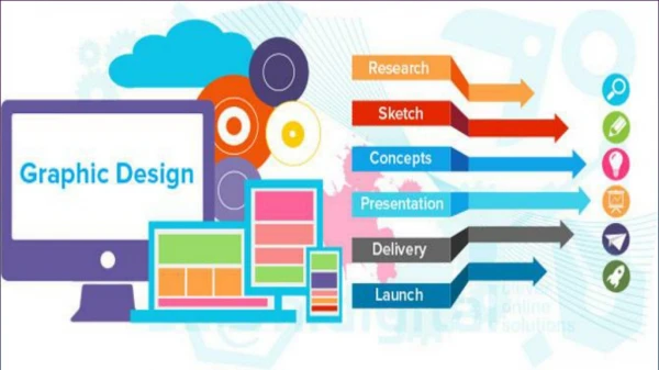
Role of Graphic Design • What someone initially encounters • Sets a framework for understanding content
Role of Graphic Design • What someone initially encounters • Sets a framework for understanding content
Role of Graphic Design • What someone initially encounters • Sets a framework for understanding content
Graphic Design • A comprehensible mental image • Appropriate organization of data, functions, tasks and roles • High-quality appearances • The “look” • Effective interaction sequencing • The “feel” • Classes at UNCC • http://www.uncc.edu/schedule/subject/artg.html • Classes at CPCC • http://www.cpcc.edu/course%5Fdescriptions/grd/
Graphic Design • Involves knowledge of: • Sequencing • Organization • Layout • Imagery • Color • Typography
Graphic Design Principles • Metaphor • Clarity • Consistency • Alignment • Proximity • Contrast
Clarity • Every element in an interface should have a reason for being there • Make that reason clear too! • White/open space • Leads the eye • Provides symmetry and balance • Strengthens impact of message • Allows eye to rest between elements of activity • Used to promote simplicity, elegance, class, refinement
Example Clear, clean appearance Opinion?
Example Does this convey different impressions?
Clarity via “White” Space • White = Open
Consistency • In layout, color, images, icons, typography, text, … • Within screen, across screens • Stay within metaphor everywhere • Platform may have a style guide • Follow it!
Example Home page Content page 1 Content page 2 www.santafean.com
Alignment • Western world • Start from top left • Novices often center things • No definition, calm, very formal • Grids • (Hidden) horizontal and vertical lines to help locate window components • Align related things • Group items logically
Layout Grids http://hotwired.lycos.com/webmonkey/98/28/index4a_page2.html?tw=design
Three Column Layout Grids From http://www.cultsock.ndirect.co.uk/MUHome/cshtml/print/grids.html
Symmetry vs. Asymmetry Beware of too much symmetry From http://www.cultsock.ndirect.co.uk/MUHome/cshtml/print/grids.html
Proximity • Items close together appear to have a relationship • Distance implies no relationship Time Time:
Example Name Name Name Addr1 Addr1 Addr1 Addr2 Addr2 Addr2 City City City State State State Phone Phone Phone Fax Fax Fax
Slide from Saul Greenberg • Two-level Hierarchy • indentation • contrast Logic of organizationalflow Grouping by white space Alignment connects visual elements in a sequence
Economy of visual elements • Minimize number of controls • Include only those that are necessary • eliminate, or relegate others to secondary windows • (but don’t want too many extra windows!) • Minimize clutter • so information is not hidden
Example Overuse of 3D effects
Contrast • Pulls you in – set off most important item • Guides your eyes around the interface • Supports skimming • Add focus
Example IBM's Aptiva Communication Center
Example Visual noise
Color • Use for a purpose and sparingly • Draw attention, communicate organization, to indicate status, to establish relationships, aid search • Use redundant cues • Color-blindness • Enhances performance • Be consistent with color associations from jobs and cultures
Color Meanings: Contextually Specific • Red • aggression, love • hot, warning, stop, radiation • Pink • female, cute, cotton candy • Orange • warm, autumn, Halloween • Blue • cold, off • Yellow • happy, caution, joy • Brown • warm, fall, dirt, earth • Green • go, on, safe, envy, lush, pastoral • Purple • royal, sophisticated, Barney
Color Meanings: Culturally Specific http://www.ricklineback.com/culture2.htm
Legibility and readability • Characters, symbols, graphical elements should be easily noticable and distinguishable Text set in Helvetica TEXT SET INCAPITOLS Text set in Braggadocio Text set in Times Roman Saul Greenberg U. Calgary
Readable Unreadable Design components to be inviting and attractive Design components to be inviting and attractive Design components to be inviting and attractive Design components to be inviting and attractive Legibility and readability • Proper use of typography • 1-2 typefaces (3 max) • normal, italics, bold • 1-3 sizes max Large Medium Small Large Medium Small Saul Greenberg U. Calgary
Remember • Form follows function • Visual elements should help convey purpose and meaning • Be consistent • Just like all design – iterate and get feedback!! • Let’s analyze: • http://www.cnn.com/ & http://www.nytimes.com/ • http://www.microsoft.com/