Download
1 / 8
80 likes | 172 Views
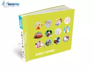
"Creating a dynamic magazine catered to sixth form students and parents interested in the Acoustic genre. Featuring an attractive model surrounded by bold text, engaging sell lines, and a modern layout to appeal to a broader audience. Conducting audience research to refine content based on preferences. Utilizing a single, centered image of a casual yet attractive model and incorporating a guitar prop. Institution envisioned for publication: IPC Media. Covering breakthrough artists and inspiring stories, aiming to inspire readers and offer exclusive content. Targeting primary audiences with quality pricing and new genre coverage, while offering special student subscriptions and interactive features for a wider reach."

E N D
Front cover evaluation Stephanie Jackson
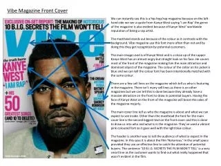
Layout The way in which I have photographed my model is that I have centred her and left plenty of room at the top for the title. The sell lines are surrounding my model. I have used a deep blue for the title, it is big and bold which will grab the readers attention. And I have used a lighter blue for the sell lines, using red for one particular line, I feel this makes that line seem important and stands out more. I have used ‘verdana’ for the font and 22 for the size of the sell lines, I have used 90 for the title, obviously a lot bigger it being the title. Also stands out more.
Audience • My target audience is aimed at sixth form students and their parents. I wanted to include the parents too so they can get a good idea of what their child is being taught and what they are being involved in. The reason I used an attractive and young model is to go well with the target audience. And the way I have set it out fits in with the target audience as it is a modern look/style. The fact I have used a female model on the front and have made it particularly girly, it may attract females more than males, I think this may be quite a weakness as really, I need to be aiming this magazine at all people, for a larger audience. From the font and image I have used shows that the audience is fairly mainstream, making the audience broader. • Audience research-The likely primary audience to see my magazine are those who are interested in the genre (Acoustic) and obviously if they play an acoustic instrument. I am going to devise a questionnaire to give out to a numerous amount of people, so then I can sum up decisions from my results as to what I should do in my magazine that will attract my target audience the most. This will test my ideas and help me decide the best style to adopt. I will ask a wide range of people so my results will be as reliable as possible.
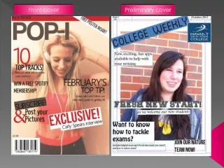
Use of images • The main image I have used is of an attractive model, which I had picked out from my preliminary photos… which I had taken before hand, so I could experiment with different photographs to make the best possible decision with my front cover. I have centred the model and have left plenty of room above the head for a big bold title. This is the only image I have used on my front cover, I didn’t want to make it look too overcrowded. The picture I have used is a generic picture, as she is typically attractive, and wearing casual clothes like anyone else.
Annotated front cover For the image I have used I decided to angle the model in this way to fill out the left hand side of the page. So I could fit all the sell-lines on the right hand side, this was always my initial intention. I decided to make the cover in a Sepia tone as I feel this signifies a relaxed tone, just as the theme of my magazine is I have used big bold title in an italic font to fit with the theme With the sell-lines I decided to make them also in an italic font to go with the theme (similar to the title). I decided to make the colours of the fonts mainly the same, with the occasional different colour to help it stand out. Text I have used a prop in the picture (The guitar). I always envisioned my front cover to have a guitar on the front cover. As I have a great love towards this instrument. It is the main representation in this magazine. I have included a barcode to fit in with a regular magazine
Institution • If my magazine were to be published and distributed to industry standard, I believe it would be by a company like IPC Media. This is a large institution that invests in many small medias that are not succeeding quite so much. I believe that my ‘Strings’ magazine values and ideology are very similar to IPC Media. I feel my magazine is represented in a way that will become a very popular magazine, as it includes breakthrough artists (which is good on their behalf) and also artists that are already big. Which looks good to my magazine as I would feel very honoured to have had a chance to include some big names such as Jack Johnson. Strings includes real life stories of how people have have broken through, very inspiring to those who are choosing to follow the same path.
Addressing the Audience • Primary Audience: • A price that denotes quality • New genres and breakthrough acts are covered • Exclusive features such as Ellie Jackson Interview first major interview and how she’s finally made it after months of hard work • Studio news relating to new Ellie Goulding and Charlie Simpson albums – Early opportunity to buy them • Secondary Audience: • Pricing – special student subscription price to build brand loyalty. Get yours now! • The WWM feature – allows audience to have a taster of peers by getting a first listen of new songs, we want your opinion!