Front Cover
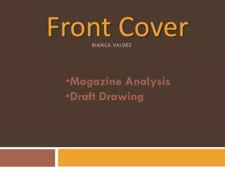
Front Cover. BIANCA VALDEZ. Magazine Analysis Draft Drawing. Here is a copy of an NME magazine that I have purchased. The genre of it is Indie/rock/alternative. When analysing the front cover of this mag I pointed out the main bits that are important. The masthead:

Front Cover
E N D
Presentation Transcript
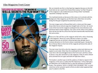
Front Cover BIANCA VALDEZ • Magazine Analysis • Draft Drawing
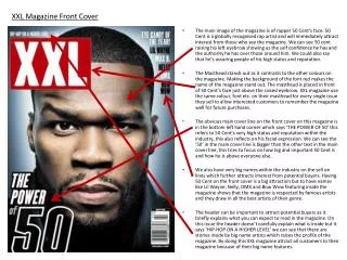
Here is a copy of an NME magazine that I have purchased. The genre of it is Indie/rock/alternative. When analysing the front cover of this mag I pointed out the main bits that are important. • The masthead: • it is BIG + BOLD to stand out to the buyer • It is coloured red. Red could mean danger/blood/love/agression, in this case of the magazine, I believe that it could represent agression. • Red is also a colour that stands out, especially from its contrast with the main picture. • The main picture: • Picture of a band. The main singer is placed in the middle. • The shot that is used is a mid shot of the three. • They are all wearing very dark colours • The lighting is very low and dark, which doesn’t show much of their clothing. • This is probably to make it seem more mysterious and give that gloomy effect. • The main headline: • Big & bold “white lies” is put in a white font. • Stands out • Placed in the center of the magazine • Sell lines: • In the top corner of the magazine it shows a “free poster section inside” • This is to make the reader want to buy the magazine & see what free posters are given inside • It has a preview of 2 posters. • It is shown with a torn paper effect, which makes it look real. • Bottom: • It shows whats inside of the magazine, and what it features.
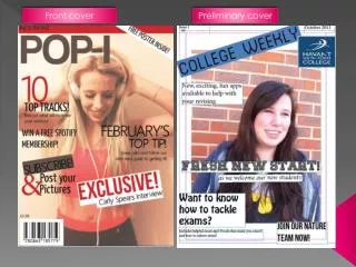
Here is a draft and an idea of how I might want my magazine to look like.
Contents Page BIANCA VALDEZ • Magazine Analysis • Draft Drawing
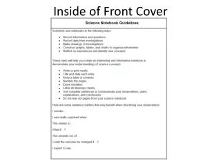
Here is a copy of an NME magazine that I have purchased. The genre of it is Indie/rock/alternative. When analysing the contents page of this mag I pointed out the main bits that are important. • The masthead is still used on the top of this page. • On the left hand side, shows a band index in alphabetical order, which makes it easier for people to search their favourite artists. • On the right hand side, it catergorises different headings, which also makes it easier for readers. • The colours used are red, black and white. This is to match the masthead. • At the bottom, shows subscription details in a different colour, to stand out.
Here is a draft and an idea of how I might want my contents page to look like.