Optimizing SfN Poster Design: Tips for a Flawless Presentation
This guide provides detailed instructions on optimizing your SfN poster design for maximum impact at conferences. Learn key tips on image resolution, font sizing, alignment, and file formats to ensure a professional and visually appealing poster. Make sure your research stands out with these essential design strategies.

Optimizing SfN Poster Design: Tips for a Flawless Presentation
E N D
Presentation Transcript
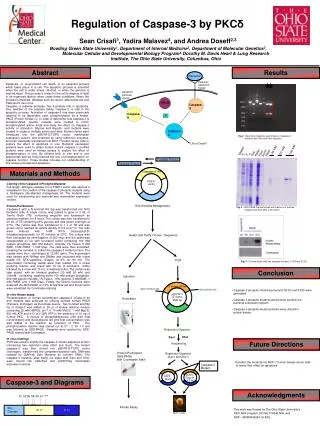
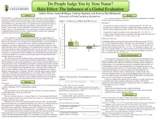
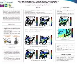
Abstract SfN maximum poster size is 68”x44”. Powerpoint is limited to 56” in any dimension, so we halve the target size (34”x22”), then double at print time. In this case, a zoom view of 200% would give you an approximation of real-world viewing. Otherwise 100% if not doubling, etc. at print time. Don’t get caught up in font sizes, as opposed to relational sizing. Step back from the monitor and evaluate. Would you be able to see things as a poster spectator from a few feet away? Figure 4 ALWAYS use 300 dots per inch (dpi) images. PNGs allow for the compression of a JPG but maintain visual fidelity – they are non-lossy. They also support transparent backgrounds (for shaped logos, graph overlays, etc.). Try to have an image that is natively the expected print size on the poster, if it is scaled, it may appear blurry. A 10” graph should be a 10” file at 300 dpi (3000 pixels across). When embedding an image and resizing it, make sure that you don’t stretch one dimension out of ratio. This results in a pinched or pulled appearance. Hold shift when clicking and dragging from a corner to keep things ratio locked. Scaling also ruins the appearance of rasterized images whose labels/text are in the image. To counter this, type labels and text boxes in PowerPoint, which are rendered at print time to maintain the highest font fidelity. Conclusions REVIEW THE POSTER ON A PC I print from a PC running Windows XP. I accept PPT or PPTX in Office 2007 or 2010. However, a recent alternative: the default Microsoft PDF export via Save As seems to be doing a decent job flattening the file (standard setting). This ensures that I get a file of the proper full-size dimensions. Due to embed issues, I do not accept Adobe Illustrator files. Let a fresh set of eyes look your poster over before submitting it to print. People in your lab are familiar with your work, they may jump to the same conclusions that you have while reviewing the poster, or may share the same shorthand that would be unfamiliar to an “outsider.” You are presenting to a wide audience, try to account for all perspectives and contingencies. ALL FILES ARE DUE BY 9:00AM the day of print. The printer generates better prints when running consecutively. Moreover, there is a finite amount of time to print each day, so the printer cannot be left to sit idle. You are advised against printing the same day that you intend to leave for the conference in the event that a print fails. One poster per timeslot. Should you require multiple posters, sign up for multiple slots. Be courteous to your colleagues, do not squat on a time slot that you do not intend to use. Plans change, but my mindreading skills don’t. Email me to cancel if things arise. Need more time? Let’s talk. If you have any questions or concerns, don’t hesitate to contact me at kevin.fisher@einstein.yu.edu. Best SfN Poster EverKevin FisherDominick P. Purpura Dept. of Neuroscience, Albert Einstein College of Medicine, Bronx, NY 10461 Methods Once you’ve finished your poster, do a “Find and Replace” to search for errant double-spaces in the document. (PC: Ctrl+F, or Mac: Cmd+F). Review the poster for debris generated during its construction. Sometimes, people leave errant textboxes, old labels, etc. This happens also when moving things around and not selecting everything (group!!!). While I try to catch these mistakes, some slip through. You want your poster looking its best. Figure 5 BE CONSISTENT If (A) Figure is the convention you’re using, make sure that B) and (C) are following the same convention. This also applies to abbreviations and formatting across the board. Use carriage returns, or indent/tab spacing (.5” is a good start, see ruler interface at top of document) to help keep text aligned within a box, or offset from the side to denote where lines wrap. This will help legibility and add a degree of polish. Tabbing to indent paragraphs also helps layout. See how jarring the indents are for this box when compared with the rest of the poster? Stick to conventional fonts (Arial, Times New Roman) so as to ensure that the poster appears as you expect it on a different computer. Figure 1 If you have the space, use the spacebar to push related terms to be on the same line. In the following example, you would space pad before the second P<0.05. P<0.05 presented cohesively is much preferred in contrast to something split: P<0. 05. This is also helpful in figure legends, push “A)” to the next line to associate it with its content. Figure 2 Use Align tools to make your borders, boxes and columns square for a clean visualization. The Align tools also allow for symmetrical distribution of selected elements in the vertical and horizontal dimensions, allowing you to easily space objects out. Figure 3 Grouping objects makes things more manageable, ensures that you don’t leave pieces of figures or labels behind when you move things around, and allows you to use that spacing/alignment functionality much more easily. Figure 6 Right-click on the empty space of the poster to “Format Background.” Here, you can change the color fill. Stick to primary colors, so that the color winds up how you expect. Subtle two color gradients can add contrast, but generally don’t distract from your images. Consider your content, don’t overwhelm things. These text-boxes have been set to White fill, with a black outline. Right-click, “Format Shape” to adjust accordingly. AVOID USING TRANSPARENCY to achieve a color as printing results are unpredictable. Instead, take a screenshot, evaluate the screenshot in Adobe using the Eyedropper Tool to sample colors. Then, you’ll get the RGB values that can be custom assigned for the fill, outline or otherwise. References Fisher, Kevin et al., Best Poster Ever, pp. 1-5, 2006. Acknowledgements This poster template was made possible by the continued support of the Neuroscience Department, IDDRC and end –users of the Neuroimaging Core.