Understanding Data Visualization for Big Data Analysis
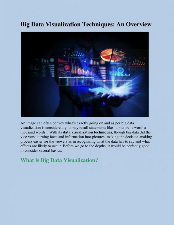
Data visualization for big data analysis is an essential practice that enables organizations to make sense of vast and complex datasets. It translates raw data into visual formats, making it easier for the human brain to comprehend patterns, trends, and outliers.


Understanding Data Visualization for Big Data Analysis
E N D
Presentation Transcript
Understanding Data Visualization for Big Data Analysis Data visualization for big data analysis is an essential practice that enables organizations to make sense of vast and complex datasets. It translates raw data into visual formats, making it easier for the human brain to comprehend patterns, trends, and outliers. With the growing volume, variety, and velocity of data, leveraging effective visualization techniques has become more crucial than ever. The Role of Data Visualization in Big Data Analysis Big data visualization simplifies complex datasets by presenting them in a digestible format. Businesses and organizations deal with massive amounts of structured and unstructured data daily. Without visualization, analyzing such data would be time-consuming and inefficient. Some common visualization tools include: Charts: Bar charts, line charts, pie charts, and area charts. Graphs: Scatter plots, histograms, and network graphs. Maps: Geographic maps, heat maps, and choropleth maps. Dashboards: Interactive platforms that combine multiple visual elements. Benefits of Data Visualization for Big Data Analysis 1. Simplifies Complex Data Big data is inherently complex, making it difficult to analyze in raw format. Data visualization for big data analysis helps break down complex datasets into visual representations that are easier to interpret. For example, a heat map in Tableau can quickly highlight underperforming sales regions by using color coding, making it immediately obvious which areas require attention. 2. Enhances Data Interpretation Visual representations of big data help in identifying patterns, trends, and correlations that might go unnoticed in tabular data. Consider a scatter plot that displays the relationship between marketing spending and revenue. Such visualization might reveal diminishing returns after a certain spending threshold, which may not be apparent from raw data alone. 3. Saves Time in Decision-Making
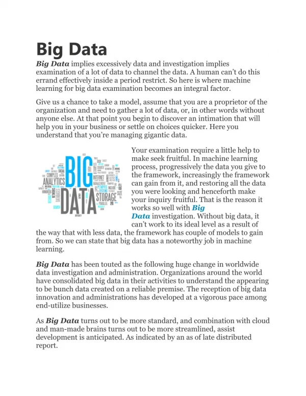
Manually scanning through extensive tables of numbers is not practical for quick decision-making. Visualization tools allow decision-makers to extract meaningful insights at a glance. For instance, an interactive dashboard showing real-time sales performance across different regions enables businesses to adjust their strategies dynamically rather than waiting for end-of-month reports. 4. Improves Communication and Collaboration Visual representations make it easier to communicate data-driven insights to a broader audience, including non-technical stakeholders. A well-designed treemap can illustrate sales performance across different regions, instantly showing which regions are top performers without requiring an in-depth understanding of raw data. 5. Facilitates Data Storytelling Data visualization helps tell a story with data, guiding viewers through insights with a clear narrative. A compelling visualization might start with an overview of performance metrics, drill down into problem areas, and conclude with actionable recommendations. This approach is particularly useful in executive presentations where decision-makers need concise yet impactful information. Big Data Visualization: Key Characteristics Given the 3Vs of big data—Volume, Variety, and Velocity—traditional visualization methods often struggle to process and present insights effectively. Big data visualization is designed to handle these challenges: Volume: The sheer size of big data requires tools capable of summarizing and presenting large amounts of information without losing critical details. Variety: Data comes in different formats, including structured databases, unstructured text, and real-time streaming data. Effective visualization tools must accommodate this diversity. Velocity: Data is generated at high speeds from various sources, such as social media, IoT devices, and financial transactions. Real-time visualization is often necessary to make timely business decisions. Importance of Big Data Visualization 1. Enhanced Decision-Making Big data visualization enables businesses to make informed decisions quickly by presenting complex data in an easily understandable format. Decision-makers can analyze trends, anomalies, and correlations at a glance, allowing them to act swiftly on critical business insights. 2. Improved Data Comprehension Without visualization, large datasets can be overwhelming and difficult to interpret. Charts and graphs help transform raw numbers into meaningful
insights, making it easier to recognize relationships between different data points. For example, a multi-line chart comparing product sales over time can immediately reveal seasonal trends. 3. Increased Engagement with Interactive Visuals Interactive dashboards allow users to explore data dynamically. Instead of static reports, users can filter data, zoom in on specific metrics, and adjust parameters to generate customized insights. This interactivity fosters deeper engagement and a better understanding of data. Tools for Big Data Visualization There are various tools available to help organizations implement data visualization for big data analysis. Some of the most widely used include: Tableau: A powerful visualization tool with interactive dashboards and AI- driven insights. Power BI: A Microsoft solution that integrates with various data sources and offers advanced analytics. Google Data Studio: A free tool for creating reports and dashboards using Google data sources. D3.js: A JavaScript library for creating custom data visualizations on web applications. Apache Superset: An open-source tool designed for big data visualization at scale. Future Trends in Big Data Visualization As data continues to grow, visualization techniques are evolving to keep pace. Some emerging trends include: AI and Machine Learning Integration: AI-powered visualizations that generate insights automatically and highlight anomalies. Augmented Analytics: The use of automation and natural language processing (NLP) to generate reports and recommendations. 3D Data Visualization: Immersive representations for complex datasets, particularly in industries like healthcare and engineering. Real-Time Analytics: Increasing emphasis on streaming data visualization for immediate insights. Conclusion At IFI Techsolutions, we recognize that data visualization for big data analysis is crucial for modern businesses looking to drive growth and efficiency. Our
expertise in advanced analytics and cloud solutions enables organizations to harness the power of big data visualization, transforming raw data into actionable insights. By leveraging cutting-edge tools and methodologies, we help businesses enhance decision-making, improve communication, and gain a competitive advantage. As the data landscape continues to evolve, IFI Techsolutions remains committed to empowering companies with innovative visualization strategies tailored to their unique needs. IFI Techsolutions Limited | NOIDA B-67, First floor, Sector-65, Noida-201301, Distt: Gautam Budha Nagar, Uttar Pradesh. Call: +91-8586000434