Download
1 / 36
370 likes | 570 Views
Learn how to present bivariate data and understand correlation and regression analysis distinctions with descriptive methods and graphical techniques.

E N D
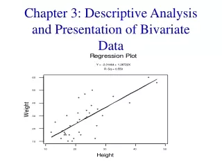
Chapter 3: Descriptive Analysis and Presentation of Bivariate Data
Chapter Goals • To be able to present bivariate data in tabular and graphic form. • To gain an understanding of the distinction between the basic purposes of correlation analysis and regression analysis. • To become familiar with the ideas of descriptive presentation.
3.1: Bivariate Data Bivariate Data: Consists of the values of two different response variables that are obtained from the same population of interest. Three combinations of variable types: 1. Both variables are qualitative (attribute). 2. One variable is qualitative (attribute) and the other is quantitative (numerical). 3. Both variables are quantitative (both numerical).
Two Qualitative Variables: When bivariate data results from two qualitative (attribute or categorical) variables, the data is often arranged on a cross-tabulation or contingency table. Example: A survey was conducted to investigate the relationship between preferences for television, radio, or newspaper for national news, and gender. The results are given in the table below.
This table may be extended to display the marginal totals (or marginals). The total of the marginal totals is the grand total. Contingency tables often show percentages (relative frequencies). These percentages are based on the entire sample or on the subsample (row or column) classifications.
Percentages based on the grand total (entire sample): The previous contingency table may be converted to percentages of the grand total by dividing each frequency by the grand total and multiplying by 100. For example, 175 becomes 13.3%
These same statistics (numerical values describing sample results) can be shown in a (side-by-side) bar graph.
Percentages based on row (column) totals: The entries in a contingency table may also be expressed as percentages of the row (column) totals by dividing each row (column) entry by that row’s (column’s) total and multiplying by 100. The entries in the contingency table below are expressed as percentages of the column totals. These statistics may also be displayed in a side-by-side bar graph.
One Qualitative and One Quantitative Variable: 1. When bivariate data results from one qualitative and one quantitative variable, the quantitative values are viewed as separate samples. 2. Each set is identified by levels of the qualitative variable. 3. Each sample is described using summary statistics, and the results are displayed for side-by-side comparison. 4. Statistics for comparison: measures of central tendency, measures of variation, 5-number summary. 5. Graphs for comparison: dotplot, boxplot.
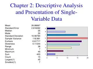
Example: A random sample of households from three different parts of the country was obtained and their electric bill for June was recorded. The data is given in the table below. The part of the country is a qualitative variable with three levels of response. The electric bill is a quantitative variable. The electric bills may be compared with numerical and graphical techniques.
Comparison using dotplots: . . : . . . . . . ---+---------+---------+---------+---------+---------+---Northeast . :..:. .. ---+---------+---------+---------+---------+---------+---Midwest . . . . . . : . . ---+---------+---------+---------+---------+---------+---West 24.0 32.0 40.0 48.0 56.0 64.0 The electric bills in the Northeast tend to be more spread out than those in the Midwest. The bills in the West tend to be higher than both those in the Northeast and Midwest.
Two Quantitative Variables: 1. Expressed as ordered pairs: (x, y) 2. x: input variable, independent variable. y: output variable, dependent variable. Scatter Diagram: A plot of all the ordered pairs of bivariate data on a coordinate axis system. The input variable x is plotted on the horizontal axis, and the output variable y is plotted on the vertical axis. Note: Use scales so that the range of the y-values is equal to or slightly less than the range of the x-values. This creates a window that is approximately square.
Example: In a study involving children’s fear related to being hospitalized, the age and the score each child made on the Child Medical Fear Scale (CMFS) are given in the table below. Construct a scatter diagram for this data.
Scatter diagram: age = input variable, CMFS = output variable
3.2: Linear Correlation • Measure the strength of a linear relationship between two variables. • As x increases, no definite shift in y: no correlation. • As x increase, a definite shift in y: correlation. • Positive correlation: x increases, y increases. • Negative correlation: x increases, y decreases. • If the ordered pairs follow a straight-line path: linear correlation.
Example: no correlation. As x increases, there is no definite shift in y.
Example: positive correlation. As x increases, y also increases.
Example: negative correlation. As x increases, y decreases.
Note: 1. Perfect positive correlation: all the points lie along a line with positive slope. 2. Perfect negative correlation: all the points lie along a line with negative slope. 3. If the points lie along a horizontal or vertical line: no correlation. 4. If the points exhibit some other nonlinear pattern: no linear relationship, no correlation. 5. Need some way to measure correlation.
Coefficient of linear correlation: r, measures the strength of the linear relationship between two variables. Pearson’s product moment formula: Note: 1. 2. r = +1: perfect positive correlation 3. r = -1 : perfect negative correlation
Example: The table below presents the weight (in thousands of pounds) x and the gasoline mileage (miles per gallon) y for ten different automobiles. Find the linear correlation coefficient.
Note: 1. r is usually rounded to the nearest hundredth. 2. r close to 0: little or no linear correlation. 3. As the magnitude of r increases, towards -1 or +1, there is an increasingly stronger linear correlation between the two variables. 4. Method of estimating r based on the scatter diagram. Window should be approximately square. Useful for checking calculations.
3.3: Linear Regression • Regression analysis finds the equation of the line that best describes the relationship between two variables. • One use of this equation: to make predictions.
Models or prediction equations: Some examples of various possible relationships. Linear: Quadratic: Exponential: Logarithmic: Note: What would a scatter diagram look like to suggest each relationship?
Method of least squares: Equation of the best-fitting line: Predicted value: Least squares criterion: Find the constants b0 and b1 such that the sum is as small as possible.
The equation of the line of best fit: Determined by b0: slope b1: y-intercept Values that satisfy the least squares criterion:
Example: A recent article measured the job satisfaction of subjects with a 14-question survey. The data below represents the job satisfaction scores, y, and the salaries, x, for a sample of similar individuals. 1. Draw a scatter diagram for this data. 2. Find the equation of the line of best fit.
Note: 1. Keep at least three extra decimal places while doing the calculations to ensure an accurate answer. 2. When rounding off the calculated values of b0 and b1, always keep at least two significant digits in the final answer. 3. The slope b1 represents the predicted change in y per unit increase in x. 4. The y-intercept is the value of y where the line of best fit intersects the y-axis. 5. The line of best fit will always pass through the point
Making predictions: 1. One of the main purposes for obtaining a regression equation is for making predictions. 2. For a given value of x, we can predict a value of y, 3. The regression equation should be used to make predictions only about the population from which the sample was drawn. 4. The regression equation should be used only to cover the sample domain on the input variable. You can estimate values outside the domain interval, but use caution and use values close to the domain interval. 5. Use current data. A sample taken in 1987 should not be used to make predictions in 1999.