Quantitative Variables: Plots, Measures, Outliers & Skewness
380 likes | 389 Views
Learn to recognize and interpret plots (histogram, boxplot), calculate and interpret measures of center (mean, median), and understand the effects of outliers and skewness.

Quantitative Variables: Plots, Measures, Outliers & Skewness
E N D
Presentation Transcript
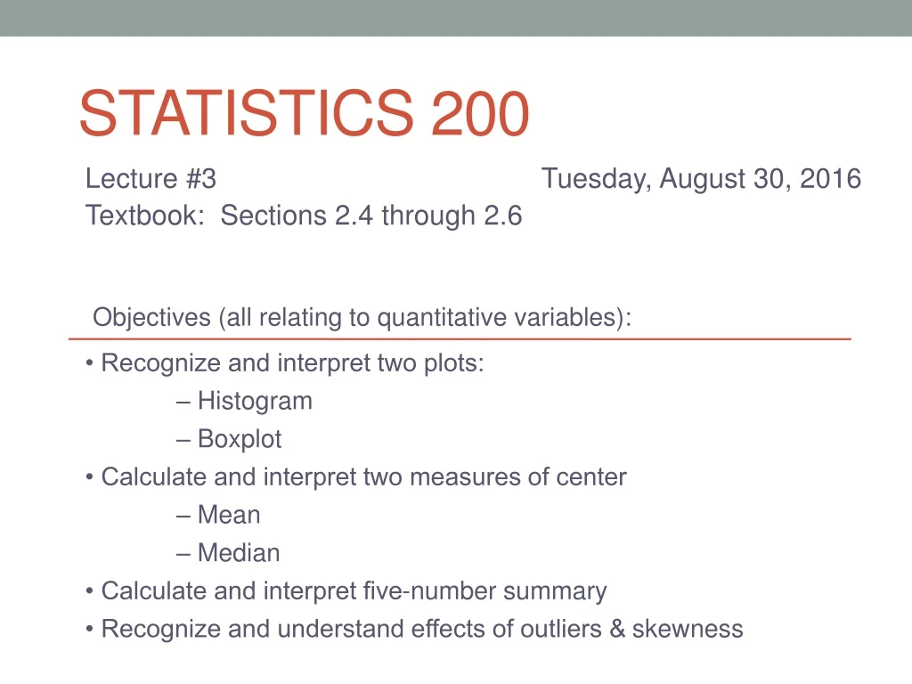
Statistics 200 Objectives (all relating to quantitative variables): • Recognize and interpret two plots: – Histogram – Boxplot • Calculate and interpret two measures of center – Mean – Median • Calculate and interpret five-number summary • Recognize and understand effects of outliers & skewness Lecture #3 Tuesday, August 30, 2016 Textbook: Sections 2.4 through 2.6
Motivating example • A group of students was randomly assigned to one of two classes. One class was taught by teacher A and the other by teacher B. At the end of the semester, all students took the same exam. • Investigate whether there is any difference in exam scores between the two teachers. 53 72 35 47 64 66 13 6 35 42 45 59 58 69 53 67 57 53 62 95 74 2 61 84 88 65 69 76 53 71 71 87 98 83 81 73 75
Summarizing Quantitative Variables • The distributionof a quantitative variable is the overall pattern of how often the possible values occur. • Four key aspects of the distribution are: • Location: center, average • Spread: variability • Shape: symmetric, bell, skew • outliers • Let’s begin with the shape, which is best seen with a visual summary
Visual summaries for quantitative variables Histogram Boxplot • A chart of the data that shows how many observations are in each equally spaced interval. • Usually use 6-15 intervals • Can use frequency or relative frequency
Histograms Teacher A Scores Teacher B Scores
Outlier An individual value that is unusual compared to the bulk of the other values. Outlier!
Example When considering study hours/week, what percent of the students spend: at most 3 hours? at least 11 hours? between 5 and 9 hours?
Shapes of distributions • Symmetric the shape of the data is similar on both sides of the center. • Bell-shaped is a special case of symmetric • Skewed:Values are more spread out on one side than the other. • Left-skewed: lower values more spread out than higher values • Right-skewed: higher values more spread out than lower values.
Shape Examples: Question: What is the fastest you have ever driven a car? Symmetric
Shape Examples: Question: How many coins are you carrying? Right-skewed Left-skewed Question: What is your grade point average?
Breakdown of DescriptiveStatistical Methods: Quantitative Data did one: histogram do now
Quantitative Data: Measures of Center Mean: • ___________ of all numbers • symbol for sample mean: • Value is sensitive to ______________ Median: • middle observation of ___________ data • value is resistant to ________________ Mode: • observation that occurs most frequently • don’t really use in this course Average Outliers ordered outliers
Sensitive vs. Resistant statistics • Calculated using ALL observations • Affected by skewness and / or unusual observations. • Example: Mean Sensitive Statistic • Calculated using only some observations • Not affected much by outliers • Example: Median Resistant Statistic
Examples: mean = 94.8 mph median =95 mph mean = 17.3 coins median = 9 coins
Work together question: Which is most likely true when considering salaries($) in a company that employs: 1. 20 factory workers and 2 very highly paid executives: one would find with the salaries that the: • mean > median • mean < median • mean ≈ median 2. 2 factory workers and 20 very highly paid executives: one would find with the salaries that the: • mean > median • mean < median • mean ≈ median
A percentile tells us how much of the data is below a specific value. Percentiles What is the value (in studyhrs/week) for the: • 5th percentile? • 90th percentile?
Percentiles of Interest 25th percentile: • ___________Quartile (QL) • ___________Quartile (Q1) Lower First 50th percentile: • Second Quartile (Q2) • ________ Median 75th percentile: • __________Quartile (QU) • __________ Quartile (Q3) Upper Third
We use quartiles for the… • Numerical method for summarizing quantitative data.
Example: 5-Number summary Descriptive Statistics: Fastest_Speed Variable N Minimum Q1 Median Q3 Maximum Fastest_Speed 20 45 90 95 100 135 Fill-in the five number summary
Another look: 5-number summary The 5-number summary divides your data into 4 quarters:
Approximately what percent of the fastest speeds: • are at least 100 mph? • are at most 90 mph?
Approximately what percent of the fastest speeds lie: • between 90 and 100 mph? • (at most 95) or (at least 100?) 45 100 90 95 135
Visual summaries for quantitative variables Histogram Boxplot • Visualization of the 5-number summary • Shows Q1, Median, Q3 • as lines around and through a middle box. • Identifies outliers. • A chart of the data that shows how many observations are in each equally spaced interval. • Usually use 6-15 intervals • Can use frequency or relative frequency
Boxplot shows same shape as histogram Symmetric
Boxplot shows same shape as histogram Right-skewed
Boxplot shows same shape as histogram Left-skewed
Another example: Parties per month Outliers!
Median: 50% of students surveyed partied less than 4.5 times per month. • Right-skewed mean > median
Consider the variables Party and Year Response • How many parties do you attend in a month? • What year are you in school? Explanatory
Consider the variables Party and Year • How many parties do you attend in a month? • What year are you in school? Quantitative Categorical (ordinal)
Which year has highest median? Largest box? Most outliers? Do we observe a trend?
Review: If you understood today’s lecture, you should be able to solve • 2.40, 2.41, 2.43, 2.49c, 2.53, 2.59, 2.62 Objectives (all relating to quantitative variables): • Recognize and interpret two plots: – Histogram – Boxplot • Calculate and interpret two measures of center – Mean – Median • Calculate and interpret five-number summary • Recognize and understand effects of outliers & skewness
