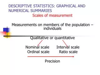
Graphical Summaries
Graphical Summaries. Graphical Summary Types. Circle Graph (Pie Chart) Bar Graph Histogram Time Series. Circle Graph. Whole circle is 100% Must now what portion measurement is of the whole Difficult to compare small differences. Bar Graph. Better for close comparison


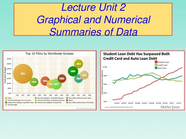
Graphical Summaries
E N D
Presentation Transcript
Graphical Summary Types • Circle Graph (Pie Chart) • Bar Graph • Histogram • Time Series
Circle Graph • Whole circle is 100% • Must now what portion measurement is of the whole • Difficult to compare small differences
Bar Graph • Better for close comparison • Difficult to see proportions • ¼ like apple
Histogram – CEO Saleries • Abstract • From Forbes magazine • Best small firms in 1993 • Given salaries of Chief Executive Officer
Histogram – CEO Saleries • Description • Why chose histogram to represent data? • See where most of the data is • Easy to group data together • 200 to 500 is normal • >500 spread out
Histogram – how to make in excel • Let’s try it with an example file • Problem with the output • Title • Don’t need legend • Spaces between bars • X & Y axes • Number line at bottom • Minor tics on x axis
Time Series – Ice Cream Consumption • Abstract • Track ice cream sales • Over 30 four-week periods • See seasonal pattern & overall increase
Time Series – Ice Cream Consumption • Description • Help us see patter/trend over time
Time Series – how to make in excel • Use scatter plot
Assignment • Go to lib.stat.cmu.edu/DASL • Find sets of data • One for each graphical summary • Create the graphical summary using excel • For each, write abstract in your own words • For each, describe how the type of graphical summary helps you understand the data.