Avoiding Common Table Mistakes in Presentations and Reports
This engaging presentation identifies common errors in table construction that can affect clarity and effectiveness. It highlights the importance of adhering to proper formatting principles, regardless of whether you're creating tables for reports or presentations. You'll learn to spot errors in various sample tables, including issues like lack of titles, non-standard text formatting, small font sizes, and insufficient explanations for symbols. By the end of the session, you will be equipped with valuable tips to improve your table designs and enhance your audience's understanding.

Avoiding Common Table Mistakes in Presentations and Reports
E N D
Presentation Transcript
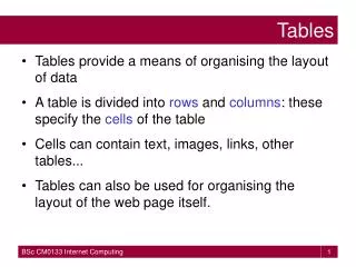
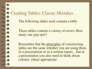
Creating Tables: Classic Mistakes The following slides each contain a table These tables contain a variety of errors: How many can you spot? Remember that the principles of constructing tables are the same whether you are using them in a presentation or in a written report…but in a presentation you also need to think about colours, where appropriate
Creating Tables To start you off, the table on the following slide has numerous errors – see how many you can identify……. Then check your ideas with the answers provided on slide 4 ….. Now work through the remaining slides to see how many more errors in the tables presented you can find
What Were the Errors? • No title • Non-standard format of text (some centred) • No footnote to explain the symbols */**/*** • Text is too small • No explanation of the coloured rows • vertical lines below column titles should be deleted Now try and spot the errors on the following tables & remember that tables presented in seminars may use colours to highlight certain data.
Growth Rates of Plants over Four Years Year Growth Rate Temperature 1 32.6 10 2 37.8 10 3 78.9 10 4 100.4 10
Growth Rates of Plants (mm/month) over Four Years (1999-2002)
Recorded Sightings of Dolphins off the West Coast of Ireland in 2002
Further Information • For more information on constructing tables see:-http://bio.ltsn.ac.uk/hosted/GSP/data.html