Download
1 / 25
250 likes | 287 Views
Learn about organizing and visualizing data using dot plots, histograms, stem-and-leaf plots, and more with practical examples. Enhance your understanding of frequency distributions and data characteristics analysis. Discover the tools and methods for interpreting datasets accurately.

E N D
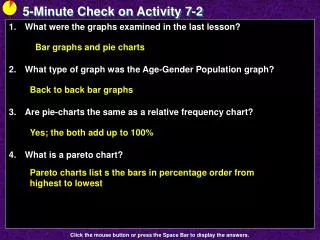
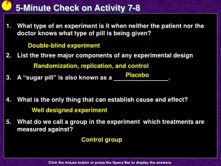
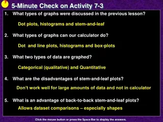
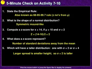
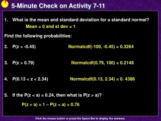
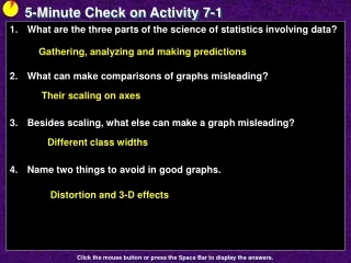
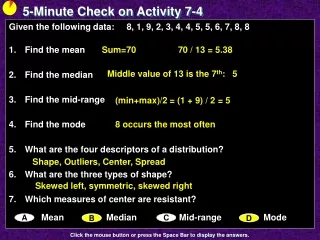
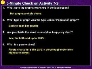
5-Minute Check on Activity 7-2 • What were the graphs examined in the last lesson? • What type of graph was the Age-Gender Population graph? • Are pie-charts the same as a relative frequency chart? • What is a pareto chart? Bar graphs and pie charts Back to back bar graphs Yes; the both add up to 100% Pareto charts list s the bars in percentage order from highest to lowest Click the mouse button or press the Space Bar to display the answers.
Activity 7 - 3 The Class Survey
Objectives • Organize data with frequency tables, dotplots, and histograms • Organize data using stem-and-leaf plots
Vocabulary • Frequency – the number of occurrences of each data value • Dotplot – a graph that represent each occurrence of a data value with a dot • Frequency Distributions – show how the data is distributed over all possible values • Classes – are frequency intervals (grouped data) • Class width – how wide a class is (upper limit – lower limit) • Stem – the digit or group of digits with the greatest place value • Leaf – the remaining digits
Activity Decisions that are made in business, government, education, engineering, medicine, and many other professions depend on analyzing collections of data. As a result, data analysis has become an important topic in many mathematics classes. In this activity, you will collect and organize data from your class.
Activity cont Fill in the requested data on the board:
Activity cont Using the data collected on the board, determine the following characteristics of your class: • Most common number of siblings (mode) • Average number of miles from school (mean) • More females or males in class (mode) • The most hours studied last night (max)
Activity cont Draw dot plots of the four categories of data Siblings Homework Miles from School Gender
TI-83 Graph Support • 2nd “Y=“ gets into STAT PLOT where we find six graph types supported • Dot plot • Line Plot • Histogram • Boxplot with outliers marked • Boxplot without outliers marked • Normality Plot • To graph things we need the values entered into the list variables L1, L2, etc • Zoom – 9 (ZoomStat) will do the windowing for us
Histograms • Histograms break the range of data values into classes and displays the count or % of observations that fall into that class • Divide the range of data into equal-width classes • Count the observations in each class: “frequency” • Draw bars to represent classes: height = frequency • Bars should touch (unlike bar graphs).
Histogram versus Bar Chart HistogramBar Chart • variables quantitativecategorical • bar space no spacespaces between
Categorical Data Example Physical Therapist’s Rehabilitation Sample
Categorical Data • Items are placed into one of several groups, intervals or categories (to be counted) • Typical graphs of categorical data: • Pie Charts; emphasizes each category’s relation to the whole • Bar Charts; emphasizes each category’s relation with other categories Bar Chart Pie Chart
Charts for Both Data Types Relative Frequency Chart Pareto Chart Cumulative Frequency Chart
Quantitative Data • Quantitative Variable: • Values are numeric - arithmetic computation makes sense (average, etc.) • Distributions list the values and number of times the variable takes on that value • Displays: • Dotplots • Stemplots • Histograms • Boxplots
Dot Plot • Small datasets with a small range (max-min) can be easily displayed using a dotplot • Draw and label a number line from min to max • Place one dot per observation above its value • Stack multiple observations evenly • First type of graph under STATPLOT 34 values ranging from 0 to 8
Stem Plots • A stemplot gives a quick picture of the shape of a distribution while including the numerical values • Separate each observation into a stem and a leafeg. 14g -> 1|4 256 -> 25|6 32.9oz -> 32|9 • Write stems in a vertical column and draw a vertical line to the right of the column • Write each leaf to the right of its stem • Note: • Stemplots do not work well for large data sets • Not available on calculator
Stem & Leaf Plots Example Given the following values, draw a stem and leaf plot 20, 32, 45, 44, 26, 37, 51, 29, 34, 32, 25, 41, 56 Ages Occurrences ------------------------------------------------------------------ 2 | 0, 6, 9, 5 | 3 | 2, 3, 4, 2 | 4 | 5, 4, 1 | 5 | 1, 6
Splitting Stems • Double the number of stems, writing 0-4 after the first and 5-9 after second.
Back-to-Back Stemplots • Back-to-Back Stemplots: Compare datasets Example1.4, pages 42-43 of YMS Literacy Rates in Islamic Nations
Example 2 The ages (measured by last birthday) of the employees of Dewey, Cheatum and Howe are listed below. • Construct a stem graph of the ages • Construct a back-to-back comparing the offices • Construct a histogram of the ages Office A Office B
Example 2a: Stem and Leaf Ages of Personnel 2 0, 1, 2, 6, 8, 8, 3 0, 1, 1, 2, 3, 5, 6, 7, 8, 9, 9, 4 2, 2, 5, 7, 8, 9, 9,
Example 2b: Back-to-Back Stem Office A: Ages of Personnel Office B: Ages of Personnel 20, 8 3 2, 3, 5, 6, 7, 8, 45, 7, 8, 9, 1, 2, 6, 8 0, 1, 1, 9, 9 2, 2, 9
Example 2c: Histogram 8 n = 24 k = √24 ≈ 4.9 so pick k = 5 w = (49 – 20)/5 = 29/5 ≈ 5.8 6 KrangeNr 1 20 – 25 3 2 26 – 31 6 3 32 – 37 5 4 38 – 43 5 5 44 – 49 5 6 4 Numbers of Personnel 2 20-25 32-37 44-49 26-31 38-43 Ages
Summary and Homework • Summary • Frequency Distribution describes how frequently each data value occurs: • Listed in a frequency table • Visually depicted in a dot-plot or histogram • Grouped histograms are useful for wide range of data by dividing groups in equal-width intervals • Stem-and-leaf organizes data by splitting each data value into two parts (usually tens digit and singles digit) • Homework • pg 811-814; problems 2, 3, 7