The Art of Typography: Balancing Style and Readability in Design
230 likes | 349 Views
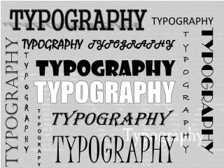
Typography is the art of arranging type to make written language legible and visually appealing. It encompasses various elements such as fonts, sizes, spacing, and styles, which contribute to effective communication. Key typography terms include ascenders, descenders, baselines, and serifs, each playing a crucial role in the overall appearance of text. Understanding typography helps designers create cohesive and aesthetically pleasing layouts, enhancing user experience across different media. Dive into the world of typography to elevate your design skills.

The Art of Typography: Balancing Style and Readability in Design
E N D
Presentation Transcript
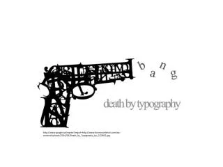
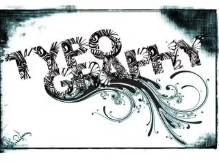
http://www.google.ca/imgres?imgurl=http://www.braincrumbtrail.com/wp-content/uploads/2010/03/Death_by_Typography_by_GCORE1.jpghttp://www.google.ca/imgres?imgurl=http://www.braincrumbtrail.com/wp-content/uploads/2010/03/Death_by_Typography_by_GCORE1.jpg
typography (usually uncountable;pluraltypographies) The art or practice of setting and arranging type; typesetting. The practice or process of printing with type. The appearance and style of typeset matter. http://www.google.ca/imgres?imgurl=http://1.bp.blogspot.com/_IFThO3GWZEs/S8YYrdHbrOI/AAAAAAAAAWI/ijC7XEsj6F4/s1600/Typography_by_DamagedInnocence.jpg&imgrefurl=http://katspeak88.blogspot.com
Common Typography Terms ascender The part of a lowercase letter that rises above the main body of the letter (as in b, d, h). The part that extends above the x-height of a font. bx This part here
Common Typography Terms px descender The lowest portion of letters such as 'g,' 'j,' 'p.' 'q,' and 'y' that extends below the baseline, or reading line of type. (See descender line.) The portion of a lowercase letter that extends below the base line of the letter. This part here
Common Typography Terms bowl The enclosed oval or round curve of letters like 'D', 'g', b', and 'o'. In an open bowl, the stroke does not meet with the stem completely; a closed-bowl stroke meets the stem. Dgbo Dgbo Dgbo
Common Typography Terms baseline The imaginary line upon which text rests. Descenders extend below the baseline. Also known as the "reading line." The line along which the bases of all capital letters (and most lowercase letters) are positioned. Baseline
Common Typography Terms Cap line cap line The imaginary line which represents the uppermost part of capital letters and some character's ascenders. A line marking the height of uppercase letters within a font.
Common Typography Terms header One or more lines of text appearing at the top of every page.
Common Typography Terms font The complete set of characters for one typeface at one particular type size, excluding attributes such as bold or italic. In modern usage, the term "font" is often confused with "typeface" and "family." Traditionally, the term "font" represents a complete set of characters (including all the letters of the alphabet, punctuation, and symbols), which share the same typeface, style, and size. For example, 12 point Goudy Oldstyle Bold is a font. Calibri (body) Algerian Chiller Freestyle Script Jokerman Palatino Times New Roman
Common Typography Terms AAAAAAAArrgh! 18 pt. 96 pt. body size The type's point size which is determined by measuring from the highest ascender to the lowest descender (plus any additional white space to the descender line). point A unit of measurement, often used to measure type size, equal to 0.013837 inch (approximately equal to 1/72"). The traditional point measurement was slightly more or less than 72 points to the inch (depending on the typesetting measurement system).
Common Typography Terms caps and small caps The typesetting option in which the lowercase letters are set as small capital letters; usually 75% the height of the size of the innercase.
Common Typography Terms bold face A heavy, stroked typeface, in which the negative space of counters is minimized; appears thick and massive; calls attention to itself in contrast to regular text for emphasis. You can attract the eye with bold face text.
Common Typography Terms italics A type style with slightly slanted characters, used for emphasis. Best used to set off quotes, special phrases, and foreign words, italic letters have a redesigned structure that allows them to slant to the right. The first italic type was designed by Aldus Manutius in AD 1501 and was based on the handwriting style of that time. Furthermore, lowercase letters were in italics while capital letters were Roman (or vertical stance). Italics Not italics Italics Not italics Italics Not italics Italics Not italics Italics Not italicsItalics Not italics
Common Typography Terms Small, finishing strokes on the arms, stems, and tails of characters. Serif typefaces are usually used for text since the serifs form a link between letters that leads the eye across a line of type. serif Small, finishing strokes on the arms, stems, and tails of characters. Serif typefaces are usually used for text since the serifs form a link between letters that leads the eye across a line of type.
Common Typography Terms A typeface without serifs. For example, Helvetica or Modern. Sans serif type is more legible in headings than in a long passage of text. sans serif A typeface without serifs. For example, Helvetica or Modern. Sans serif type is more legible in headings than in a long passage of text. Helvetica is an example of a sans serif typeface. First designed by William Caslon IV in 1816, it was originally referred to as "English Egyptian." Also known as "Gothic" in the United States and "Grotesque" in Europe.
Common Typography Terms dingbats Once known as "printer's flowers," these are the small decorative marks, bullets, or symbols that usually make up a specialty face. Zapf Dingbats is one well-known example of a dingbat font.
