Scientific Method
Scientific Method. Unit 1A. Observation. Recognizing or noting facts about a specific instance. Hypothesis. Proposed & testable explanation of the observation Example: Observation- When I hold my pen up and then let go, it falls to the floor

Scientific Method
E N D
Presentation Transcript
Scientific Method Unit 1A
Observation • Recognizing or noting facts about a specific instance
Hypothesis • Proposed & testable explanation of the observation • Example: • Observation- When I hold my pen up and then let go, it falls to the floor • Hypothesis- The floor and the pen are magnetically attracted to each other, therefore when the pen is free to move, it moves to the floor.
Experiment • A step by step, repeatable process for testing a hypothesis • Independent variable: what is being tested- YOU control this variable! • Dependent variable: what can change when the independent variable is changed • Control: variable that remains the same throughout the experiment
Let’s try to identify the variables… • 1 - Patty Power • Mr. Krabbs wants to make Bikini Bottoms a nicer place to live. He has created a new sauce that he thinks will reduce the production of body gas associated with eating crabby patties from the Krusty Krab. He recruits 100 customers with a history of gas problems. He has 50 of them (Group A) eat crabby patties with the new sauce. The other 50 (Group B) eat crabby patties with sauce that looks just like new sauce but is really just mixture of mayonnaise and food coloring. Both groups were told that they were getting the sauce that would reduce gas production. Two hours after eating the crabby patties, 30 customers in group A reported having fewer gas problems and 8 customers in group B reported having fewer gas problems. • Which people are in the control group? • What is the independent variable? • What is the dependent variable?
Data • Information gathered from an experiment • Quantitative data: numbers and measurements • Qualitative data: describes the quality
Accurate data refers to how close a set of data is to the correct or known value. Precise data refers to how close a set of data points are to each other. Accurate or Precise Data
Error in the Lab • Human error – can occur when a person doesn’t measure substances correctly or makes a mathematical error.
Error in the Lab • Mechanical error – may be out of your control. Sometimes equipment may not be calibrated correctly or is broken without you knowing it and it measures incorrectly.
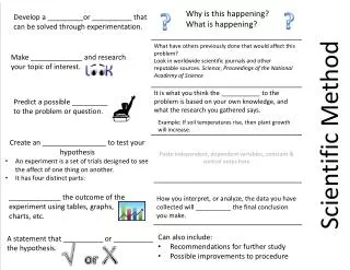
Data Analysis – Graphing Guidelines • 1. Always give your graph a title in the following form: “The Dependence of (your dependent variable) on (your independent variable)”. • Ex. The Dependence of Reaction Rate on Temperature
2. The x-axis of a graph is always the independent variable & the y-axis is the dependent variable. Always label your x and y axes and give units!
3. Always make a line graph! • Line graphs are better in science because they tell you how one thing changes under the influence of some other variable!
4. Never, EVER, connect the dots on your graph! • Why? When you do an experiment, you always screw something up. Yeah, you! It’s probably not a big mistake and is, frequently, not something you have a lot of control over. However, things can and do go wrong. As a result, experimental data never makes a nice, straight line. Instead, it makes a bunch of dots that seem to wiggle around a graph. This is normal! • You’re best bet is to make a line or curve that follows the data as well as possible without actually connecting the dots. This shows the trend in the data, without depending too much on the noise created by error.
5. Make sure your data is graphed as large as possible in the space you’ve been given.
Example of a Bad Graph • There's no title. What's it a graph of? Who knows? • There are no labels on the x or y axis. What are those numbers? Who knows? • There are no units on the x or y axis. Is this a graph of speed in miles per hour or a graph of temperature in Kelvins? Who can tell? • Somebody played "connect the dots". This should be a nice straight line which goes through the points or a curve that tends to follow them.
Theory or Scientific Law • Theory • Explains why specific phenomena occur
Scientific Law • Describes what happens when the phenomena occur