Chapter 3 Summarizing Categorical Data
This chapter explores various charts and graphs used to summarize categorical data. It covers constructing frequency tables, bar charts, pie charts, and contingency tables, utilizing examples such as eye color data and movie genres released in 2005. Key concepts include frequency and relative frequency, along with graphical representations for effective data visualization. The chapter illustrates how to interpret these visual tools to extract meaningful insights from categorical data, making it a fundamental resource for understanding data summaries.


Chapter 3 Summarizing Categorical Data
E N D
Presentation Transcript
Chapter 3Summarizing Categorical Data In this chapter, we will look at some charts and graphs used to summarize categorical data.
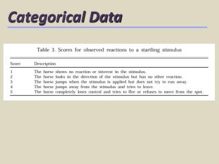
A table of the form: Frequency= the count or number in the sample falling into the category value Relative Frequency= the percentage of the sample that falls into the category value Frequency Tables
Construct a frequency table for eye color using the data from “ACSC”. Example 1
A graphical version of a frequency table: • the horizontal axis has each category value (in any order) equally spaced apart • the vertical axis should be appropriately scaled, and it represents either the frequencies or relative frequencies • rectangles (of equal width) are then drawn above each category with heights corresponding to each frequency or relative frequency Bar Charts
Construct a bar chart for eye color using the data from “ACSC”. Example 2
A circular version of a bar chart: Each category value is graphed with its appropriate “wedge size” in a circle rather than bars/rectangles side by side. Pie Charts
Construct a pie chart for eye color using the data from “ACSC”. Example 3
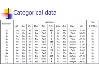
A two-way table that gives the frequencies (or relative frequencies) for 2 categorical variables simultaneously: Contingency Tables
The table shows the frequencies of 120 movies released in 2005 based on genre and rating. Example 4
The table shows the frequencies of 120 movies released in 2005 based on genre and rating. The first thing we should do with such a table is fill in the totals. Example 4
The table shows the frequencies of 120 movies released in 2005 based on genre and rating. (a)What percent of the movies were comedies? Example 4
The table shows the frequencies of 120 movies released in 2005 based on genre and rating. (b)What percent of the movies were rated PG? Example 4
The table shows the frequencies of 120 movies released in 2005 based on genre and rating. (c)What percentage of the dramas were rated R? Example 4
The table shows the frequencies of 120 movies released in 2005 based on genre and rating. (d)What percentage of PG-13 movies were Horror films? Example 4