Python plotting for lab folk
Python plotting for lab folk. Only the stuff you need to know to make publishable figures of your data. For all else: ask Sourish. Overview. Introductory stuff A simple time series plot Plots with multiple panes and axes A Keeling plot Scatterplots and maps

Python plotting for lab folk
E N D
Presentation Transcript
Python plotting for lab folk Only the stuff you need to know to make publishable figures of your data. For all else: ask Sourish
Overview • Introductory stuff • A simple time series plot • Plots with multiple panes and axes • A Keeling plot • Scatterplots and maps • Functions, modules and classes
What is Python? • Python is an general-purpose high-level programming language • Many, many things are done with Python • There are many libraries available with modules for specialized tasks. Like for scientific data plotting... A general tutorial to Python is available on http://docs.python.org/tutorial/. Very useful! This one also seems useful: http://www.openbookproject.net/thinkcs/python/english2e/
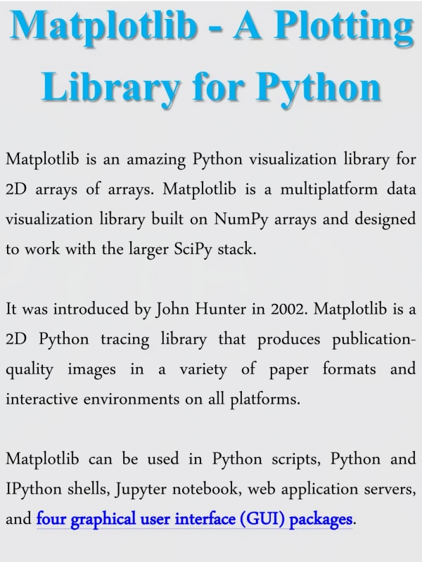
Packages for plotting data • Matplotlib: for plotting ( http://matplotlib.sourceforge.net/, you’ll need this webpage often... ) • Numpy: for scientific computing (http://www.scipy.org/Tentative_NumPy_Tutorial ) These libraries/packages are combined in the pylab package.
Starting up I usually open a terminal, and give the command “ipython –pylab”. Then this appears: This may work slightly differently on your computer.
Starting up Now I can give commands, or run some script that I have on my computer somewhere.
Scripts Scripts are text files with extension ‘.py’ that contain Python commands. You can edit them in Komodo or any other text editor that you find convenient. In principle, you could build your figure by typing all your commands in the terminal, but that is really tedious... So from now on, I’ll assume that you want a script that draws your figure.
Overview • Introductory stuff • A simple time series plot • Plots with multiple panes • A Keeling plot • Scatterplots and maps • Functions, modules and classes
A simple time series plot In Excel:
A simple timeseries plot (step 1) Save your data in a “clean” Windows Comma Separated Value (.csv) file (other text formats are also possible, but this usually works best).
A simple timeseries plot (step 2) Start scripting! First, load the useful packages. Maybe set some default settings for the graphics as well. There are different ways to import functions
A simple timeseries plot (step 3) Read the data from the file and get them into a tidy nested list. Object-oriented way of calling a function “List comprehensions”: typical for Python and essentially a way to write a list-creating loop very compactly
A simple timeseries plot (step 4) Set up the figure, get the values you want to plot in lists, and plot. For use in the legend Formatting string: specifies blue (b) lines (-) with square (s) markers
A simple timeseries plot (step 5) Format the axes and embellish your plot with titles, axis labels, legends, annotations. Save.
Errorbar plot Suppose you want to have errorbars in your plot that are 2% of the values. Then you can replace the plot command: With this command that uses the errorbar function:
Overview • Introductory stuff • A simple time series plot • Plots with multiple panes and axes • A Keeling plot • Scatterplots and maps • Functions, modules and classes
Plot with two y-axes You can make a plot with two y-axes with the twinx() command:
Multipane plots The simplest way to define subplots is with the subplot() or fig.add_subplot() commands. In the brackets should be the desired number of rows, columns and the number of the figure.
Multipane plots The distance between the subplots is adjustable, also to 0. The NullFormatter() can be used to remove the axis ticklabels. Overlapping ticklabels can be removed.
Multipane plots Even more customizable subplots can be made with add_axes(), should you want it.
Overview • Introductory stuff • A simple time series plot • Plots with multiple panes and axes • A Keeling plot • Scatterplots and maps • Functions, modules and classes
A Keeling plot Python offers more possibilities than Excel for customized fits to data. There are scipy.stats.linregress() and scipy.optimize.curvefit(), but you can also write your own routines. I often use a home-made bivariate fit module based on Cantrell (2008) to fit straight lines to data with errors in x and y, like in Keeling plots.
Overview • Introductory stuff • A simple time series plot • Plots with multiple panes and axes • A Keeling plot • Scatterplots and maps • Functions, modules and classes
Scatter plots Of all the other plot possibilities that matplotlib offers, I find the scatter plots quite useful. In scatter plots, marker color and/or size can depend on a third variable.
Maps Maps can be made with the basemap package
Scatter plots and maps Maps can be combined with other things, like plot(), errorbar() and scatter().
Overview • Introductory stuff • A simple time series plot • Plots with multiple panes and axes • A Keeling plot • Scatterplots and maps • Functions, modules and classes
Functions When your script gets longer, it can be a good idea to group some statements into functions. “def” starts function definition The function needs this argument Optional argument Body: what the function does Return value Calls to the function
Modules Function definitions can be grouped into a file and then imported into a script (or interactively). Such a file with definitions is called a module. The bivariate fit module that was imported to the Keeling plot script is an example. If you’re changing your module while running your script, you may have to use the reload() command.
Classes Almost everything in Python is an object of some class or other. Object classes have “methods” associated with them that can work on those objects. You can define your own object classes and methods. Method: definition of a function that can work on your object Another method